Brand
One mark, two colours, two typefaces.
Everything needed to show layermetry correctly: the logo for light and dark backgrounds, the colour values the website and the docs are built from, and the type. Take what you need.
The logo
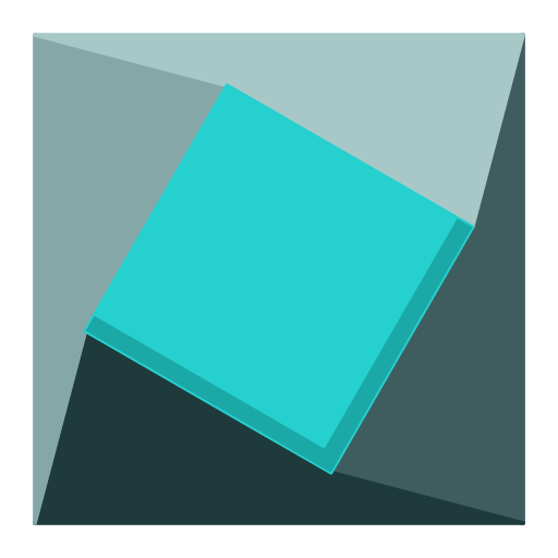
Two offset squares that read as layers, next to the wordmark. It is one colour and never a gradient: black on light backgrounds, white on dark or coloured ones. The gap where the squares overlap is the background showing through, so the mark sits cleanly on any surface. The wordmark is Geist 600 with the letters slightly closer together, which is exactly what the site header uses.



Colours
Black and white carry the design. Teal is the one accent, and it is used as a fill, not as text: on white it fails to separate from the background, so text and links use the darker teal instead.
#26d0ceButtons, marks and small accents. Never as text on white.#0e7a79dark: #4ee0deLinks and teal wording.#0a0a0bdark: #f5f5f7Headlines and body text.#5a5f68dark: #9aa0aaSupporting lines and captions.#ffffffdark: #0a0a0aThe page itself.#fafafbdark: #0e0f11Cards and panels.rgba(10,10,20,0.1)dark: rgba(245,245,250,0.12)Borders and rules.Type
Editing that runs anywhere.
Geist · Headlines and body text
npm i @layermetry/media-editor
Geist Mono · Code and anything measured
Download
- The whole kitEvery file on this page, in one archive.264 KB
- Logo, black (SVG)For light backgrounds. The wordmark is drawn with the font inside the file.19 KB
- Logo, white (SVG)For dark and coloured backgrounds.19 KB
- Mark (SVG)Takes the colour of the text around it.1 KB
- Logo (PNG, 2048px)Transparent background, black. Also 1024 and 512.
- Logo, white (PNG, 1024px)Transparent background, white. Also 512.
- Mark (PNG, 512px)For app icons and avatars. Also 256, 128, 64 and 32.
- Logo with clear space, on lightShows how much room to leave around it.
- Logo with clear space, on darkThe same, on black.




Using the mark
- Leave clear space around the mark, at least the height of one square.
- Use the white logo on dark or coloured backgrounds, so it keeps its contrast.
- Scale it as a whole, from the SVG wherever you can.
- Do not recolour the mark or add a gradient to it.
- Do not stretch, rotate, outline or add a shadow to it.
- Do not rebuild the wordmark in another typeface, or change the spacing between mark and wordmark.
Need a format that is not here?
Tell us what you are putting it on and we will send it.