

Theming
Apply brand colors, fonts, and a logo to the video editor.
The editor takes your brand colors, the fonts of your application, and your logo. These settings change the editor's own panels and buttons. They never change the design on the canvas.
Colors
theme sets colors by role name. Each name you give replaces one color. Every name you leave out keeps its default.
import { VideoEditor, type SemanticRole } from '@layermetry/media-editor/react';
// Purple instead of the default teal. Names you leave out keep their default color.
const brandColors: Partial<Record<SemanticRole, string>> = {
primary: '#7C3AED',
accent: '#7C3AED',
brand: '#7C3AED',
selected: '#7C3AED',
focus: '#7C3AED',
link: '#7C3AED',
};
export default function App() {
return (
<div style={{ position: 'fixed', inset: 0 }}>
<VideoEditor
licenseKey="YOUR_LICENSE_KEY"
onClose={() => console.log('The editor was closed')}
theme={brandColors}
/>
</div>
);
}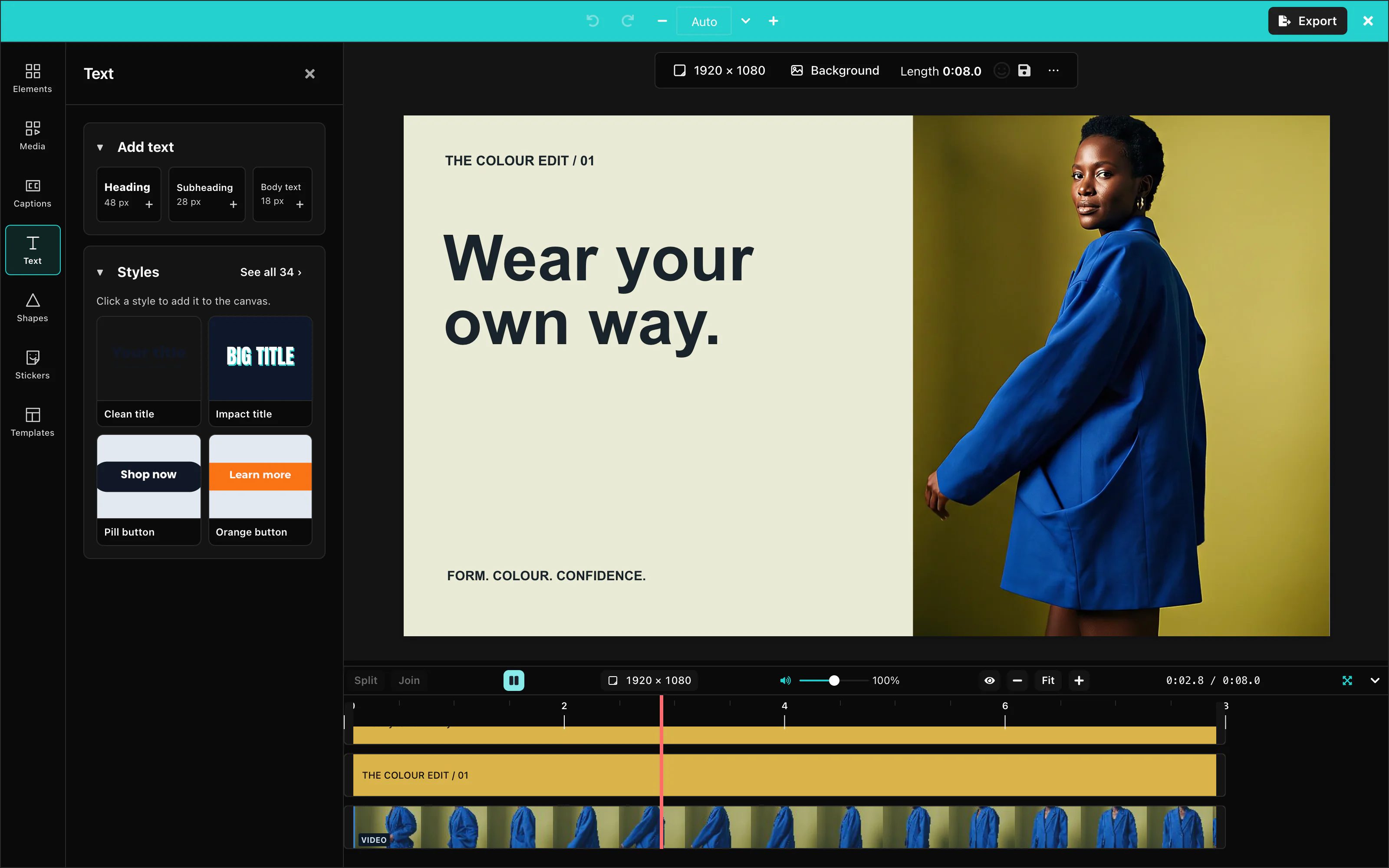 View full size
A value is any CSS color, such as #7C3AED, or a color name from the editor's palette, such as gray.200.
There are 35 role names:
| Group | Names |
|---|---|
| Brand and actions | primary, secondary, tertiary, accent, brand, link, focus, active, hover, selected, highlight, disabled |
| Status | success, info, warning, danger |
| Surfaces | background, surface, overlay, border, divider, shadow, muted |
| Text | textPrimary, textSecondary, textMuted, textOnPrimary, textOnSecondary, textInverse |
| Timeline clips | video, audio, image, shape, text, mediaSelected |
The timeline clips use their own built-in colors until you set one of these five names. Your color then wins. See Clip colors.
TypeScript lists the names as the type SemanticRole.
A few dark colors over the light palette give a mix: the names you did not set stay light. For a dark design, also pass darkMode={true}, so that the dark palette is the base. Or set all 35 names.
Customization Studio
With showThemeCreator set to true, the palette button opens the Customization Studio. Choose colors, fonts, corners, icons and tool visibility there. Copy settings copies one JSON object. Download .json saves it as editor-settings.json.
The Settings tab starts from your supplied theme, logo, data icons and UI settings. It includes your edits. The file contains no license key or callbacks. React component icons are omitted because the file stores data only. Closing the Studio restores your supplied settings. Copy or download changes before closing it.
Logo edits appear immediately in the editor’s top bar while the Studio is open. Clearing the field removes the logo from the preview. Closing the Studio restores your supplied logo.
The Bar tab previews the real toolbar for each item type. Nothing selected previews the page bar. For a selected-item control, change its label, choose Default, Icon only, Words only or Both, move it up or down, or hide it. These settings are saved in ui.selection.
Tools marked (off by default) enter the rail order only when you enable them. Reordering the rail does not enable those tools. Reset restores the settings you supplied when the Studio opened.
Apply the entire JSON object as editor options, then add your license key and callbacks. See Editor settings for complete React, mount-function and custom-element examples.
The video settings file can also contain enableThemeToggle. A custom theme has no light/dark pair, so it hides the switch and overrides darkMode while active.
The Studio is a development tool. Its button is hidden by default. Set showThemeCreator to true in your development build only.
The four status names, success, info, warning, and danger, are never worked out from your brand colors. Set them yourself if you want to change them.
Default: the Layermetry teal palette.
Corners
radii sets the rounding of the editor's buttons, fields, panels, and badges. Each value is a CSS length.
radii={{ sm: '2px', md: '4px', lg: '8px', full: '9999px' }}sm is for badges, md for buttons and fields, lg for panels, and full for round buttons. Default: the built-in rounding.
Fonts
typography sets the fonts of the editor's panels, menus, and buttons. It takes three CSS font-family values:
import { VideoEditor } from '@layermetry/media-editor/react';

export default function App() {
  return (
    <div style={{ position: 'fixed', inset: 0 }}>
      <VideoEditor
        licenseKey="YOUR_LICENSE_KEY"
        onClose={() => console.log('The editor was closed')}
        // Your page loads these fonts. The editor only uses their names.
        typography={{ heading: 'Georgia, serif', body: 'Georgia, serif', mono: 'Menlo, monospace' }}
        radii={{ sm: '0', md: '0', lg: '0', full: '0' }}
      />
    </div>
  );
}
The editor writes the names into its styles. Your page must load the font files, for example with a <link> to Google Fonts. A font that the page did not load falls back to the browser's default font.
Text on the canvas keeps its own fonts. See Text.
Default: the built-in font stacks.
Light and dark mode
darkMode={true} selects the dark theme, and darkMode={false} the light theme. enableThemeToggle={true} adds a button to the app bar, so the user can switch.
import { VideoEditor } from '@layermetry/media-editor/react';

export default function App() {
  return (
    <div style={{ position: 'fixed', inset: 0 }}>
      <VideoEditor
        licenseKey="YOUR_LICENSE_KEY"
        onClose={() => console.log('The editor was closed')}
        darkMode={true}
        enableThemeToggle={true}
      />
    </div>
  );
}
The editor remembers the user's choice for the next time. When you pass darkMode, your value wins when the editor starts. A theme object hides the switch.
Default: without darkMode, the editor is light in the regular layout and dark in the compact layout. The switch is hidden.
Logo
logo shows your logo at the left end of the app bar. It takes the address of a picture.
import { VideoEditor } from '@layermetry/media-editor/react';

export default function App() {
  return (
    <div style={{ position: 'fixed', inset: 0 }}>
      <VideoEditor
        licenseKey="YOUR_LICENSE_KEY"
        onClose={() => console.log('The editor was closed')}
        logo="/logo.svg"
      />
    </div>
  );
}
The editor shows the logo at 32 by 32 pixels, or 24 by 24 pixels in the compact layout. Use a square picture.
Default: no logo.
Icons
icons maps icon names to IconData or React components. Use icon data for JSON settings and non-React hosts.
icons: { plus: { url: '/icons/plus.svg' } }A refused standard icon keeps its built-in icon with one console warning. See Icon data for SVG limits and accepted addresses.