

Theming
Apply brand colors, fonts, and a logo to the image editor.
You can give the editor your brand colors, fonts, corner rounding, and logo. These settings change the editor's own buttons and panels. They never change the user's design.
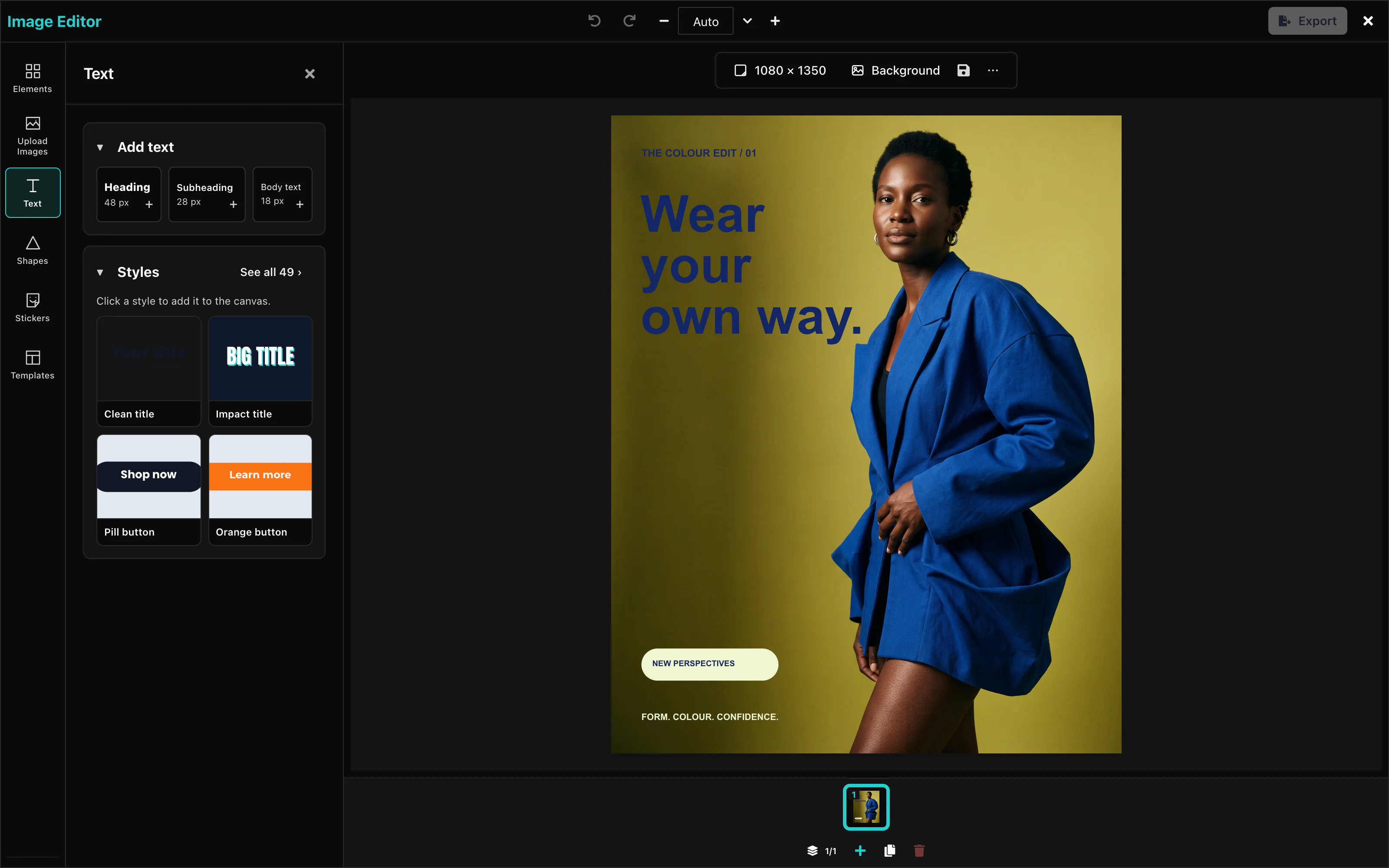 View full size
This example produces the editor in the picture:
import { ImageEditor } from '@layermetry/media-editor/react';

// A square logo. Use the address of your own logo file.
const LOGO =
  'data:image/svg+xml,' +
  encodeURIComponent(
    '<svg xmlns="http://www.w3.org/2000/svg" viewBox="0 0 32 32"><rect width="32" height="32" rx="8" fill="#7c3aed"/><circle cx="16" cy="16" r="7" fill="#fff"/></svg>',
  );

export default function App() {
  return (
    <div style={{ position: 'fixed', inset: 0 }}>
      <ImageEditor
        licenseKey="YOUR_LICENSE_KEY"
        onClose={() => console.log('The editor was closed')}
        theme={{
          primary: '#7c3aed',
          secondary: '#7c3aed',
          surface: '#f5f3ff',
          border: '#ddd6fe',
          textPrimary: '#1e1b4b',
        }}
        typography={{
          heading: 'Georgia, serif',
          body: 'Georgia, serif',
          mono: 'Menlo, monospace',
        }}
        radii={{ sm: '2px', md: '4px', lg: '6px', full: '9999px' }}
        logo={LOGO}
      />
    </div>
  );
}
Colors
theme sets the colors of the editor. Name only the roles you want to change. Every other role keeps its default.
theme={{ primary: '#7c3aed', secondary: '#7c3aed' }}Default: the Layermetry palette in the table below. A value is a CSS hex color, or a color name from the table, such as gray.200.
| Role | What it colors | Light | Dark |
|---|---|---|---|
primary | Brand color: the active tool, the selected page, and the add buttons | #26D0CE | #26D0CE |
secondary | The Export button and other filled buttons | teal | teal |
tertiary | Recessed areas and track backgrounds | cyan | cyan.300 |
accent | Highlights and active rings | #26D0CE | #26D0CE |
brand | Brand badges | #26D0CE | #26D0CE |
background | The background behind everything | white | gray.900 |
surface | Top bar, side panels, and sheets | gray.50 | gray.800 |
overlay | Pop-up menus and hover fills | gray.200 | gray.700 |
border | Panel edges and input outlines | gray.300 | gray.600 |
divider | Thin lines inside panels | gray.200 | gray.700 |
textPrimary | Labels, values, and headings | gray.900 | gray.50 |
textSecondary | Help and caption text | gray.700 | gray.400 |
textMuted | Placeholders and unavailable labels | gray.400 | gray.500 |
textOnPrimary | Text on a brand-colored button | white | gray.900 |
textOnSecondary | Text on a secondary button | white | gray.900 |
textInverse | Tooltips | white | gray.900 |
focus | The keyboard focus outline | #26D0CE | #26D0CE |
hover | The color under the pointer | #1FB8B6 | #1FB8B6 |
active | A control while it is pressed | #26D0CE | #26D0CE |
selected | The chosen tool or tab | #26D0CE | #26D0CE |
disabled | Unavailable controls | gray.200 | gray.700 |
image | Picture items | green | green |
text | Text items | yellow | yellow |
shape | Shape items | teal | teal |
video | Video items | #26D0CE | #26D0CE |
audio | Audio items | purple.50 | purple.50 |
success | Confirmations | green | green.400 |
info | Information messages | cyan | cyan.300 |
warning | Warnings | yellow | yellow.300 |
danger | Delete and other actions that remove things | red | red.400 |
muted | Less important parts of the editor | gray | gray.500 |
shadow | Shadows under panels | gray.500 | black |
highlight | Search highlights | yellow.100 | yellow.200 |
link | Links | #26D0CE | #26D0CE |
The video editor accepts the same names and one more, mediaSelected. The image editor ignores mediaSelected, so one color object can serve both editors.
Customization Studio
With showThemeCreator set to true, the palette button opens the Customization Studio. Choose colors, fonts, corners, icons and tool visibility there. Copy settings copies one JSON object. Download .json saves it as editor-settings.json.
The Settings tab starts from your supplied theme, logo, data icons and UI settings. It includes your edits. The file contains no license key or callbacks. React component icons are omitted because the file stores data only. Closing the Studio restores your supplied settings. Copy or download changes before closing it.
Logo edits appear immediately in the editor’s top bar while the Studio is open. Clearing the field removes the logo from the preview. Closing the Studio restores your supplied logo.
The Bar tab previews the real toolbar for each item type. Nothing selected previews the page bar. For a selected-item control, change its label, choose Default, Icon only, Words only or Both, move it up or down, or hide it. These settings are saved in ui.selection.
Tools marked (off by default) enter the rail order only when you enable them. Reordering the rail does not enable those tools. Reset restores the settings you supplied when the Studio opened.
Apply the entire JSON object as editor options, then add your license key and callbacks. See Editor settings for complete React, mount-function and custom-element examples.
The image settings file does not contain enableThemeToggle; the image editor has no user-facing light/dark switch. darkMode selects the base palette for any omitted theme roles.
The Studio is a tool for you, the developer. Its button is hidden by default. Show it in your development build only. Only the value true shows it. Default: false.
showThemeCreator={true}The Studio starts from your supplied settings. Hidden tools are written into ui.toolRail.hidden or ui.dock.hidden. A dark base writes darkMode: true. Reset returns to your supplied theme.
Fonts
typography sets the fonts of the editor's buttons, panels, and menus. Each value is a CSS font-family. Your page must load the font files.
typography={{ heading: 'Georgia, serif', body: 'Georgia, serif', mono: 'Menlo, monospace' }}Default: the editor's own fonts. A key that you leave out keeps its default.
This does not change the fonts that users can pick for text in their designs. See Text.
radii sets the corner rounding of buttons, inputs, and panels, in any CSS length. Default: the editor's own rounding.
radii={{ sm: '2px', md: '4px', lg: '6px', full: '9999px' }}Light and dark mode
darkMode selects the dark palette. Default: false, the light palette.
darkModeWith theme, darkMode decides which palette your colors change: roles that you do not name come from the dark palette. The editor has no switch for the user. Your application decides the mode, and can change it while the editor is open.
Logo
logo shows your logo in the top bar. The value is the address of an image: a URL, or a data: URL.
logo="https://example.com/logo.svg"The logo is drawn at 32 × 32 pixels at the left of the top bar, before the title. In the compact layout it is 24 × 24 pixels, in the middle of the top bar. Default: no logo.
Icons
icons maps icon names to IconData or React components. Use icon data for JSON settings and non-React hosts.
icons: { plus: { url: '/icons/plus.svg' } }A refused standard icon keeps its built-in icon with one console warning. See Icon data for SVG limits and accepted addresses.