

Text
Add, style, and generate text.
Text boxes hold the words of a design. The user picks the font, size, color, and alignment, styles single words, and adds outline, shadow, and gradient. Ready-made text templates and AI help write the words.
Setup
Text works with no setup. Three props add more:
import { ImageEditor } from '@layermetry/media-editor/react';

export default function App() {
  return (
    <div style={{ position: 'fixed', inset: 0 }}>
      <ImageEditor
        licenseKey="YOUR_LICENSE_KEY"
        onClose={() => console.log('The editor was closed')}
        // The whole Google Fonts catalog in the font list, from your own server.
        googleFonts={{ endpointUrl: '/api/fonts' }}
        // Your brand's text styles.
        templateMetadata={{
          metadata: {},
          textStyles: {
            headline: {
              textStyleName: 'Brand headline',
              fontFamily: 'Montserrat',
              fontSize: 64,
              fontWeight: 700,
              lineHeight: 1.1,
              fontStyle: 'normal',
              textDecoration: 'none',
            },
          },
        }}
        // AI text generation and rewriting.
        ai={{ endpointUrl: 'https://api.example.com/ai' }}
      />
    </div>
  );
}| Option | Prop | Page |
|---|---|---|
| The whole Google Fonts catalog | googleFonts | Fonts |
| Your brand's text styles | templateMetadata.textStyles | Brand text styles |
| Host text templates | textTemplates | Text templates |
| AI text generation and rewriting | ai | AI providers |
Text panel
The panel is arranged in this order: a selected-text strip; Generate with AI (or Rewrite with AI and + New when text is selected); Brand styles when a brand is active; Add text with Heading, Subheading and Body; Styles with four template previews and See all; and Generated. Sections can be folded. Styles and Generated have full-list routes, and the compact view uses a sheet. The toolbar’s Text styles control opens the panel at Brand styles.
Text boxes
In the Text panel, choose Heading (48 px), Subheading (28 px), or Body text (18 px) under Add text. The new item starts as “Add your heading”, “Add your subheading”, or “Add your text”. When a brand is active, the tiles use its Title, Subtitle and Body styles.
Double-click a text box to type in it. Enter ends the editing, and Shift+Enter starts a new line. Esc, or a click outside the box, also ends the editing.
When a text box is selected, the toolbar above the page shows:
| Group | Controls |
|---|---|
| Text | Rewrite with AI, font, align left, center, and right |
| Format | Bold, italic, underline, text color |
| Style | Font size, from 1 to 999, and Text styles |
| Controls | Bring to front, send to back, delete, transparency |
Fonts
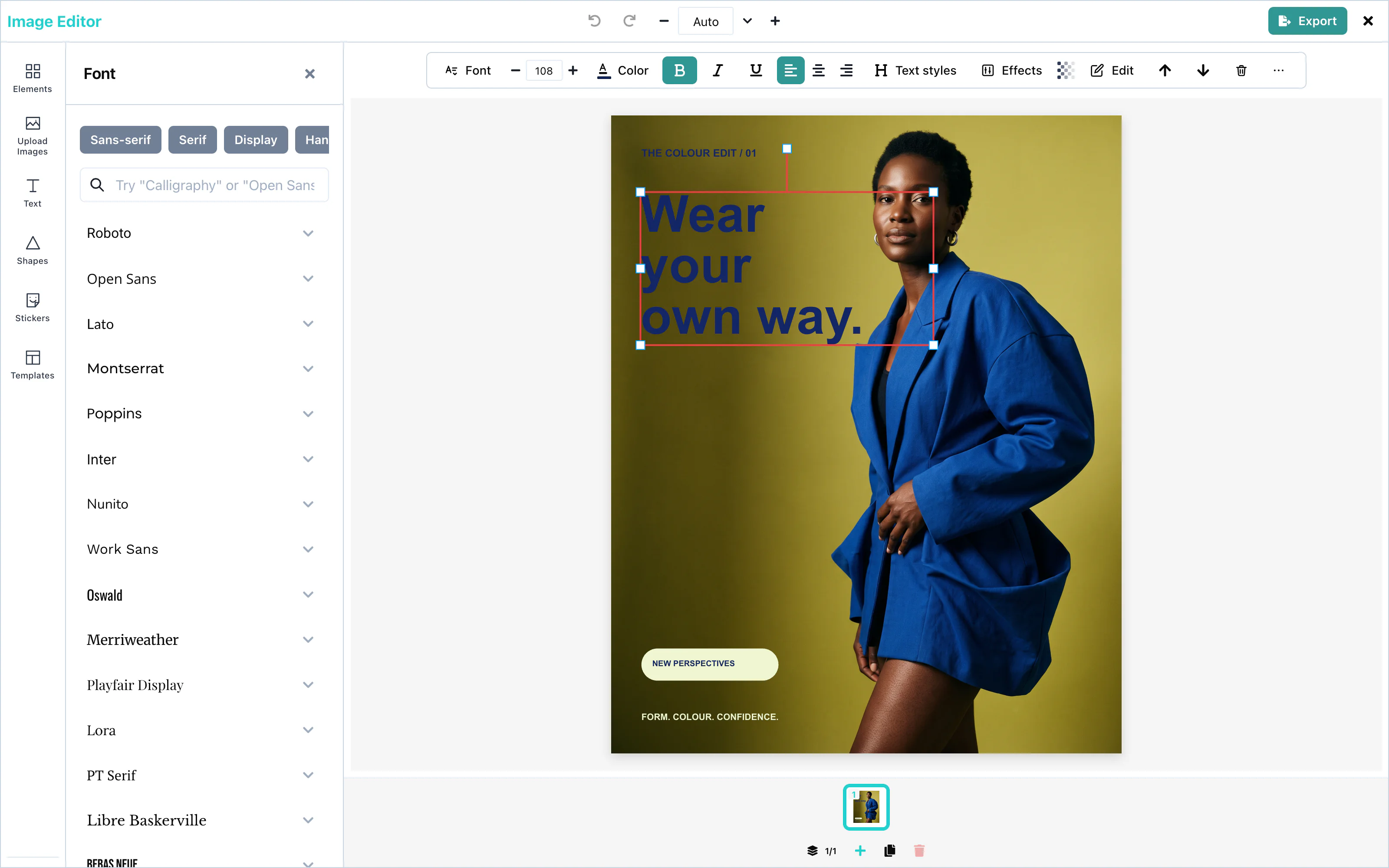
Select a text box and press the font button in the toolbar. The Font panel lists font families by category, with a search field. Open a family to choose a weight or italic.
 View full size
Without the whole catalog, the panel lists 25 popular families: Roboto, Open Sans, Lato, Montserrat, Poppins, Inter, Nunito, Work Sans, Oswald, Merriweather, Playfair Display, Lora, PT Serif, Libre Baskerville, Bebas Neue, Anton, Righteous, Alfa Slab One, Pacifico, Satisfy, Dancing Script, Caveat, Roboto Mono, Source Code Pro, and JetBrains Mono.
The panel can also list the whole Google Fonts catalog, about 1,500 families, which the user can search. You choose where that list comes from with googleFonts. It takes exactly one of three ways, and none of them puts a Google key in the page:
| Setting | Where the list comes from |
|---|---|
googleFonts={{ hosted: true }} | The Layermetry server, which uses its own Google key. The request carries your licenseKey, and goes to mediaApiUrl when you set one. |
googleFonts={{ endpointUrl: '/api/fonts' }} | Your own server, which holds your Google key. The editor sends GET with no headers. The address can be relative. |
googleFonts={{ requestFn }} | Your own function. The editor makes no request. |
Without googleFonts, the panel uses its built-in families. If you provide both licenseKey and mediaApiUrl, it requests the font list from your media server and falls back to built-in families if that request fails. A setting that names two ways, or none, prints one console line and uses the built-in families.
Your server or your function answers with the same JSON as the Google Fonts Developer API: an items list in which each entry has family, variants, and category. Other fields are ignored. Your function receives an AbortSignal, which fires when the panel closes before the answer arrives:
import { ImageEditor, type GoogleFontsCatalogue } from '@layermetry/media-editor/react';

async function loadFonts(signal: AbortSignal): Promise<GoogleFontsCatalogue> {
  // Your own route, which calls the Google Fonts Developer API with your key.
  const response = await fetch('/api/fonts', { signal });
  if (!response.ok) throw new Error(`The font list failed with status ${response.status}`);
  return response.json();
}

export default function App() {
  return (
    <div style={{ position: 'fixed', inset: 0 }}>
      <ImageEditor
        licenseKey="YOUR_LICENSE_KEY"
        onClose={() => console.log('The editor was closed')}
        googleFonts={{ requestFn: loadFonts }}
      />
    </div>
  );
}
The editor keeps a good answer for as long as the page is open, so opening the panel again makes no second request. The browser downloads each chosen font from Google Fonts, which needs no key.
googleFontsApiKey is deprecated. It still works, but it sends your Google key in a request from the browser, where anyone who opens the page can copy it. When you pass both, googleFonts wins and the key is not sent. On a page that is not on localhost, the editor prints one console warning about the key. If you keep the key, restrict it by HTTP referrer in Google Cloud Console.
Text styles
The toolbar’s Text styles control opens the Text panel at Brand styles; the separate Text Styles panel has been removed. With text selected, Styles includes size presets (H1 32 px, H2 28 px, H3 24 px, H4 20 px, H5 18 px, Normal 16 px) and case controls (ABC, abc, Abc).
Brand text styles
templateMetadata.textStyles appears in Brand styles below the AI control when a brand is active. With no text selected, choosing one adds text in that style; with text selected, it applies the style.
templateMetadata={{
  metadata: {},
  textStyles: {
    headline: {
      textStyleName: 'Brand headline',
      fontFamily: 'Montserrat',
      fontSize: 64,
      fontWeight: 700,
      lineHeight: 1.1,
      fontStyle: 'normal',
      textDecoration: 'none',
    },
  },
}}| Field | Type | Description |
|---|---|---|
textStyleName | string | The name in the panel. |
fontFamily | string | A font family. Your page must load a font that is not in Google Fonts. |
fontSize | number | The size in pixels. |
fontWeight | number | For example 400 or 700. |
lineHeight | number | The line height, as a multiple of the size. |
fontStyle | string | 'normal' or 'italic'. |
textDecoration | string | 'none' or 'underline'. |
With a brand kit, the same styles also appear in the Brand panel and in a Brand styles card at the top of the Text panel. A click styles the selected text, or adds new text in that style when nothing is selected. Pass the kit's styles in brands[].textStyles instead of textStyles. A kit with several brands shows the styles of the active brand only.
metadata is required in templateMetadata. It adds your own fields to saved templates. See Saving and loading.
Letter case
When text is selected, the Styles section offers ABC (uppercase), abc (lowercase), and Abc (capitalize). The words themselves are changed.
Rich text
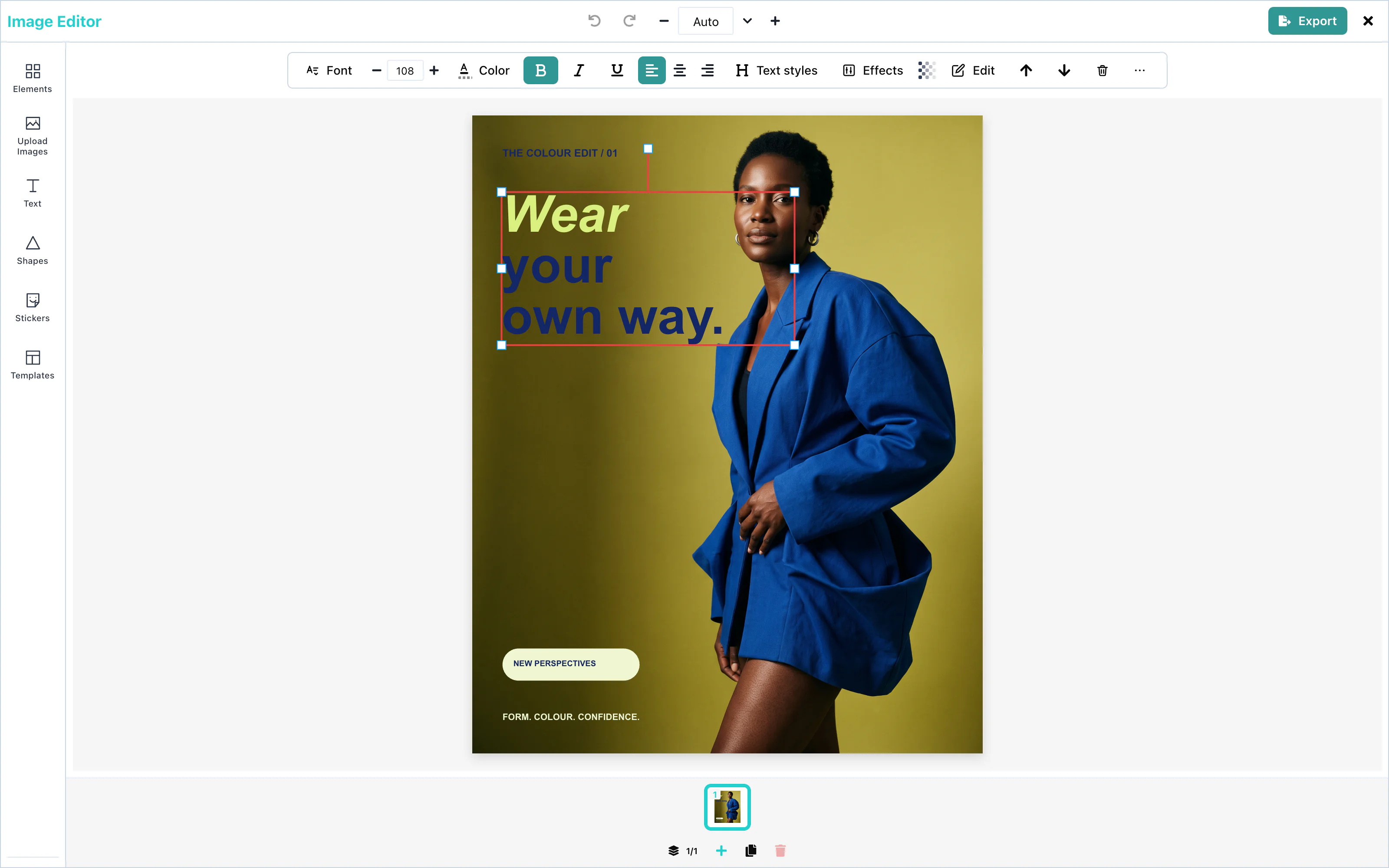
A single word or letter can have its own style. Double-click a text box, select part of the text, and press Bold, Italic, Underline, or the text color, or change the font size.
 View full size
When part of the text is selected, the tooltips of these buttons end in "selected text". The font, the alignment, and the text styles always apply to the whole text box. A new font size applies to whole lines, so that each line has one size.
When the whole selection already has a style, the button removes it. Otherwise, it adds the style to all of the selection.
Outline and shadow
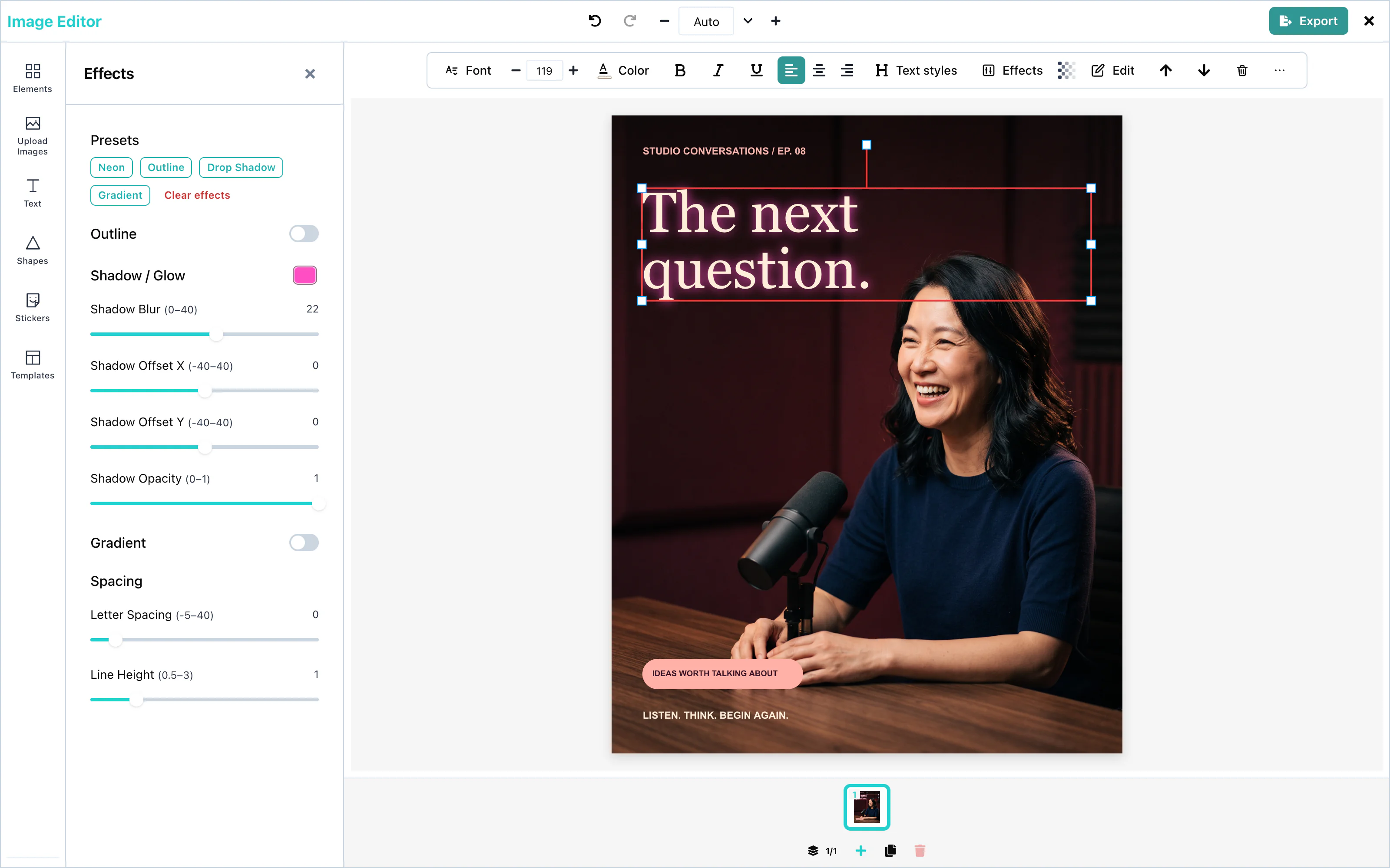
Select a text box and open the Effects panel. Outline draws a line around the letters. Shadow / Glow draws a soft color behind them.
| Control | Range | When switched on |
|---|---|---|
| Outline color | any color | black |
| Outline width | 0 to 10 | 3 |
| Shadow color | any color | none |
| Shadow Blur | 0 to 40 | 0 |
| Shadow Offset X, Shadow Offset Y | -40 to 40 | 0 |
| Shadow Opacity | 0 to 1 | 1 |
The presets at the top set several values at once:
| Preset | Result |
|---|---|
| Neon | A pink glow: color #ff4fc3, blur 22, no offset. |
| Outline | A black outline, width 3. |
| Drop Shadow | A black shadow, blur 4, 5 pixels right and down. |
| Gradient | A yellow-to-orange gradient. See Gradient text. |
| Clear effects | Removes outline, shadow, gradient, letter spacing, and line height. |
 View full size
The same panel sets Letter Spacing, from -5 to 40, and Line Height, from 0.5 to 3.
Gradient text
The Gradient switch in the Effects panel fills the letters with a color gradient, from the Start color at the top to the End color at the bottom. The default colors are #fbbf24 and #f97316.
The gradient is linear and runs from top to bottom, over the height of one line.
Text templates
The Styles section has four template previews and a See all view. The full view includes search and purpose categories (Title, Button, Call to action, Sale, Price, Lower third, Quote, Testimonial, Social handle, Announcement, Countdown and Caption), then style categories (Bold, Elegant, Script, Neon, Outline and More for Gradient, Shadow and Minimal). Brand styles appear first when a brand is active; saved AI-made templates appear first with an AI badge. There is no Label category.
A template is a group of text and simple shapes. With one text selected, it replaces that text, puts the selected words in its main line and keeps their size. With several texts selected, each becomes its own group. A style-locked text cannot be put in a template. With no text selected, the group is added. See Text templates.
AI text generation
The Text panel’s Generate with AI button opens one form. Choose Words or Text template; with text selected, those choices read Change the words and Put it in a template. The prompt remains when switching. Selecting a result previews it on the canvas and makes it the current choice. Generate more appends results; Try again replaces them. Add to canvas keeps the form open. See AI providers for the request and Text templates for the typed template format.
AI rewrite
The toolbar’s Rewrite with AI and the text right-click action open the Text panel’s AI form in rewrite mode. The same form can change the selected words or use them in a text template; + New starts a new text item. Selecting a result previews it. Closing with ✕, pressing Escape, or changing selection keeps the choice as one undoable edit.
Configuration
| Prop | Type | Default | Description |
|---|---|---|---|
textTemplates | AITextTemplatesSettings | none | Adds host categories and templates to Styles. Invalid entries are dropped with a console warning. See Text templates. |
googleFonts | { hosted: true }, { endpointUrl }, or { requestFn } | Built-in families | Where the Font panel gets the whole Google Fonts catalog. Without the catalog, 25 popular families are listed. |
googleFontsApiKey | string | none | Deprecated. Sends your Google key from the browser. Use googleFonts. |
templateMetadata.textStyles | object | none | Your brand text styles, shown in Brand styles when a brand is active. |
ai | object | none | The AI provider for text, text rewriting and text-template generation. |
ai.text, ai.textRewrite, ai.textTemplate | false or object | operation-dependent | Configure or disable each operation. Hosted text-template generation is off unless you explicitly set ai.textTemplate. |
typography | object | none | The fonts of the editor's own buttons and panels, not of the design. See Theming. |
Events
Text has no events of its own. The words are part of the design, and they reach you in the exported file through onExport. See Events.