

Shapes
Add, style, and generate vector shapes.
Shapes are vector elements: rectangles, circles, stars, arrows, lines, speech bubbles, and more. The user sets their fill color, outline color, and outline width. With an AI provider, the user can also describe a new shape.
Setup
Shapes work with no setup. AI shape generation needs an AI provider:
import { ImageEditor } from '@layermetry/media-editor/react';

export default function App() {
  return (
    <div style={{ position: 'fixed', inset: 0 }}>
      <ImageEditor
        licenseKey="YOUR_LICENSE_KEY"
        onClose={() => console.log('The editor was closed')}
        // AI shape generation: your AI proxy.
        ai={{ endpointUrl: 'https://api.example.com/ai' }}
      />
    </div>
  );
}
Shape library
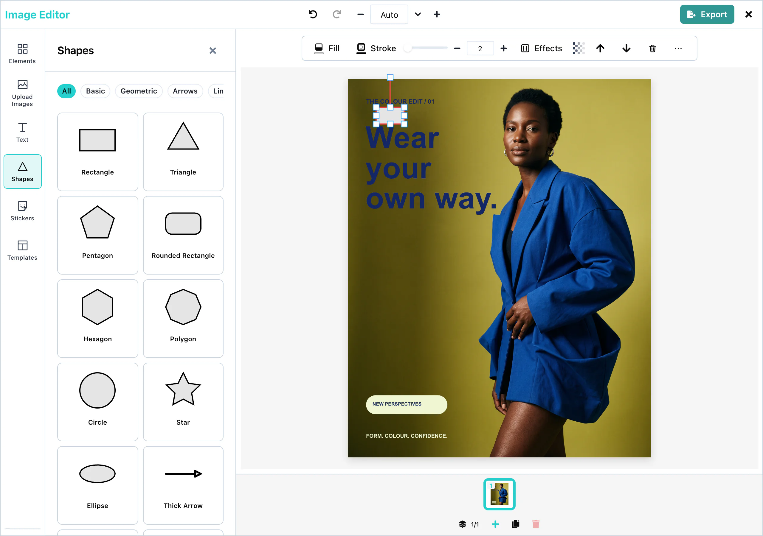
Open the Shapes panel in the tool rail, or press Add shape in the toolbar above the page. A click on a shape adds it to the page and selects it.
 View full size
The panel has 43 shapes, in six categories:
| Category | Shapes |
|---|---|
| Basic | Rectangle, Rounded Rectangle, Circle, Ellipse, Squircle, Pill |
| Geometric | Triangle, Pentagon, Hexagon, Polygon, Ring, Diamond, Parallelogram, Trapezoid, Right Triangle, Semicircle, Quarter Circle |
| Arrows | Thick Arrow, Arrow Up, Arrow Down, Arrow Left, Arrow Right, Double Arrow, Curved Arrow |
| Lines | Line, Divider, Dashed Line, Dotted Line, Arrow Line, Double Arrow Line |
| Organic | Soft Blob, Blob Two, Blob Three |
| Symbols | Star, Chevron, Cross, Heart, Star 4, Star 6, Badge, Speech Bubble, Callout, Octopus |
All shows every shape. A new shape is light gray (#E5E5E5) with a black outline.
Fill and stroke
Select a shape. The toolbar above the page shows:
| Control | What it changes |
|---|---|
| Fill color | The color inside the shape. |
| Stroke color | The color of the outline. |
| Stroke width | The width of the outline. The slider goes from 0 to 40. You can type any value, with decimals, such as 0.5. |
| Transparency | How see-through the shape is, from 0 to 100. |
The color pickers offer a color field, hex and RGB values, and a row of ready-made colors.
A stroke width of 0 removes the outline. Fill is a solid color. For effects such as a shadow or rounded corners, use the Effects panel. See Effects and filters.
Lines and arrows
The Lines category adds straight lines: a solid, dashed, or dotted line, a line with one arrowhead, or a line with two. A new line is 200 pixels long and horizontal.
Select a line to see a handle at each end. Drag a handle to change the length and the angle of the line. The color of a line is its stroke color, and its thickness is its stroke width.
The Arrows category adds filled arrow shapes, which resize like any other shape.
AI shape generation
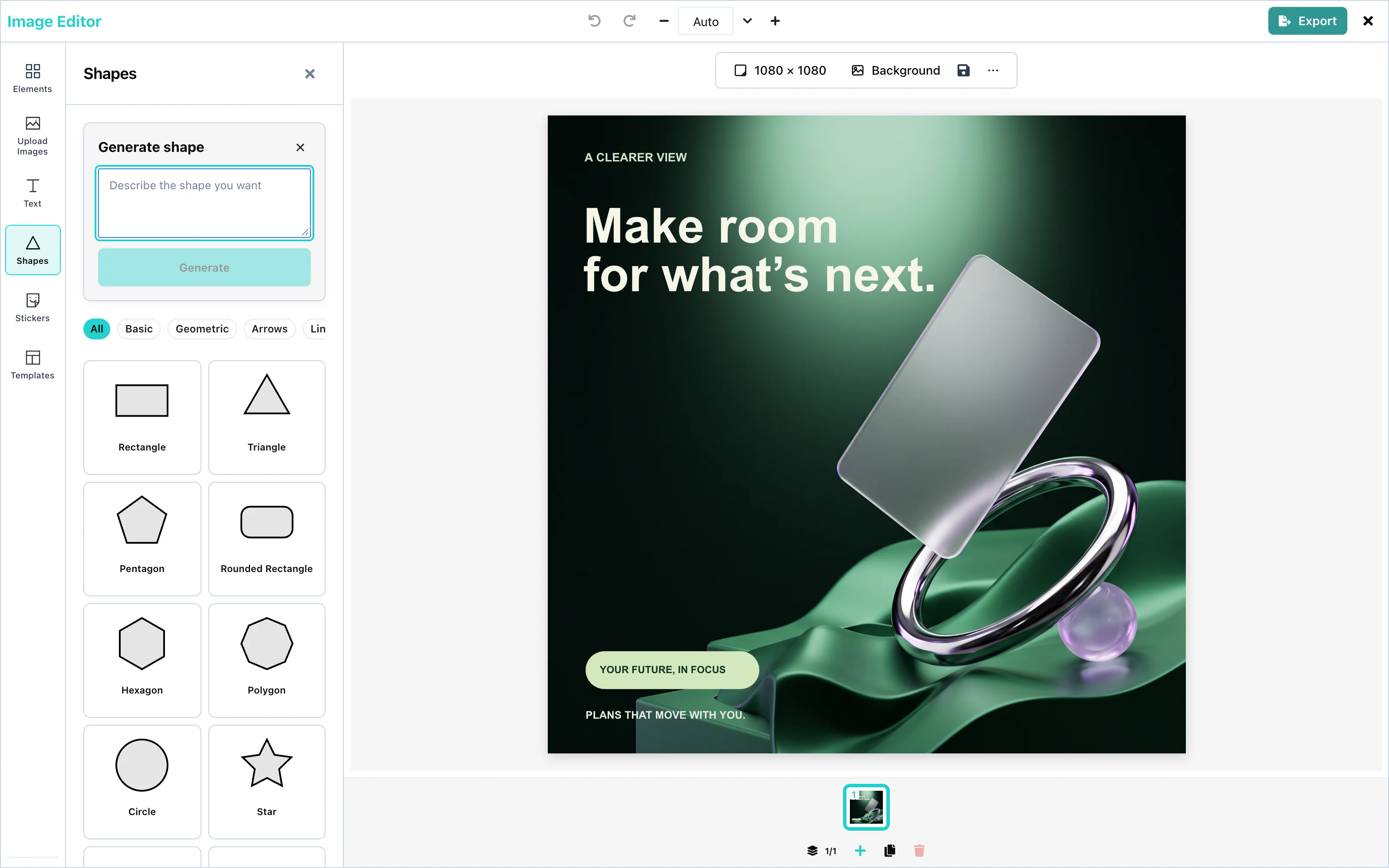
ai. See AI providers.With ai set, the Shapes panel shows Generate shape at the top. The user describes the shape, for example "a simple triangle", and presses Generate. The count line shows the number of returned outlines. Add to canvas adds the chosen shape to the page.
 View full size
A generated shape is a vector path. It has the same fill and stroke controls as the other shapes.
The request has "operation": "svgPath", and your AI server answers with { items: [{ pathData }] }, with SVG path data in each entry. See Custom AI endpoint.
Configuration
| Prop | Type | Default | Description |
|---|---|---|---|
ai | object | none | The AI provider for Generate shape. Without it, the button does not appear. |
ai.svgPath | false or object | on | false hides Generate shape. |
Events
Shapes have no events of their own. They are part of the design, and they reach you in the exported file through onExport. See Events.