

Effects and filters
Apply visual effects to images and text.
The Effects panel changes how a selected element looks. Pictures and shapes get filters and adjustments. Text gets outline, shadow, gradient, and spacing. Effects appear in the exported file exactly as on the page.
Setup
Effects work with no setup:
import { ImageEditor } from '@layermetry/media-editor/react';

export default function App() {
  return (
    <div style={{ position: 'fixed', inset: 0 }}>
      <ImageEditor
        licenseKey="YOUR_LICENSE_KEY"
        onExport={(file) => console.log(`Exported ${file.name}`)}
        onClose={() => console.log('The editor was closed')}
      />
    </div>
  );
}
Open the Effects panel in the tool rail, and select an element on the page. With nothing selected, the panel says "Select an image, shape, or text to apply effects".
Filter presets
On a phone, expand the Effects sheet for more room. While expanded, press Collapse beside Done, or tap the grip, to return to its default height.
Four filters change the colors of a picture or a shape. Each one is a switch under Base Effects, and they can be combined:
| Filter | Result |
|---|---|
| Grayscale | Shades of gray. |
| Sepia | Warm brown tones, like an old photo. |
| Invert | Every color becomes its opposite. |
| Emboss | A raised, stamped look. |
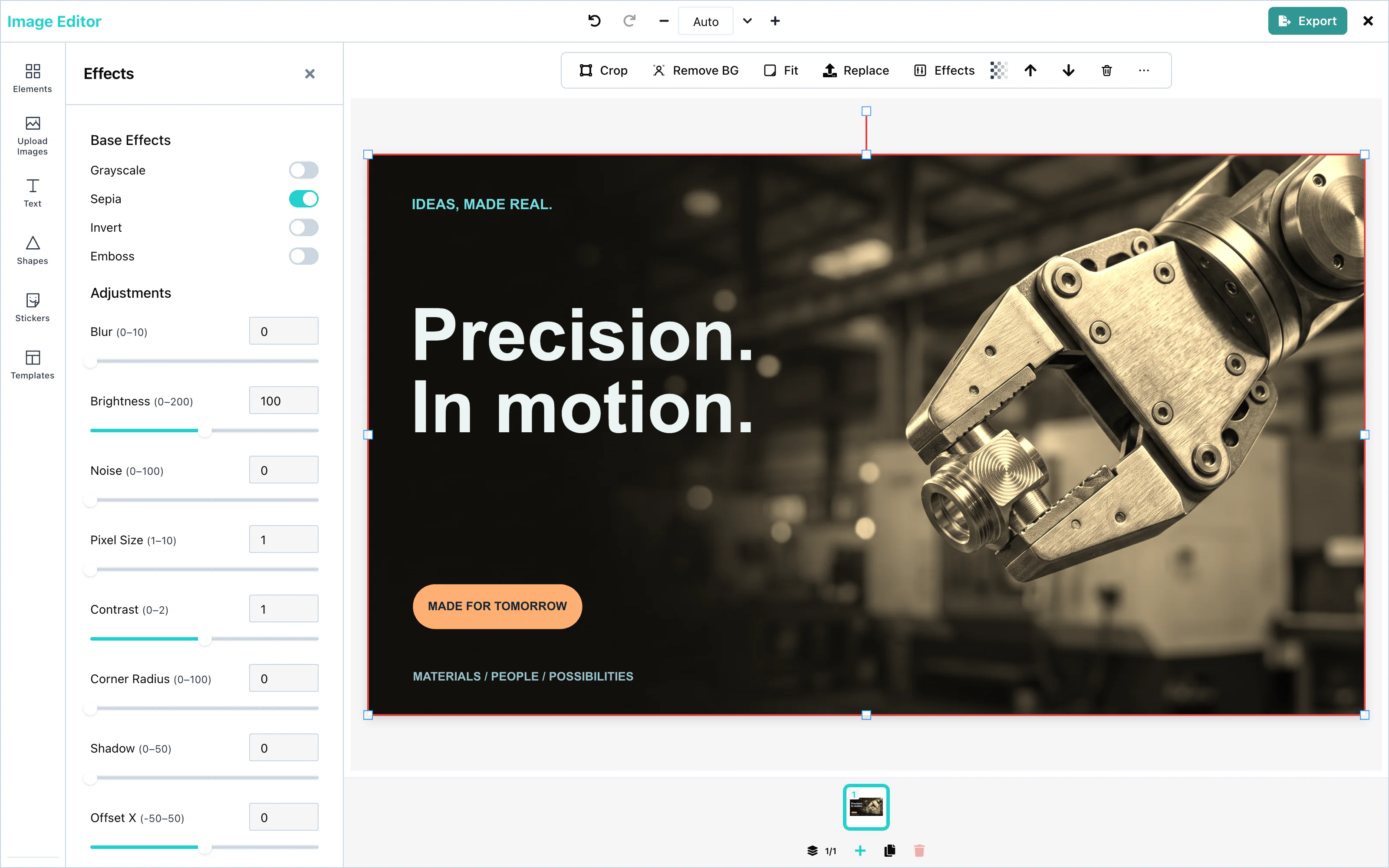 View full size
For text, the panel offers other presets. See Text effects.
Adjustments
Under Adjustments, each value has a slider and a number field. The change applies when the user releases the slider, or leaves the number field.
| Adjustment | Range | What it changes |
|---|---|---|
| Blur | 0 to 10 | Softens the picture. |
| Brightness | 0 to 200 | Makes the picture darker or lighter. 100 keeps it as it is. |
| Noise | 0 to 100 | Adds grain. |
| Pixel Size | 1 to 10 | Turns the picture into larger squares. |
| Contrast | 0 to 2 | Makes the difference between light and dark smaller or larger. 1 keeps it as it is. |
| Corner Radius | 0 to 100 | Rounds the corners. |
| Shadow | 0 to 50 | The softness of a shadow behind the element. |
| Offset X, Offset Y | -50 to 50 | Moves the picture inside its frame. |
| Shadow Offset X, Shadow Offset Y | -50 to 50 | Moves the shadow away from the element. |
A line or an arrow takes the filters, but not the shadow or the corner radius.
To make any element see-through, select it and use Transparency in the toolbar above the page, from 0 to 100.
Text effects
Select a text box, and the Effects panel shows text effects instead of filters:
| Control | What it does |
|---|---|
| Presets | Neon, Outline, Drop Shadow, and Gradient set several values at once. Clear effects removes them all. |
| Outline | A line around the letters, with a color and a width from 0 to 10. |
| Shadow / Glow | A color behind the letters, with blur, offset, and opacity. |
| Gradient | Letters filled with two colors, from top to bottom. |
| Spacing | Letter spacing from -5 to 40, and line height from 0.5 to 3. |
See Outline and shadow and Gradient text for every value.
Configuration
The Effects panel has no props. To hide the Effects tool, use ui={{ toolRail: { hidden: ['effects'] } }}. See UI customization.
Events
Effects have no events of their own. They are part of the design, and they reach you in the exported file through onExport. See Events.