

Rails
Integrate the video editor in a Rails view with Turbo.
ERB renders the editor's host element. A Stimulus controller mounts the editor in the browser and releases it when Turbo removes the view. The permanent custom-element alternative is described under Turbo navigation.
Installation
Install the package and serve its distribution files from public/sdk/:
npm install @layermetry/media-editor
mkdir -p public/sdk
cp -R node_modules/@layermetry/media-editor/dist/. public/sdk/
Copy the distribution again after each package update. Keep the browser assets beside the bundle at the same relative paths. No React installation or JavaScript bundler is required for this importmap setup.
Requirements
- Rails with Turbo. The example application uses Rails 8.1.3 with
turbo-railsandimportmap-rails2.2.3. - A license key. See License keys.
- A page served over HTTPS, or from
localhost. See Requirements.
Usage
Use the following files in an existing Rails application with Turbo and importmap-rails. The controller registration is explicit; replace the application entry shown here, or add the same registration to your existing Stimulus application once.
Rails.application.config.media_editor = {
  license_key: ENV.fetch("LAYERMETRY_LICENSE_KEY", "YOUR_LICENSE_KEY")
}
Set LAYERMETRY_LICENSE_KEY to a key valid for your origin. This license key reaches the browser. Keep provider secrets on the Rails server.
Rails.application.routes.draw do
  get "editor", to: "editors#show"
endclass EditorsController < ApplicationController
def show
end
endpin "application"
pin "@hotwired/turbo-rails", to: "turbo.min.js"
pin "@hotwired/stimulus", to: "stimulus.min.js"
pin_all_from "app/javascript/controllers", under: "controllers"import "@hotwired/turbo-rails";
import { Application } from "@hotwired/stimulus";
import MediaEditorController from "controllers/media_editor_controller";
const application = Application.start();
application.register("media-editor", MediaEditorController);<!DOCTYPE html>
<html lang="en">
<head>
<title>Media editor</title>
<meta name="viewport" content="width=device-width, initial-scale=1">
<%= csrf_meta_tags %>
<%= csp_meta_tag %>
<meta name="turbo-cache-control" content="no-preview">
<%= javascript_importmap_tags %>
</head>
<body><%= yield %></body>
</html>The shared browser helper adds the current CSRF token to your application's non-GET requests. It leaves cross-origin requests unchanged. railsAI sends captions as multipart and other AI requests as JSON, so a Rails endpoint can keep forgery protection enabled.
export async function csrfFetch(input, init = {}) {
  const url = new URL(input instanceof Request ? input.url : String(input), window.location.href);
  const method = (init.method ?? (input instanceof Request ? input.method : 'GET')).toUpperCase();
  const headers = new Headers(init.headers ?? (input instanceof Request ? input.headers : undefined));
  if (url.origin === window.location.origin && !['GET', 'HEAD', 'OPTIONS'].includes(method)) {
    const token = document.querySelector('meta[name="csrf-token"]')?.content;
    if (!token) throw new Error('Missing Rails CSRF token');
    headers.set('X-CSRF-Token', token);
  }
  return window.fetch(input, { ...init, headers });
}

export async function railsAI(url, request, signal, extraHeaders = {}) {
  let body;
  const headers = { ...extraHeaders };
  if (request.input.operation === 'captions') {
    const input = request.input;
    body = new FormData();
    body.append('audio', input.audio, input.audio.name ?? 'audio.wav');
    body.append('kind', 'captions');
    body.append('type', request.type);
    if (input.language !== undefined) body.append('language', input.language);
    if (input.format !== undefined) body.append('format', input.format);
    if (request.options !== undefined) body.append('options', JSON.stringify(request.options));
  } else {
    headers['Content-Type'] = 'application/json';
    body = JSON.stringify(request);
  }
  const response = await csrfFetch(url, { method: 'POST', headers, body, signal });
  if (!response.ok) throw new Error(`AI request failed: ${response.status}`);
  return response.json();
}
<section data-controller="media-editor"
  data-media-editor-license-key-value="<%= Rails.application.config.media_editor.fetch(:license_key) %>">
  <div data-editor-host style="position: fixed; inset: 0"></div>
</section>import { Controller } from "@hotwired/stimulus";
import { mountVideoEditor } from "/sdk/embed.modern.js";
export default class extends Controller {
static values = { licenseKey: String };
connect() {
if (this.editor) return;
this.events = new AbortController();
const box = this.element.querySelector('[data-editor-host]');
box.hidden = false;
this.editor = mountVideoEditor(box, {
licenseKey: this.licenseKeyValue,
onExport: (file) => console.log(`Exported ${file.name}: ${file.size} bytes, ${file.type}`),
onClose: () => { console.log('The editor was closed'); this.stop(); },
});
document.addEventListener('turbo:before-cache', () => this.stop(), { signal: this.events.signal });
}
stop() {
this.editor?.unmount();
this.editor = null;
this.element.querySelector('[data-editor-host]').hidden = true;
}
disconnect() {
this.events?.abort();
this.stop();
}
}For each complete example below, replace the view and media_editor_controller.js together. Keep the shared helper, layout, routes, importmap and application registration above. Restart Rails after changing initializer configuration. Start the server:
bin/rails server -p 3000Open http://localhost:3000/editor. Usage mounts an editor that fills the viewport; its export and close callbacks log in the browser console. Later Options excerpt blocks show only the settings being explained. Imports, callback helpers and lifecycle belong to their complete files.
The topic examples unmount before Turbo caches the page and when Stimulus disconnects the view. Their request and UI cleanup also runs at that point. Navigating away therefore discards unsaved editor state; use Saving and loading to persist it. These view-scoped mount examples are distinct from the layout-wide permanent custom-element alternative below.
Relative /api/... requests require matching Rails routes/actions or another reachable backend. Rails server startup does not create those endpoints. The complete files name HTTP methods, multipart fields, JSON wrappers and response shapes. Replace provider credentials and example.com URLs; supply the media and sticker fixtures named beside each file. JSON-backed actions must return JSON, not a Turbo Stream or redirect. Keep your existing authentication and authorization on stored assets and designs.
For a same-origin Rails AI route, use requestFn with railsAI so requests carry CSRF. A bare endpointUrl does not add the Rails token. Long-running job handles returned through requestFn need whole status/cancel addresses: HTTPS, or loopback HTTP for development on your own computer. The SDK polls and cancels those jobs directly; its cancellation POST does not call csrfFetch. Supply signed or otherwise authenticated job-service URLs rather than a session-protected Rails cancellation action that requires the page token. Cross-origin services and the assistant media API need their own documented authentication/CORS setup; the local CSRF helper does not authenticate them.
Launch from a button
Mount the editor after the user presses the button. onClose unmounts it; Stimulus disconnect and Turbo caching use the same cleanup.
<section data-controller="media-editor"
  data-media-editor-license-key-value="<%= Rails.application.config.media_editor.fetch(:license_key) %>">
  <button type="button" data-action="media-editor#open">Edit video</button>
  <div data-editor-host hidden style="position: fixed; inset: 0; z-index: 1000"></div>
</section>import { Controller } from "@hotwired/stimulus";
import { mountVideoEditor } from "/sdk/embed.modern.js";
export default class extends Controller {
static values = { licenseKey: String };
connect() {
this.events = new AbortController();
document.addEventListener('turbo:before-cache', () => this.close(), { signal: this.events.signal });
}
open() {
if (this.editor) return;
const box = this.element.querySelector('[data-editor-host]');
box.hidden = false;
this.editor = mountVideoEditor(box, {
licenseKey: this.licenseKeyValue,
onExport: (file) => console.log(`Exported ${file.name} (${file.type})`),
onClose: () => this.close(),
});
}
close() {
this.editor?.unmount();
this.editor = null;
this.element.querySelector('[data-editor-host]').hidden = true;
}
disconnect() {
this.events?.abort();
this.close();
}
}Expected result: Edit video opens the editor; Close removes it and the button opens it again. Use the shared setup and server command in Usage.
Configuration
Pass objects, functions, and files through the custom element's props property or the second argument of mountVideoEditor. The complete topic files below use the mount function inside a Stimulus controller.
update(patch) shallow-merges options. replace(options) replaces the mount handle's complete options; assigning element.props replaces the element's own options too. Options omitted from replacement return to their defaults, except attributes on a custom element remain its base configuration. element.update(patch) merges into its own options.
Attributes hold strings, numbers, booleans, or JSON values. Use lowercase hyphenated names such as license-key and dark-mode. Functions must be properties. The license key stays text; other values are parsed as JSON when possible. Explicit properties override attributes.
Layout and sizing
Set the host element's CSS width and height to size the editor. The editor fills that host.
Use CSS sizes such as width: 390px or height: 80vh. The complete example below switches between narrow and wide containers and adds a fullscreen button.
#editor { width: 390px; height: 80vh; max-width: 100%; }Container sizing
Give the host an explicit CSS height, such as height: 80vh or height: calc(100vh - 64px). The editor measures its container continuously and adjusts when that container changes size.
Compact layout
The editor uses the compact layout below 768 pixels and the regular layout from 768 pixels. The container determines the layout, including in a narrow desktop side panel.
The tool rail becomes a bottom dock, and tools open as sheets. A selected item shows a small action menu configured by itemActions. Without darkMode, compact mode uses the dark theme. See Theming and UI customization.
Fullscreen mode
The editor has no fullscreen button. Call requestFullscreen() on its container after a user click or key press. Exit fullscreen before removing that container. To fill the browser window without fullscreen, use position: fixed and inset: 0 on the parent.
Editing outside canvas
Selected or dragged items remain visible in the gray area outside the canvas, with their outside parts dimmed. Resize and rotation handles remain usable. Deselecting an item clips it at the canvas edge. The export contains only the canvas.
| Behavior | What the user sees |
|---|---|
| Canvas snapping | Matching item and canvas edges, or their centers, align within 6 screen pixels and show a guide. |
| Disable snapping | Hold Alt, or Option on a Mac, while dragging. |
| Drag return | With less than 8 screen pixels left inside on either axis, the item returns to its last visible position over 200 ms. |
| Reduced motion | The item returns immediately. |
| Outside at drag start | An item that never enters the canvas stays where it is released. |
| Edge markers | Select the nearest outside item; repeated presses cycle through items on that side. |
| Move into canvas | The selected outside non-background item moves inside with the smallest movement; oversized axes are centered. |
| Fit | Square canvas corners with at least 20 screen pixels of surrounding space. |
Snapping aligns with the canvas, not with other items. Move into canvas is in the right-click menu, respects position locks and takes one undo step. Markers do not appear in exported files.
See Canvas editing for the recovery steps.
Theming
Theming changes the editor's colors, control fonts, corners, and logo. Canvas content keeps its own styling.
Colors
theme sets colors by role name. Each name you give replaces one color. Every name you leave out keeps its default.
const options = {
    "theme": {
        primary: '#7C3AED',
        accent: '#7C3AED',
        brand: '#7C3AED',
        selected: '#7C3AED',
        focus: '#7C3AED',
        link: '#7C3AED',
    }
};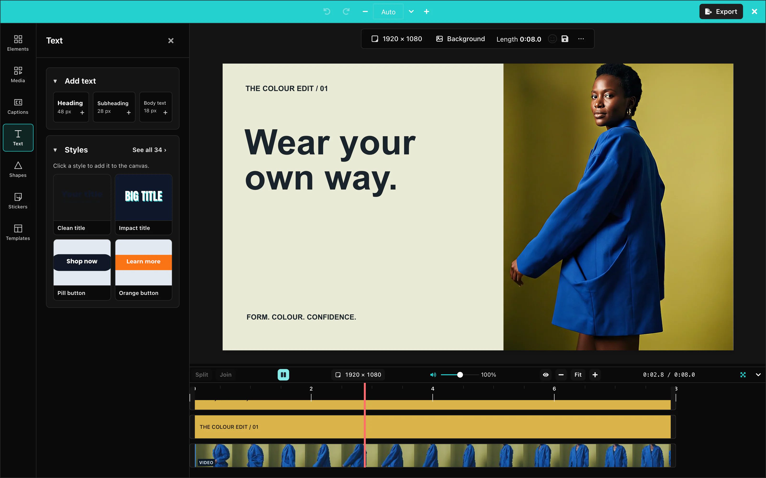 View full size
A value is any CSS color, such as #7C3AED, or a color name from the editor's palette, such as gray.200.
There are 35 role names:
| Group | Names |
|---|---|
| Brand and actions | primary, secondary, tertiary, accent, brand, link, focus, active, hover, selected, highlight, disabled |
| Status | success, info, warning, danger |
| Surfaces | background, surface, overlay, border, divider, shadow, muted |
| Text | textPrimary, textSecondary, textMuted, textOnPrimary, textOnSecondary, textInverse |
| Timeline clips | video, audio, image, shape, text, mediaSelected |
The role names above are accepted as keys of the theme object.
A few dark colors over the light palette give a mix: the names you did not set stay light. For a dark design, also pass darkMode: true, so that the dark palette is the base. Or set all 35 names.
Customization Studio
With showThemeCreator set to true, the palette button opens the Customization Studio. Choose colors, fonts, corners, icons and tool visibility there. Copy settings copies one JSON object. Download .json saves it as editor-settings.json.
The Settings tab starts from your supplied theme, logo, data icons and UI settings. It includes your edits. The file contains no license key or callbacks. React component icons are omitted because the file stores data only. Closing the Studio restores your supplied settings. Copy or download changes before closing it.
Logo edits appear immediately in the editor’s top bar while the Studio is open. Clearing the field removes the logo from the preview. Closing the Studio restores your supplied logo.
The Bar tab previews the real toolbar for each item type. Nothing selected previews the page bar. For a selected-item control, change its label, choose Default, Icon only, Words only or Both, move it up or down, or hide it. These settings are saved in ui.selection.
Tools marked (off by default) enter the rail order only when you enable them. Reordering the rail does not enable those tools. Reset restores the settings you supplied when the Studio opened.
Apply the settings file
Import the downloaded JSON and spread the whole settings object into the options from your existing host.
import settings from './editor-settings.json';

// In the Stimulus controller, update the existing mount handle.
this.editor.update(settings);
The video settings file can also contain enableThemeToggle. A custom theme has no light/dark pair, so it hides the switch and overrides darkMode while active.
icons accepts IconData: { svg: '<svg …></svg>' } or { url: '/icons/plus.svg' }. SVG text is limited to 8,192 UTF-8 bytes and cannot contain a script tag, JavaScript URL or event-handler attribute. Icon addresses use HTTPS, image data URLs, relative paths or HTTP on localhost, 127.0.0.1 or [::1]. A refused standard icon keeps the built-in icon with one warning. Custom actions accept icon data only; the standard icon map also accepts React components.
The JSON file contains icon data. It contains no React components. Your page loads the font files named by typography. See Editor settings for complete files and the settings table.
The Studio is a development tool. Its button is hidden by default. Set showThemeCreator to true in your development build only.
The four status names, success, info, warning, and danger, are never worked out from your brand colors. Set them yourself if you want to change them.
Default: the Layermetry teal palette.
Corners
radii sets the rounding of the editor's buttons, fields, panels, and badges. Each value is a CSS length.
const options = {
    "radii": { sm: '2px', md: '4px', lg: '8px', full: '9999px' }
};sm is for badges, md for buttons and fields, lg for panels, and full for round buttons. Default: the built-in rounding.
Fonts
typography sets the fonts of the editor's panels, menus, and buttons. It takes three CSS font-family values:
const options = {
    "typography": { heading: 'Georgia, serif', body: 'Georgia, serif', mono: 'Menlo, monospace' },
    "radii": { sm: '0', md: '0', lg: '0', full: '0' }
};The editor writes the names into its styles. Your page must load the font files, for example with a <link> to Google Fonts. A font that the page did not load falls back to the browser's default font.
Text on the canvas keeps its own fonts. See Text.
Default: the built-in font stacks.
Light and dark mode
darkMode: true selects the dark theme, and darkMode: false the light theme. enableThemeToggle: true adds a button to the app bar, so the user can switch.
const options = {
    "darkMode": true,
    "enableThemeToggle": true
};The editor remembers the user's choice for the next time. When you pass darkMode, your value wins when the editor starts. A theme object hides the switch.
Default: without darkMode, the editor is light in the regular layout and dark in the compact layout. The switch is hidden.
Logo
http://localhost, http://127.0.0.1 and http://[::1] are allowed for development on your own computer. Relative paths and storage keys must resolve to HTTPS outside local development. See Address security.logo shows your logo at the left end of the app bar. It takes the address of a picture.
const options = {
    "logo": "/logo.svg"
};The editor shows the logo at 32 by 32 pixels, or 24 by 24 pixels in the compact layout. Use a square picture.
Default: no logo.
UI customization
The ui prop hides, reorders, and renames parts of the editor. Every field is optional. Without ui, the editor shows everything in its default order.
Panels
ui.toolRail changes the tool rail on the left. order moves the tools you list to the top, hidden removes tools, and labels renames them:
const options = {
    "ui": {
        toolRail: {
            order: ['text', 'media'],
            hidden: ['stickers', 'templates'],
            labels: { subtitle: 'Subtitles' },
        },
    }
};Tools you do not list in order keep their default order, after the ones you list. The ids of the tool rail are:
| Id | Tool |
|---|---|
media | Media: upload and stock video, pictures, and audio |
subtitle | Captions |
text | Text |
shapes | Shapes |
stickers | Stickers |
effects | Effects. Off the rail by default. |
background | Background. Off the rail by default. |
templates | Templates |
audioEffects | Audio Effects. Off the rail by default. When you list it, it shows only while a clip with sound is selected. |
animations | Animations. Off the rail by default. When you list it, it shows only while an item is selected. |
The AI Assistant button stays at the bottom of the rail. To remove it, see AI features.
With createAutomatedContent, the rail and the compact dock also have Generate, with the id automated. Hide it with ui.features.automatedContent: false.
ui.dock does the same for the dock of the compact layout. Its ids are media, text, elements, templates, captions, effects, background, aiChat, and resize.
An unknown id prints a warning in the console and is skipped. The editor keeps working.
To hide the timeline, for example in an editor that only fills in a template, set ui.chrome.timeline to false:
const options = {
    "ui": { chrome: { timeline: false } }
};Default: every tool in the order of the table, except the four that are off the rail. See Tools that are off the rail by default.
Toolbar buttons
The palette button. showThemeCreator: true shows a button in the app bar that opens the Customization Studio, a tool for developers. Use it in your development build only. Default: hidden. Only the value true shows it.
The light and dark switch. enableThemeToggle: true adds it to the app bar. Default: hidden. See Theming.
The right-click menu. ui.generative.contextMenu hides, reorders, or renames its entries by id. false gives the browser's own menu back.
const options = {
    "showThemeCreator": false,
    "ui": { generative: { contextMenu: { hidden: ['delete'] } } }
};| Id | Entry |
|---|---|
bringForward, sendBackward, bringToFront, sendToBack | Change the layer order |
duplicate, copy, paste, delete, selectAll | Edit the selection |
editText | Edit the text of a text item |
crop, replace | Crop the item, or replace its picture or video |
split | Split a clip at the playhead |
generateCaptions | Create captions from the speech in a clip |
removeBackground, stabilize | Media server actions. See Video. |
The item menu in the compact layout. A selected item shows a small menu of its most important actions. itemActions changes it for each kind of item: replace sets the whole list, add appends actions, and remove drops them. false removes the menu.
const options = {
    "itemActions": { text: { replace: ['textColor', 'fontSize'] } }
};The kinds of item are video, image, gif, sticker, text, shape, label, and subtitle. The menu always keeps the full set of actions in the bar at the bottom of the screen.
| Kind | Default actions |
|---|---|
video, image | bringForward, sendBackward, crop, opacity |
gif, sticker | bringForward, sendBackward, opacity |
text | bringForward, sendBackward, textColor, fontSize, textAlign |
shape | bringForward, sendBackward, fill, stroke |
label | bringForward, sendBackward, editText, textColor |
subtitle | bringForward, sendBackward, subtitleStyle |
The menu shows four actions. More actions go behind a ⋯ button.
Recording
The voiceover recorder and the camera recorder are on by default. Each switch in ui.features removes one control:
const options = {
    "ui": { features: { 'recording.camera': false, 'recording.takes': false } }
};| Setting | What it does |
|---|---|
ui.features['recording.microphone']: false | Removes Record voiceover from Media > Audio, and Re-record part from a sound clip's bar on a phone. |
ui.features['recording.camera']: false | Removes Record with camera from Media > Video. |
ui.features['recording.countdownChoice']: false | Removes the Countdown choice. The recorder uses recording.countdownSeconds, or 3 seconds. |
ui.features['recording.inputLevel']: false | Removes Automatic level and the Level slider. The browser's automatic level is used. |
ui.features['recording.cleanUp']: false | Removes Clean up noise. The recorder uses recording.cleanUpNoise. |
ui.features['recording.takes']: false | The recorder keeps one take at a time. Record again replaces it. |
ui.features['recording.script']: false | Removes the Script section and the prompter. |
ui.features['recording.captions']: false | Removes Generate captions from the recorder. |
ui.features['recording.punchIn']: false | Removes Replace part of the selected clip from the recorder, and Re-record part from a sound clip's bar on a phone. |
See Microphone recording for the recorder, and recording for its defaults.
The image editor accepts the same switches and ignores them.
Two switches change the box for AI music and sound effects:
| Setting | What it does |
|---|---|
ui.features['aiSound.length']: false | Removes the Length row. Music then asks for the length of the video, or 30 seconds on an empty timeline. A sound effect lets the model decide. |
ui.features['aiSound.instrumental']: false | Removes the Instrumental switch. Music is then always made without singing. |
The image editor accepts these two switches too, and ignores them. It has no music.
AI features
Use HTTPS for endpointUrl. HTTP is allowed only on your own computer at the loopback addresses.
AI controls appear only when you pass ai. Inside ai, a capability set to false is hidden everywhere. ui then decides where the remaining controls appear:
const options = {
    "ai": { endpointUrl: 'https://api.example.com/ai', video: false },
    "ui": {
        features: { 'ai.chat': false },
        generative: {
            actions: { image: { label: 'Create a picture', surfaces: ['panel'] } },
        },
    }
};| Setting | What it does |
|---|---|
ui.features['ai.chat']: false | Removes the AI assistant. |
ui.features['ai.generate']: false | Removes every generate control. Same as ui.generative.enabled: false. |
ui.generative.actions.<capability>.enabled: false | Hides one capability. |
ui.generative.actions.<capability>.surfaces | The places where the control may appear. [] leaves it in the assistant only. |
ui.generative.actions.<capability>.label | Renames the control. |
ui.generative.actions.<capability>.presets | Replaces the suggestion buttons. [] removes them. |
The capabilities are text, textRewrite, image, imageEdit, svgPath, video, imageToVideo, captions, voice, music, and soundEffect. music and soundEffect appear in the panel and shortcut places only. The places are:
| Place | Where the control appears |
|---|---|
panel | At the top of a panel: Text, Media, Shapes, or Captions |
selection | On the selected item |
contextMenu | In the right-click menu of an item |
emptyCanvas | In the right-click menu of the empty canvas |
shortcut | Under Cmd+K on a Mac, or Ctrl+K |
ui can only take controls away. It never shows a control that your AI provider cannot serve.
Default: every AI control that your ai setting can serve, in its default places.
See AI providers for ai.
Built-in control lists
On a desktop, one bar above the canvas shows the controls of the selected item, for every type of item and for several items together. The floating pill and the phone's selection bar use the same settings. A button shows its current value, for example opacity or font size. When the bar is too narrow, the controls at the end of the default list move into a More menu. Colour, volume, effects and the other value controls open in a panel on the left side. With nothing selected, the bar becomes a page bar with the canvas size, Background, the length of the video, the emoji button, the Save template button when the editor can save templates, and a More menu with the lines of the empty-canvas right-click menu.
ui.selection changes the controls of the selected item. The editor has a default list of controls for each type of item. That list is only the starting view. ui.selection is applied after it, so your choice wins. Merge this section into the existing host's ui option.
/** @type {import('@layermetry/media-editor').UiConfig} */
const uiControls = {
  selection: {
    order: ['trim', 'mute'],           // these come first
    hidden: ['delete'],                // no Delete button
    labels: { replace: 'Swap file' },  // a new name
    display: { effects: 'icon' },      // a picture only
  },
};
Listed ids come first, in your order, even a control that would wait behind More. The other controls keep their default order. Hidden buttons leave shortcuts and editing actions available. labels renames a control, and the new name is also its tooltip and accessible name. display: 'icon' draws a picture only and keeps the label as the tooltip and accessible name. The desktop bar draws Bold, Italic, Underline, Bring forward, Send backward, Delete and Mute as a picture only by default. Set display to 'label' or 'both' to bring the words back. The right-click menu keeps words. Unknown ids are ignored with one warning.
The new ids are trim and mute (video and sound clips), replace, copyStyle and pasteStyle. group and ungroup also work for several selected items.
ui.toolbar is still accepted. The bar has no groups now, so the editor translates each group id into the controls that the group held. The group text held font, textAlign, rewriteWithAi and effects. A labels setting for a group has no heading to change, and the order, labels and display of actions (your own buttons) are not applied. The editor prints one console warning that starts with [MediaEditor] ui.toolbar:. Use ui.selection instead.
See Default lists for the real default list of every type of item, and Control ids for the typed id unions.
Tools that are off the rail by default
Effects, Animations, Audio effects and Background are not on the left rail by default. Reach them from the bar above the canvas: Effects, Animations and Audio effects from the bar of the selected item, and Background from the page bar. To put a tool back on the rail, list its id in ui.toolRail.order. A host that already lists every tool sees no change. The phone's dock is not changed by this.
/** @type {import('@layermetry/media-editor').UiConfig} */
const uiRail = {
  toolRail: { order: ['text', 'media', 'effects', 'background'] },
};
Color controls
Color controls show the current color, your brand colors and 16 default colors. Use the same control for text and label colors, shape fill and stroke, text outline and shadow, caption colors. Open Custom color for the color square, hue strip and HEX, R, G and B fields. The control stays inside the panel or phone sheet.
| Palette row | Colors |
|---|---|
| Primary | #FFFFFF, #000000, #FF0000, #FFFF00, #00FF00, #00FFFF, #0000FF, #FF00FF |
| Drawing | #A3A3A3, #FF6B6B, #FFC53D, #3DDC84, #26D0CE, #4D96FF, #B197FC, #F783AC |
A steady 3 px line under a toolbar color icon shows its stored color. Mixed colors show a gray dashed line. Your icon, label and display settings still apply. Dragging an item color previews it live. Releasing it saves one change, so one Undo restores the previous color. Escape cancels an unfinished item preview. Selected words in an open text box receive colors through the text editor.
The video color controls save opaque hex colors.
Generate from the bar
With nothing selected, open More and choose Generate text… or Generate image here…. These open the Text panel or the Photo tab of Media, with its Generate form already open. With an item selected, Rewrite with AI, Edit with AI and Make video open the form in the left panel. For Rewrite with AI and Edit with AI, the selected suggestion previews on the existing item; closing the box keeps it. New-item operations add a separate item through their add action.
For an existing-item edit, closing with ✕ or Escape keeps the selected card. Selecting another item or opening another panel also ends the edit and keeps that choice as one Undo step. Choose Original first to keep the current item unchanged. A new result needs Add to canvas, Add to timeline or Set as background. Only one panel is open at a time.
When the required panel is unavailable or hidden by ui.panels, ui.toolRail or ui.dock, the form opens under the bar. Panel placement also respects ui.generative. The floating pill, Cmd+K and the panels’ own Generate buttons keep their existing behavior.
Copy style and paste style
Copy style takes the look of one item. Paste style gives that look to one or more other items. Both are in the More menu of the bar above the canvas, in the right-click menu, and on the keyboard: Cmd + Option + C and Cmd + Option + V on a Mac, Ctrl + Alt + C and Ctrl + Alt + V on Windows and Linux. The editor matches the physical key, AltGr on Windows still types its character, and holding the keys pastes once. The ids are copyStyle and pasteStyle, so ui.selection can hide, move or rename them.
Copy style needs exactly one selected item that has a style. Text copies its font, size, weight, italic, underline, color, alignment, letter spacing, line height, outline and shadow. A shape copies its fill, outline color and outline width. A picture, video clip, GIF or sticker copies the filters and adjustments of the Effects panel, and its mask. Every item that has transparency copies the transparency. Not copied yet: the colored plate behind a text and its color gradient, the corner rounding of a shape, and the outline of a picture. A plain source clears italic, underline, shadow, filters and the mask instead of keeping the target’s old style. A paste is one Undo step. A part of the style that does not fit an item is skipped, and locked items are skipped. The editor then shows one short message that says what was left out. If every selected item is locked, the message is "The selected items are locked." If cropping alone is locked, the message is "The mask was left as it was, because cropping is locked."
Custom actions
customActions adds your own buttons after the built-in controls. Define this complete configuration module, then import customActions and onCustomAction into the host from the UI customization example above.
/** @type {import('@layermetry/media-editor').CustomAction[]} */
export const customActions = [{
  id: 'inspect-selection',
  label: 'Inspect selection',
  placements: ['selection', 'contextMenu'],
  when: { selection: 'any' },
  run(ctx) {
    console.log('Selected items', ctx.items);
    ctx.notify(`${ctx.items.length} item(s) selected.`, 'info');
  },
}];

/** @param {import('@layermetry/media-editor').CustomActionEvent} event */
export function onCustomAction(event) {
  console.log(event.actionId, event.status);
}
Options excerpt: keep the existing host's license key, required callbacks and lifecycle.
this.editor.update({ customActions, onCustomAction });Select at least one item to see Inspect selection. Video custom actions can edit through ctx.verbs. Pass explicit target ids and scopeReason: 'explicit'. Editor edits made by one action use one Undo step by default. The list accepts at most 24 actions. Only one custom action runs at a time. A viewer sees none. The customaction DOM event carries the same status payload as the callback. Pass the action list as a property, not an attribute. See Custom actions for the fields, overflow counts and cancellation rules.
Saving and loading
Your application stores designs as template records. Pass save and load callbacks to store a record and return it when the user opens a design.
Saving designs
Pass onSaveTemplate. The editor calls it with the template record when the user saves, and waits for the Promise it returns:
const options = {
    "onSaveTemplate": saveTemplate,
    "onGetTemplates": getTemplates
};With onSaveTemplate, a save button appears in the toolbar above the canvas, and Save current design appears in the Templates panel. Without it, the editor shows no save button, and the console says which prop is missing.
How your Promise settles decides what the user sees:
Your Promise | What the user sees |
|---|---|
| Resolves | "Template saved". |
| Rejects | "Template wasn't saved", and the save button changes to a retry button. The design stays as it was. |
| Does not settle within 30 seconds | The same as a rejection, so the user can try again. |
The value that your Promise resolves with is ignored.
To attach your own fields to every save, pass templateMetadata. The editor adds the fields of templateMetadata.metadata next to template:
const options = {
    "templateMetadata": { metadata: { workspaceId: 'ws-42', folder: 'spring-campaign' } },
    "onSaveTemplate": async ({ template, ...metadata }) => {
        const response = await fetch('/api/templates', {
            method: 'POST', headers: { 'Content-Type': 'application/json' },
            body: JSON.stringify({ template, ...metadata }),
        });
        if (!response.ok)
            throw new Error(`Saving failed: ${response.status}`);
    }
};The element also sends a DOM event named templatesave after each attempt, with detail: { template, saved }. Use it to observe saves. It cannot answer the editor.
Default: no onSaveTemplate, so the editor has no save button.
Loading designs
To open a design, pass the record as defaultTemplate. Load the record before you render the editor:
const options = {
    "defaultTemplate": template
};To let the user choose from your saved designs, pass onGetTemplates as in Saving designs. The Templates panel calls it and shows the records. A click on a design opens it.
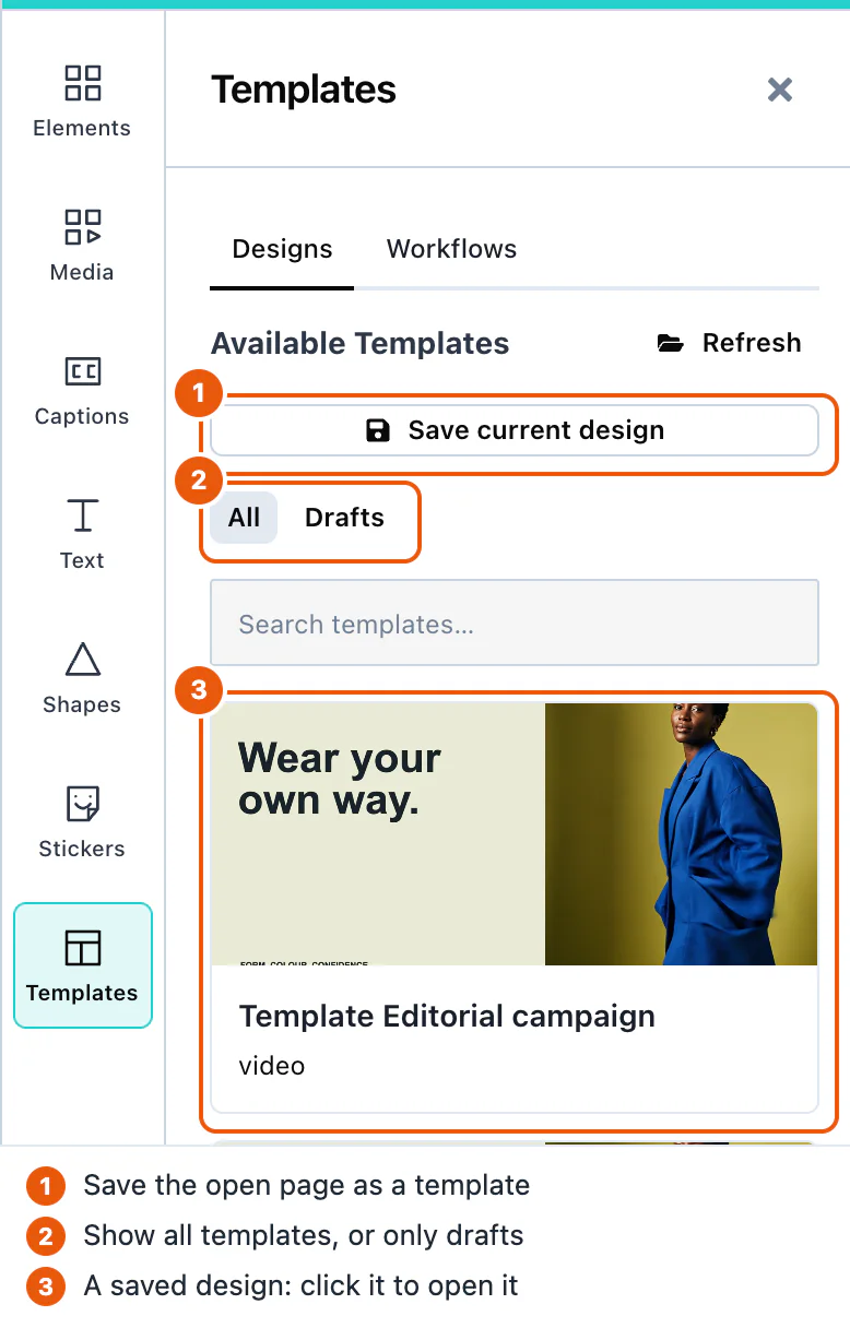
The panel shows only records with sceneMode set to "video" and a schemaVersion that this version of the editor can read. You can keep video and image designs in one list.
A template can come from a canvas of a different size. templateCanvasPolicy decides what happens then:
| Value | What happens |
|---|---|
'adopt' | The canvas takes the size of the template. This is the default. |
'fit' | The canvas keeps its size, and the design is scaled to fit inside it. |
'place' | The items keep their positions and sizes. Use it only when the sizes match. |
Default: no defaultTemplate, so the editor opens with an empty canvas. templateCanvasPolicy is 'adopt'.
A design that carries voiceoverScript puts its script back in the voiceover recorder. A design without one leaves the current script as it is. See Script and prompter.
Drafts
A draft is a design that the user has not finished. Save draft in the Export panel, or Cmd+S (Ctrl+S), sends it through the same onSaveTemplate, with draft: true on the record.
Saving a draft again updates the same record. The first draft save of a design makes a new template.id, and every later draft save of that design sends the same id, from the button, the keyboard, or automatic saving. Opening a draft from the Templates panel continues that draft under its own id. Opening another template, the defaultTemplate, or a new blank design starts a new record. A finished template save gets a new id every time. Store drafts by template.id, and replace a record that has the same id.
A draft record can carry two more fields:
chatSessionId: the conversation with the AI assistant that belongs to the design.generated: what AI models made during the session, including the words the user typed. Remove this field before you share a draft with other people.
The Templates panel shows drafts under Drafts.
To save drafts while the user works, turn on autosave:
const options = {
    "ui": { drafts: { autosave: true } },
    "onSaveTemplate": saveTemplate,
    "onGetTemplates": getTemplates
};Autosave starts only after the user has pressed Save draft once. After each change, it waits 30 seconds, and every further change restarts the wait.
Default: autosave is off. Every autosave is a request to your backend.
Server-side handling
Store each record exactly as you received it, and return it unchanged. The editor may add fields in later versions, and it reads them back.
This Node.js server stores each record as a file, and returns them all:
import { createServer } from 'node:http';
import { mkdir, readdir, readFile, writeFile } from 'node:fs/promises';

const FOLDER = './templates';
await mkdir(FOLDER, { recursive: true });

async function readBody(request) {
  const chunks = [];
  for await (const chunk of request) chunks.push(chunk);
  return JSON.parse(Buffer.concat(chunks).toString('utf8'));
}

createServer(async (request, response) => {
  if (request.url !== '/api/templates') {
    response.writeHead(404).end();
    return;
  }
  if (request.method === 'POST') {
    const payload = await readBody(request);
    const template = payload.template ? { ...payload, ...payload.template } : payload;
    if (payload.template) delete template.template;
    if (!/^[\w-]+$/.test(String(template.id))) {
      response.writeHead(400).end();
      return;
    }
    // Store the record exactly as the editor sent it, including fields you do not use.
    await writeFile(`${FOLDER}/${template.id}.json`, JSON.stringify(template));
    response.writeHead(201).end();
    return;
  }
  const files = await readdir(FOLDER);
  const templates = await Promise.all(
    files.map(async (file) => JSON.parse(await readFile(`${FOLDER}/${file}`, 'utf8'))),
  );
  response.writeHead(200, { 'Content-Type': 'application/json' });
  response.end(JSON.stringify(templates));
}).listen(3001);
Your page reaches it at /api/templates, for example through the proxy of your development server.
The record has these fields:
| Field | Type | Description |
|---|---|---|
id | string | A unique id that the editor creates for each save. |
scene | string | The design, as JSON text. |
thumbUri | string | A preview picture: a data: URL, or your own address when you pass onUploadAsset. |
sceneMode | string | "video" for the video editor. |
global | boolean | Reserved. Store it and return it. |
schemaVersion | number | The version of the scene format. |
canvasWidth, canvasHeight | number | The size of the canvas the design was made on, in pixels. |
draft | boolean | true on a draft. |
chatSessionId | string | On a draft: its conversation. |
generated | array | On a draft: what AI models made. |
voiceoverScript | string | The script of the voiceover recorder, when the design has one. Store it and return it. |
Pictures from the user's computer are stored inside scene as data, which makes records large. Videos and sound files from the user's computer need onUploadAsset, or the save fails. See Asset storage.
Item locking
@layermetry/media-editor. It needs version 1.0.0 or later; versions before 1.0.0 do not have the props, fields and actions in this section.A lock stops some kinds of change to one item. For example, a person can change the words of a headline but cannot move the logo. The person who made the design sets the locks. Your application tells the editor who is editing, and the editor obeys the locks for that person.
Lock roles
The role prop says who is editing. You choose it for each person. The editor never decides it.
role | Who it is for | What this person may do |
|---|---|---|
'creator' | The person who made the design. | Ignores every lock. May lock and unlock items, and may set the design's default locks. |
'adopter' | A person who reuses the design. | Obeys every lock. May unlock only when you pass allowUnlock, and only when your onUnlock agrees. |
'viewer' | A person who only looks. | May select items, play the video and export it. Changes nothing. The editor hides the editing tools, the Save template button and Save draft, and leaves Cmd+S (Ctrl+S) to the browser. |
When you pass no role, the role is 'adopter'. A value that is not one of the three names is also read as 'adopter'.
This is a change from earlier releases. Before item locking, a missing role changed nothing. Now a missing role means 'adopter'. The editor then obeys the locks in the design, and nobody can lock or unlock. This affects you only when your designs already carry isLocked: true or locks on an item, or defaultLocks on the record. No earlier release of the editor wrote a lock, so a design has one only if your own code or server put it there. A design without locks behaves as before. Pass role: 'creator' in the options, or editor-role="creator" on the custom element, for each person who should ignore locks.
Lock props
Pass the four lock props to the editor. This example opens the editor for an adopter. It lets that person ask to unlock, records each unlock in your audit log, and locks the position of every item that has no lock of its own:
mountVideoEditor(box, {
  role: 'adopter',
  allowUnlock: true,
  onUnlock: handleUnlock,
  defaultLocks: { move: true },
});| Prop | Attribute | Type | Default | What it does |
|---|---|---|---|---|
role | editor-role | 'creator' | 'adopter' | 'viewer' | 'adopter' | Who is editing. See Lock roles. |
allowUnlock | allow-unlock | boolean | false | Lets an adopter ask to unlock. A creator may always unlock. A viewer never may. |
onUnlock | none: set it in props | (event) => answer, or a Promise of an answer | none | Called before every unlock, a creator's too. See Unlocking items. |
defaultLocks | default-locks, as JSON text | object, for example { move: true } | the design's own default locks | Replaces the design's own default locks for this session. A save never writes it. |
In markup, the role attribute is editor-role, not role. On every HTML element, role describes the element to screen readers, so the editor leaves role to the browser and never reads it. allow-unlock with no value means true. default-locks takes JSON text. onUnlock is a function, so it goes in props, like onSaveTemplate.
The element reads its attributes when it starts, and again each time you set props. When props and an attribute set the same prop, props wins. In props, the role is named role. To change the role while the editor is open, call update on the element, for example editor.update({ role: 'viewer' }). Changing an attribute alone does not reach an editor that is already open. The editor uses a new value of props at once.
TypeScript names the types EditorRole, LockScopes, UnlockHandler, UnlockEvent and UnlockAnswer. The package also exports LockScope, UnlockRecord and LockManifest. They come from @layermetry/media-editor, @layermetry/media-editor/embed and @layermetry/media-editor/react.
Lock scopes
Each kind of change that a lock can stop has a name, called a scope. A lock is a list of scopes.
| Scope | Switch in the lock panel | When it is locked, the item cannot… |
|---|---|---|
content | Words and picture | have the words or media changed. |
style | Look | have the look changed. |
move | Position | be moved. |
resize | Size | be resized. |
rotate | Rotation | be turned. |
crop | Crop and mask | be cropped or masked. |
timing | Timing | have the timing changed. |
animate | Animation | have the animation changed. |
audio | Sound | have the sound changed. |
delete | Deleting | be deleted. |
select | Selecting | be selected. |
duplicate | Copying | be copied. |
arrange | Layer order and groups | be moved to another layer, group or track. |
add | Adding new items | This scope is for the whole design: no new item can be added. |
add is a lock on the whole design, not on one item. The editor reads it only from the design's default locks. The item lock panel does not show it. The Default locks… panel does.
Lock fields
The locks are stored in the design, so every save carries them:
| Field | Where it is | What it means |
|---|---|---|
locks | On an item, inside scene. | The locked scopes of this item, for example { "move": true, "delete": true }. Only the value true locks a scope. A scope that is missing is not locked. |
isLocked | On an item, inside scene. | The older field. true means that every scope is locked. It still works. |
unlocks | On an item, inside scene. | One record for each unlock that an adopter made. See Unlocking items. |
defaultLocks | On the record, next to scene. | The design's default locks, for example { "move": true, "add": true }. They lock every item that has no lock of its own. |
The editor decides the locked scopes of one item in this order:
- When
isLockedistrue, every scope is locked. - Otherwise, when the item has a
locksobject, the scopes in it are locked. An empty object,{}, locks nothing, and the default locks do not apply to that item. - Otherwise, the design's default locks apply.
Only the lock menus and the lock actions change these fields. Any other change that writes locks, isLocked or unlocks is refused.
Unlocking items
An unlock removes scopes from the lock of one or more items. A creator may always unlock. An adopter may unlock only when you pass allowUnlock. A viewer never may. Every unlock follows these steps:
- The editor checks the role and
allowUnlock. When they do not allow the unlock, it is refused, and youronUnlockis not called. - The editor calls your
onUnlockand waits for its answer. It does this before every unlock, a creator's too. - When you allow the unlock, the editor removes the scopes. For an adopter, it also adds an unlock record to each item that lost a scope. An item that had none of the asked scopes locked stays as it is and gets no record. A creator's unlock adds no record, because a creator's change is the design itself.
- Without
onUnlock, the editor unlocks the items when step 1 allows it, and still adds the adopter's record.
Your onUnlock receives one event:
| Field | Type | What it holds |
|---|---|---|
itemIds | string[] | The items to unlock. |
scopes | string[] | The scopes to unlock. |
role | string | The role of the person who unlocks. |
origin | 'user' or 'host' | 'user' when a person in a mounted editor unlocks, from a menu or through your code's Editor API call. 'host' when your own code drives an editor with no person at it. |
Your answer decides what happens:
| Your answer | Result |
|---|---|
false | The unlock is refused. Nothing changes. |
{ allowed: false } | The unlock is refused. Nothing changes. |
A rejected Promise, or an error thrown | The unlock is refused. Nothing changes. |
true, nothing, or { allowed: true } | The editor unlocks the items. |
{ ref: 'audit-1' } | The editor unlocks the items and stores 'audit-1' in the unlock record. |
Use ref for the id of the entry in your own audit log. The editor keeps a ref only when it is text that is not empty.
An unlock record looks like this:
{ "scopes": ["style"], "at": "2026-10-05T09:30:00.000Z", "role": "adopter", "ref": "audit-1" }scopes lists the scopes that the unlock removed. at is the time, as a date and time text such as 2026-10-05T09:30:00.000Z. role is the role of the person. ref is present only when your onUnlock gave one.
Saving locks
Each save gives onSaveTemplate two lock fields, next to scene:
| Field | When it is present | What it holds |
|---|---|---|
defaultLocks | Only when the design has default locks. | The design's own default locks. It is never the value of your defaultLocks prop. |
lockManifest | On every save, also for a design without locks. | A summary of the locks for your server, so that your server does not need to read scene. |
A lockManifest looks like this:
{
  "version": 1,
  "defaultLocks": { "move": true },
  "items": {
    "logo-1": { "locks": ["move", "resize", "delete"] },
    "photo-1": { "locks": ["move"] },
    "headline-1": {
      "locks": [],
      "unlocks": [{ "scopes": ["style"], "at": "2026-10-05T09:30:00.000Z", "role": "adopter", "ref": "audit-1" }]
    }
  }
}
items lists only the items that have a locked scope or an unlock record. Each item's locks is the list of scopes that are locked for it, with the design's own default locks applied, never your defaultLocks prop. In this example, photo-1 has no lock of its own, so it shows the default lock move. headline-1 has no locked scope left, but it is listed because of its unlock record. add never appears in an item's list.
When the editor opens a design, it reads defaultLocks back from the record. It does not read lockManifest. The locks inside scene are the ones that count.
Store template.defaultLocks next to scene. You should also store template.lockManifest. The default locks are not inside the scene text. A server that keeps only scene, or drops fields it does not know, loses them. The design then opens with no default locks, and every item without a lock of its own can be changed. The server in Server-side handling stores the whole record, so it keeps both fields.
Checking locks on your server
The editor runs in the person's browser. A person who controls the browser can change a record before it reaches your server. The lock is protection against mistakes, not security.
Your server can still find a lock that was removed without permission. Keep the lockManifest of the template that a design came from. When an adopter saves the design, compare the two manifests. Accept a lock that disappeared only when the item carries an unlock record for that scope, and the record's ref is in your own audit log. A creator's save is a new version of the template, and a creator's unlock leaves no record, so do not run this check for a creator.
This Node.js route writes each unlock to an audit log, and returns the id that your onUnlock returns as ref:
import { createServer } from 'node:http';
import { appendFile } from 'node:fs/promises';
import { randomUUID } from 'node:crypto';

async function readBody(request) {
  const chunks = [];
  for await (const chunk of request) chunks.push(chunk);
  return JSON.parse(Buffer.concat(chunks).toString('utf8'));
}

createServer(async (request, response) => {
  if (request.method !== 'POST' || request.url !== '/api/unlocks') {
    response.writeHead(404).end();
    return;
  }
  const event = await readBody(request);
  const id = randomUUID();
  // One line per unlock: the id, the time, and the event from onUnlock.
  await appendFile('./unlock-audit.jsonl', JSON.stringify({ id, at: new Date().toISOString(), event }) + '\n');
  response.writeHead(201, { 'Content-Type': 'application/json' });
  response.end(JSON.stringify({ id }));
}).listen(3002);
Your page reaches it at /api/unlocks, for example through the proxy of your development server. Add your own sign-in check, so that only a person who may unlock gets an id.
This function compares the two manifests. It returns one line for each lock that disappeared without an approved unlock:
export function findUnapprovedUnlocks(sourceManifest, savedManifest, auditIds) {
  const problems = [];
  for (const [id, before] of Object.entries(sourceManifest.items)) {
    const after = savedManifest.items[id];
    if (!after) {
      // The item was deleted, or it lost every lock without an unlock record. See the note below.
      if (before.locks.length > 0) problems.push(`${id}: the item or its locks are gone`);
      continue;
    }
    for (const scope of before.locks) {
      if (after.locks.includes(scope)) continue;
      const approved = (after.unlocks ?? []).some(
        (record) => record.scopes.includes(scope) && auditIds.has(record.ref),
      );
      if (!approved) problems.push(`${id}: '${scope}' was unlocked without an approved ref`);
    }
  }
  return problems;
}
For example, the template's manifest has "headline-1": { "locks": ["style"] }. The saved design has the manifest shown in Saving locks, where headline-1 has "locks": [] and an unlock record with "ref": "audit-1". Your audit log holds audit-1, so findUnapprovedUnlocks(source, saved, new Set(['audit-1'])) returns [], and you accept the save. With an empty audit log, it returns ["headline-1: 'style' was unlocked without an approved ref"], and you refuse the save. auditIds.has(record.ref) is false for a record without ref, so such a record never approves an unlock.
An item that is missing from the saved manifest was deleted, or lost every lock without an unlock record. The manifest alone cannot tell these two apart, so the function reports both. When delete was not locked on that item, read scene to see whether the item is still there before you refuse the save.
Locks in the editor API
Every action that runs through the Editor API obeys the locks. The actions of the AI assistant obey them too. A refused action changes nothing and adds no undo step. It returns ok: false, a fixed reason for your code, and an error sentence for a person:
reason | When | error, for example |
|---|---|---|
'locked' | Every item that the action names is locked in a scope that the action changes. | textSetColor was not run: headline-1 is locked (style). A locked item is never changed. With several items: headline-1, logo-1 are locked (move, resize). An item locked in every scope is named without a list: headline-1 is locked. |
'locked' | The design does not allow new items. | clipSplit was not run: this design does not allow new items. When items are locked as well, both are said: headline-1 is locked (style), and this design does not allow new items. A locked item is never changed. |
'locked' | The assistant called a lock action. | itemSetLocks was not run: locks are changed only by a person, never by the assistant. |
'locked' | An ordinary action tried to write locks, isLocked or unlocks. | <action> was not run: the locks of headline-1 are changed only by the lock actions., where <action> is the name of the action. |
'role-forbids' | The design is open as 'viewer', and the action would change it. | textSetColor was not run: this design is open as 'viewer', which may look at it but not change it. |
'role-forbids' | A lock action that only a creator may run was called by another role. | itemSetLocks was not run: only the design's creator may change locks, and this design is open as 'adopter'. |
'unlock-forbidden' | itemUnlock was called by a person who may not unlock. Your onUnlock is not called. | itemUnlock was not run: this design is open as 'adopter', and the host does not allow it to unlock items. |
'unlock-refused-by-host' | Your onUnlock said no, or failed. | itemUnlock was not run: the host refused the unlock. Its onUnlock answered false. The last sentence names your answer: Its onUnlock answered { allowed: false }. or Its onUnlock failed: followed by the error message. |
When only some of the named items are locked, the action changes the others and returns ok: true. The locked items are listed in skipped, each with reason: 'locked'.
An action that makes one change across several items is kept whole or refused whole. This applies to cutting and joining clips, grouping, ungrouping, a layer move, a canvas resize, and replacing part of a sound clip.
Three actions change the locks:
| Action | Who may run it | Arguments |
|---|---|---|
itemSetLocks | A creator. | ids, and either locks or preset. In locks, true locks a scope, false unlocks it, and a scope you do not name stays as it is. preset: 'all' locks every scope, and preset: 'none' unlocks every scope. |
itemUnlock | A creator, or an adopter when you pass allowUnlock. | ids, and scopes: a list such as ['move'], or ['all'] for every scope. It asks your onUnlock first. |
designSetDefaultLocks | A creator. | locks or preset, as for itemSetLocks. Here locks can also set add. |
Each lock action is one undo step. Like every action that changes the design, each one also needs scopeReason. The lock actions are for a person only. The assistant is not offered them, and it is refused when it calls one. Otherwise an assistant asked to move the logo could unlock it first.
itemUnlock waits for your onUnlock, so it cannot answer at once. Run it with executeAsync(name, args), which returns a Promise of the result:
const result = await api.executeAsync('itemUnlock', {
  ids: ['headline-1'],
  scopes: ['style'],
  scopeReason: 'explicit',
});
console.log(result.ok ? result.message : `${result.reason}: ${result.error}`);
api is the handle from the ready event; see Editor API. execute refuses itemUnlock with this sentence: itemUnlock takes time (it waits for work outside the editor), so it cannot answer at once. Run it through executeTool, the door the assistant uses, or executeAsync, the person's door, instead of execute.
scopes must be a list, even for one scope. scopes: 'all' is refused with the sentence "scopes must be a list, for example ["all"], even for one value. Got string."
The reading actions show the locks. readItems and readCanvasState give each locked item a locks list, such as ["move", "style"], with the default locks applied. readCanvasState also reports role, and defaultLocks as a list of the scopes that the default locks hold, add included. Each field is absent when it is empty.
Lock controls
A locked item shows a small lock badge at its top-right corner. The badge has the same size at every zoom, and every role sees it. It never appears in an exported file, a thumbnail or a template preview. An item whose select scope is locked cannot be selected by an adopter or a viewer.
A creator finds Lock… when items are selected, and Default locks… for the whole design. An adopter finds Unlock when you pass allowUnlock and a locked item is selected. These entries are in the right-click menu, in the ⋯ list of the selection toolbar, in the compact bar and in the desktop toolbar. Default locks… is also in the right-click menu of the empty canvas. A person who may not use an entry does not see it. The lock panel has one switch per scope, and the buttons Lock everything and Unlock everything. Lock everything leaves select unlocked, so that an adopter can still select the item and ask to unlock it. preset: 'all' in itemSetLocks locks select too.
When the editor refuses a change, it shows a short notice with the title "Locked":
| What happened | The notice says |
|---|---|
| An adopter tried a locked change on one item. | "This item is locked: it cannot be moved." |
| An adopter tried a locked change on several items. | "2 items are locked: they cannot be moved or be resized." |
| A viewer tried any change. | "You can look at this design, but you cannot change it." |
| The design does not allow new items. | "New items cannot be added to this design." |
| A change tried to write a lock field. | "Locks can only be changed from the Lock menu." |
| An adopter tried to open or clear a design that has items locked against deleting. | "This design has locked items, so it cannot be replaced or cleared." |
Your onUnlock refused an unlock. | "The unlock was not allowed." |
Asset storage
The editor never writes to cloud storage itself. When a design needs a file stored, the editor gives the file to your onUploadAsset function, and keeps the reference that your function returns.
Uploads
A file that the user adds from the computer exists only in the browser. When the user saves the design, the editor passes each such file to onUploadAsset, and then the preview picture of the design:
const options = {
    "onSaveTemplate": saveTemplate,
    "onUploadAsset": uploadAsset,
    "resolveAssetUrl": resolveAssetUrl,
    "assetMetadata": { workspaceId: 'ws-42' }
};Your function receives the File and a context object. It returns { url }. The editor stores url in the design exactly as you return it: a full address, a path, or a key of your own.
| Context field | Description |
|---|---|
type | image, video, audio, or thumbnail (the preview picture of the design). New kinds can appear in later versions. Store an unknown kind like any other file. |
mimeType | The real type of the file. Use it as Content-Type. |
itemId | The id of the item in the design. |
templateId | The id of the template record being saved, so you can group its files. |
sceneMode | video in the video editor. |
suggestedPath | A suggested name, such as templates/1754500000000_item-42.mp4. You can ignore it. |
source | Why the file is stored: template for a save, generated for AI output, staged for a clip that your media server must download, and recorded for a voiceover recorded with the microphone. New values can appear in later versions. Store an unknown value like any other file. |
capability, producedBy | For AI output: the capability and the model that made it. |
take | For a recording, when you set recording.uploadAllTakes: { index, used }. index counts the takes of one recorder session from 1. used is true for the take the user added to the timeline. |
punchIn | For a recording that replaces part of a clip: { itemId, startSeconds, endSeconds }. itemId is the clip in the design. The times are the range, in seconds on the timeline. |
assetMetadata adds your own text fields to every context, for example a workspace or a customer id. They reach every upload: a template save, a generated file, a clip for a media server job, and a file that the AI assistant placed. A field name that the editor already uses keeps the editor's value.
If your function rejects, the whole save fails, and the user can try again. The editor never saves a design with missing media.
A file that already has an http or https address, such as a stock photo, is stored by its address and not uploaded again.
When the design opens again, a reference that is a full http or https address loads as it is. Any other reference goes through resolveAssetUrl, which returns an address the browser can load, such as a signed URL. Without resolveAssetUrl, the editor adds the reference to assetBaseUrl.
Storage keys
When onUploadAsset returns a storage key instead of a web address, the item keeps your key in the design. A later save keeps the key and sends nothing to onUploadAsset again. This is true for a picture, a clip, or a sound, including one added from the generated results, by Edit with AI, or by the AI assistant. When the design opens again, the editor loads the file from the key through resolveAssetUrl, or assetBaseUrl. Undo and redo load such a picture the same way.
The export also turns a background's key into an address itself, by the same rule: resolveAssetUrl first, then assetBaseUrl.
Signed addresses
The editor loads the address that resolveAssetUrl returns exactly as it is. A signed S3 or CloudFront address is never changed, so its signature stays valid. The editor adds a t= parameter only to an S3 or CloudFront address that has no query at all, so that the browser asks for a fresh copy.
Every file that your storage returns must allow your page to read it, with the Access-Control-Allow-Origin header. The editor draws pictures on a canvas and reads sound and video for the export.
Default: no onUploadAsset. See Temporary assets for what happens then.
Generated media
When the user keeps a picture, a clip, or a sound that an AI model made, the editor fetches it and passes it to onUploadAsset at once, before it appears on the canvas. The context has source: 'generated'. The design then keeps your reference, not the model's address.
Addresses from AI models are temporary. Some stop working after about an hour, so the editor stores the file as soon as the user keeps it.
capability says which AI feature made the file, for example image, imageToVideo, music, or soundEffect. Music and sound effects arrive with type: 'audio'. The words that the user typed are not in the context.
Default: without onUploadAsset, the design keeps the model's address, which can stop working.
Recorded voiceovers
When the user presses Use this in the voiceover recorder, the editor passes the recording to onUploadAsset before it appears on the timeline. The design then keeps your reference. The context has these values:
| Context field | Value |
|---|---|
source | recorded |
type | audio |
mimeType | audio/webm in Chrome, Edge, and Firefox, and audio/mp4 in Safari. The editor does not convert the file. |
itemId, templateId | recording- followed by a number, because no template is being saved |
suggestedPath | A name in the recordings/ folder |
take | Only with recording.uploadAllTakes. See below. |
punchIn | Only for a take that replaces part of a clip: the clip and the range it replaces. |
By default, only the take that the user adds is sent. To receive every take, set recording.uploadAllTakes to true. The added take is sent first, with take.used: true. The other takes follow, with take.used: false. Takes that the user did not add are also sent when the recorder closes.
const options = {
    "recording": { uploadAllTakes: true },
    "onUploadAsset": uploadAsset
};When your function rejects the added take, the take is not lost. The editor adds it to the timeline from the browser, and writes one line to the console that starts with "[MediaEditor] onUploadAsset refused a recording". When your function rejects a take that was not added, the editor writes one line to the console and carries on. It never shows the user an error for it.
Default: without onUploadAsset, the take stays in the browser, like a sound file from the user's computer. See Temporary assets.
Staged clips
Stabilize and Remove background send a clip to your media server, and the server downloads it. A clip that is already at an http or https address is sent as it is. A clip that exists only in the browser, such as a file from the user's computer, is first passed to onUploadAsset:
| Context field | Value |
|---|---|
source | staged |
type | video |
templateId | processing- followed by the item id, because no template is being saved |
suggestedPath | A name in the processing/ folder |
Return an https address that your media server can reach, or a key that resolveAssetUrl turns into one. The editor sends that address to the server and does not keep it in the design.
Default: without onUploadAsset, the editor uploads the clip with its own uploader, which needs assetBaseUrl.
Temporary assets
Without onUploadAsset, files from the user's computer stay in the browser until the design is saved. Then:
- Pictures are stored inside the design record as data. The save works, but the record is large.
- A video or sound file stops the save. The user sees "This design contains video that this app can't store yet, so it wasn't saved." The console names
onUploadAsset.
To store every file inside the record on purpose, set inlineTemplateMedia to true. Records can then be many megabytes.
A file the user has added but not saved exists only in that browser tab. Closing the tab loses it.
Default: inlineTemplateMedia is false.
Stock media
Stock media lets users search photos, videos, music, and stickers from outside services inside the editor. You connect each service with your own account, in one of three ways:
| Way | What you pass | Where your key is |
|---|---|---|
| API key | apiKey | In the page. Anyone who opens the page can read it. |
| Proxy | endpointUrl | On your server. The editor sends its requests to your server, and your server adds the key. |
| Function | searchFn or requestFn | Wherever your function sends the request. |
Use exactly one of the three for each service. Use a proxy or a function in production.
A searchFn receives search parameters such as query, page, and perPage. Return { results, total, total_pages }, using the exported result types below:
| Result type | Required fields | Optional fields |
|---|---|---|
StockPhoto | id, url | thumbnailUrl, width, height, alt, attribution, downloadTrackingUrl |
StockVideo | id, url | posterUrl, durationSeconds, width, height, attribution |
Unmodified Pexels and Unsplash responses are also accepted. The editor validates each page of results: it skips an item missing id or url and logs the omission. A response without a result list appears as a service error.
A setting that names none, or more than one, of apiKey, endpointUrl, and searchFn turns off only that service. Its panel says, for example, "Unsplash photos are not available.", and the console says which setting is wrong.
An apiKey is visible to anyone who opens your page. Use it only while you develop.
Pexels
Pexels gives the editor stock photos and stock videos:
const options = {
    "stockMediaApis": { pexels: { apiKey: 'YOUR_PEXELS_KEY' } }
};With endpointUrl, the editor sends POST requests to your address, with the paths of the Pexels API without /v1: /search and /curated for photos, /videos/search and /videos/popular for videos. The query string and a JSON body carry query, page, and perPage. Your server adds the key, calls Pexels, and returns the response from Pexels unchanged.
const options = {
    "stockMediaApis": { pexels: { endpointUrl: 'https://api.example.com/stock/pexels' } }
};Default: off.
Unsplash
Unsplash gives the editor stock photos. Unsplash requires that the photographer's name is shown, so showAttribution must be true:
const options = {
    "stockMediaApis": {
        unsplash: { apiKey: 'YOUR_UNSPLASH_ACCESS_KEY', showAttribution: true },
    }
};When the user adds an Unsplash photo, the editor reports the download to Unsplash, as the Unsplash rules require. trackDownloads: false turns this off.
With endpointUrl, the editor sends POST {endpointUrl}/search with the JSON body { query, page, perPage, orientation }. Return the response from the Unsplash search endpoint unchanged.
With endpointUrl, the editor reports a download through your server. It sends POST {endpointUrl}/download, with your headers and the JSON body { "downloadLocation": "<the photo's links.download_location>" }. Your server adds your access key and calls that address. Check that the address is on api.unsplash.com before you call it. No request in proxy mode carries your key. With searchFn, the editor has no route for the report, so it sends nothing and prints one console line.
Default: off.
Freesound
Freesound gives the editor music and sound under Creative Commons licenses. Pass it as music:
const options = {
    "stockMediaApis": { music: { apiKey: 'YOUR_FREESOUND_KEY' } }
};With endpointUrl, the editor sends POST {endpointUrl}/search with the JSON body { query, page, perPage, source, mediaType }, and downloads a track with GET {endpointUrl}/download/freesound/{id}. Your search response is { tracks, total, total_pages, page }:
{
  "tracks": [
    {
      "id": 701,
      "title": "Calm piano",
      "artist": "composer1",
      "duration": 42,
      "previewUrl": "https://cdn.example.com/previews/701.mp3",
      "downloadUrl": "https://cdn.example.com/sounds/701.mp3",
      "license": "CC0",
      "source": "freesound"
    }
  ],
  "total": 1,
  "total_pages": 1,
  "page": 1
}
license is CC0, CC-BY, or CC-BY-SA. A track that is not CC0 needs attribution, and the editor keeps the artist's name with the clip.
Default: off.
GIPHY
GIPHY gives the editor stickers and animated stickers. It is a sticker source, so you pass it in stickers, with giphyStickers:
const options = {
    "stickers": { sources: [giphyStickers({ apiKey: 'YOUR_GIPHY_KEY' })] }
};The Stickers panel shows the words "Powered by GIPHY" while GIPHY stickers are browsed, as GIPHY's terms ask. The mark is in the panel only, never on the canvas or in an export.
With endpointUrl, the editor sends GET {endpointUrl}/search?q=… or GET {endpointUrl}/trending, with type=stickers, rating=pg, limit, and offset. Your server adds api_key, calls GIPHY, and returns the response from GIPHY unchanged. requestFn receives the same request as an object.
See Stickers and GIFs for built-in and custom sticker sets.
Default: off. Without stickers, the panel shows the built-in stickers.
Photo credits
A stock photo keeps its photographer's credit after the user places it. The placed item carries attribution, which is saved with templates and drafts. Stock video clips and music tracks keep their credit too.
When the design holds a stock photo with a credit, the Export panel shows two switches:
| Switch | What it does |
|---|---|
| Show photo credits on the canvas | Draws the credits, such as "Photo by Ana on Unsplash", in a small dark box in the bottom-left corner of the canvas. |
| Include photo credits in the export | Writes the same box into the exported video. |
The user's choice is saved with the design, and it can be undone. showAttributionOverlay and includeAttributionInExport set the starting value of each switch. Both are false by default.
To show credits your own way, hide a switch. A hidden switch always follows your prop:
const options = {
    "ui": { exportOptions: { hidden: ['photoCreditsOverlay', 'photoCreditsInExport'] } }
};stockMediaApis.pexels.showAttribution: false hides the photographer's name on the Pexels photo tiles. Unsplash tiles always show the name, because Unsplash requires it.
Where providers appear
Each service adds a Stock tab to the Media panel, or adds stickers to the Stickers panel:
| Service | Where it appears |
|---|---|
| Pexels | Media > Video > Stock Videos, and Media > Photo > Stock Images |
| Unsplash | Media > Photo > Stock Images |
| Freesound | Media > Audio > Stock Music |
| GIPHY | Stickers |
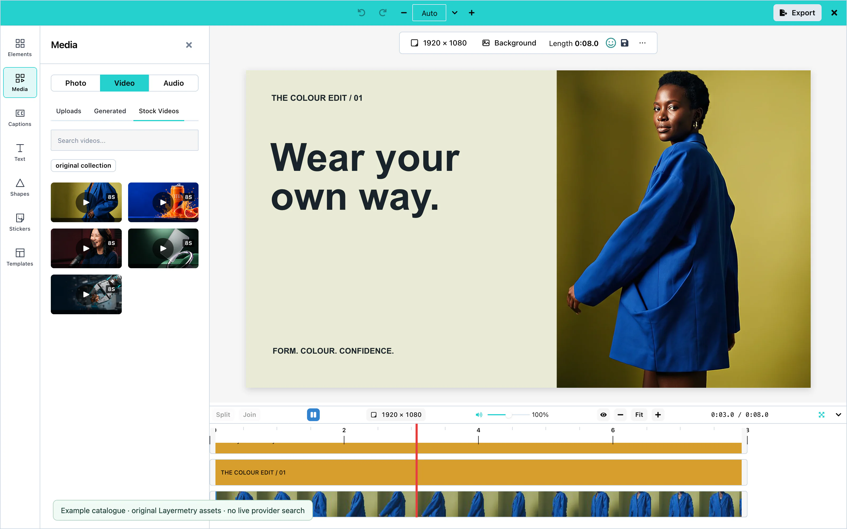 View full size
A service without configuration has no tab.
AI providers
The ai prop turns on the AI features of the editor and says where their requests go. Without ai, the editor shows no AI control and sends no AI request.
ai takes exactly one of three ways to send requests: endpointUrl, requestFn, or hosted. With none of them, or with two, the editor prints one error in the console and keeps AI off. Hosted AI is coming soon and available only with an enterprise licence from Layermetry.
The AI features, and the capability name of each:
| Capability | What the user does | Where |
|---|---|---|
text | Writes text from a description | Text panel: Generate text, and Write with AI in the voiceover recorder |
textRewrite | Rewrites the words of a selected text item | Rewrite with AI on the selected text |
image | Makes a picture from a description | Media > Photo: Generate image |
imageEdit | Changes a selected picture | Edit with AI on the selected picture |
svgPath | Makes a shape from a description | Shapes panel: Generate shape |
video | Makes a video clip from a description | Media > Video: Generate video |
imageToVideo | Makes a video clip from a selected picture | Make video on the selected picture |
voice | Reads words aloud as a sound clip | Media > Audio: Generate voiceover |
captions | Writes down the speech in a clip | Captions panel, and Generate captions in the voiceover recorder. See Captions. |
The right-click menu of the canvas, and Cmd+K (Ctrl+K), also open these controls.
Hosted service
endpointUrl or requestFn. Hosted AI is coming soon. Available only with an enterprise licence from Layermetry.Use your own endpointUrl or requestFn for generation. hosted: true sends AI requests to Layermetry. Hosted AI is coming soon. Available only with an enterprise licence from Layermetry. Enterprise setup:
const options = {
    "ai": { hosted: true }
};Hosted mode is coming soon and available only with an enterprise licence from Layermetry. It is the only AI transport that sends your license key, in the x-license-key header. Your own endpointUrl or requestFn does not receive it.
Use your own mediaApiUrl for transcription, background removal and stabilization. Hosted routing is coming soon and available only with an enterprise licence from Layermetry; when enabled, it uses Layermetry’s media service if no mediaApiUrl is set.
When the account that pays for AI has no credits left, a request is refused with ai-credits-exhausted. When the plan does not include a kind of AI work, it is refused with meter-off. Both can carry a top-up address for your own interface. See Top-up address.
For enterprise hosted integrations, the service address is exported as LAYERMETRY_MEDIA_API_URL for your content security policy. Hosted AI is coming soon and available only with an enterprise licence from Layermetry.
Default: off.
Proxy URL
endpointUrl sends every AI request to your own server. Your server holds the provider keys and calls the providers:
const options = {
    "ai": { endpointUrl: 'https://api.example.com/ai' }
};The editor sends POST with a JSON body, and never sends your license key. Custom AI endpoint describes every request and response, with a complete server.
Default: off.
Request function
requestFn hands each request to your own function. The editor then makes no AI request itself:
const options = {
    "ai": { requestFn }
};The function receives the same request object that a proxy receives, and an AbortSignal that fires when the user cancels. It returns the response, in the same format as a proxy response. A thrown error shows as a failed generation.
Pass functions in the options object you give to the mount function.
Default: off.
Session limits
maxPerSession stops a capability after a number of generations. limits.maxPerSession counts all capabilities together:
const options = {
    "ai": {
        endpointUrl: 'https://api.example.com/ai',
        text: { maxPerSession: 1 },
        limits: { maxPerSession: 20 },
    }
};The editor counts in the browser, per editor, while the page is open. Anyone can change a number in their own browser, so this is a guard for honest use, not a security control. Enforce your real limits on your server.
In the voiceover recorder, Write with AI shows the requests left for text, and Generate captions shows the requests left for captions.
When your server refuses a request, it responds with an error code, and the editor shows a heading and a message for that code. See Error codes.
Default: no limit.
Per-feature options
Each capability takes true, false, or an object with settings. A capability you do not name is on, if the transport can serve it:
const options = {
    "ai": {
        endpointUrl: 'https://api.example.com/ai',
        // No shape generation.
        svgPath: false,
        // Pictures go to a different server.
        image: { transport: { endpointUrl: 'https://images.example.com/generate' } },
        // Short vertical clips only.
        video: { maxDurationSeconds: 6, aspectRatios: ['9:16'] },
        // Two voices only, named as your server names them.
        voice: { voices: ['alloy', 'nova'] },
    }
};| Setting | Capabilities | What it does |
|---|---|---|
false | all | Hides the control everywhere. |
maxPerSession | all | A limit for this capability. See Session limits. |
transport | all | Sends this capability through its own endpointUrl, requestFn, or hosted. Hosted AI is coming soon and available only with an enterprise licence from Layermetry. |
maxDurationSeconds | video, imageToVideo | A longer request is refused with limit-reached. |
aspectRatios | video, imageToVideo | The shapes offered: 16:9, 9:16, 1:1, 4:5. Another shape is refused with invalid-input. |
voices | voice | The voices offered, written exactly as your server names them. Another voice is refused with invalid-input. |
languages | captions | The languages offered, such as ['en', 'fr']. |
minDurationSeconds, maxDurationSeconds | music, soundEffect | The length range, in seconds. It replaces the range of your server's model list, and it is the only range with requestFn. A length outside it is refused with invalid-input. |
There is no hosted service for music and sound effects. They work only through your own endpointUrl or requestFn. See Music and sound effects.
To hide a control in one place only, for example the right-click menu, use ui.generative. See UI customization.
Generating a clip with video or imageToVideo may take several minutes. The editor shows its progress in a notice, and the finished clip appears in Media > Generated. See Long-running jobs.
Default: every capability is on.
Saving generated results
ai.generatedStore.onSave receives text results when they are generated. File results use saveFiles: 'all' by default; when you provide onUploadAsset, the file uploads before its record is pushed. Set saveFiles: 'used' to wait until a file is placed. The list matches records by userId and brandId; other scope fields are carried but not compared. See Save generated results for the details, flow diagram, defaults and host checklist.
Generation results
The first returned suggestion is selected automatically. For Rewrite with AI and Edit with AI, it appears on the existing item. Click a different card to compare it. Leaving the box keeps the selected card as one editing action and one Undo step. This includes ✕, Escape, Enter from the results, changing selection or opening another panel. Choose Original before leaving to make no change. The timeline keeps the saved words until the box closes.
The text card says Original (your text now). A returned wording identical to it says Same as your text. Picture edits label the source Original. If the target was deleted, the editor says That item was deleted, so the change was not kept.
Generate more appends suggestions using the previous request. Try again replaces the current choices. The count excludes Original and states the number actually returned. The SDK sends the selected field values to your host through the configured schema, including any sendAs names. If your service returns fewer suggestions than requested, handling that count belongs to your service; the editor does not create extra answers.
For a new result shown in the box, the add action depends on its destination:
| Result | Add action |
|---|---|
| Text, picture, sticker, shape | Add to canvas |
| Video, image-to-video, voice, music, sound effect | Add to timeline |
| A result made from the Background panel | Set as background |
A long-running video result can finish under Generated in Media. Select its card there to add it. In the Text panel, Generated uses the same list as Elements. With no text selected, selecting a text result adds it. With editable text selected, choose Replace selected to keep its font family, font size and position, or Add as new. Replacement is one Undo step. Locked text has no Replace selected action.
The toolbar action Rewrite with AI opens the Text panel form in rewrite mode. With selected text, the form can change the words or put them in a template; + New starts a separate text item.
Custom AI endpoint
Use HTTPS for statusUrl and cancelUrl. HTTP is allowed only on your own computer at the loopback addresses.
With endpointUrl in ai, the editor sends each AI request to your server, and your server responds. The following contract describes the requests and responses, with a complete Node.js server.
The server below handles text, image, shape, voice, and video JSON requests. Captions use a multipart transcription endpoint; music and sound effects need the audio contract below. Its helper functions return fixed results. Replace them with calls to your AI service and provide reachable media files.
The local server uses loopback HTTP addresses for video job polling, which are allowed for development on your own computer. Use absolute HTTPS statusUrl and cancelUrl values outside local development, as described in Long-running jobs. Replace its placeholder picture, voice, and video addresses with reachable fixtures that allow your editor origin through CORS.
Start the server, and pass its address to the editor:
| Language | Start command |
|---|---|
| Node.js | node server.mjs |
const options = {
    "ai": { endpointUrl: 'http://localhost:8787/ai' }
};Set ALLOWED_ORIGIN to the address of your page. The editor calls your server from the browser, so the server must allow that address with Access-Control-Allow-Origin.
Request format
The editor sends POST to endpointUrl, with Content-Type: application/json. It never sends your license key. The body has four fields:
| Field | Type | Description |
|---|---|---|
type | string | The group of the request: text, image, SVGPath, video, or audio. |
prompt | string | The words the user typed. |
input | object | What the user asked for. input.operation names the capability. |
options | object | Settings for the model, such as count. |
For example, Generate sound effect, with the length on Auto and no model picked, sends:
{
  "type": "audio",
  "prompt": "a wooden door closing softly",
  "input": { "operation": "soundEffect", "prompt": "a wooden door closing softly", "loop": false },
  "options": { "action": "soundEffect" }
}
For text, pictures, shapes, voices, and clips, options also carries provider, the name of a vendor. The editor names that vendor for the reference backend, which reads it. Your server can ignore provider and choose its own vendor and model. Music and sound effects carry no provider.
Each capability puts these fields in input:
input.operation | type | Fields of input |
|---|---|---|
text | text | prompt |
textRewrite | text | text (the current words), instruction |
image | image | prompt, and aspectRatio when the user chose one |
imageEdit | image | prompt, source ({ url } or { dataUrl } of the picture) |
svgPath | SVGPath | prompt |
video | video | prompt, durationSeconds, aspectRatio, model |
imageToVideo | video | source, prompt, durationSeconds, aspectRatio, model |
voice | audio | prompt, voice, format |
music | audio | prompt (a description), durationSeconds, instrumental, loop, model |
soundEffect | audio | prompt (a description), durationSeconds, loop, model |
options.count is the number of results the editor asks for: 3 for text, and 1 for the others. options for video also carries aspectRatio (default 16:9), durationSeconds (default 8), resolution (720p), and generateAudio (true).
Captions are different. The editor sends the sound as a file upload, not as JSON. See Custom transcription.
Model list
Before it shows a control, the editor asks which models your server offers: GET on the address next to endpointUrl, named models, with ?capability= and the type. For https://api.example.com/ai, that is https://api.example.com/models?capability=image. The response is:
{ "models": [{ "id": "fast", "label": "Fast" }, { "id": "best", "label": "Best quality" }], "default": "fast" }This route is optional. Without it, the editor shows no model picker and lets your server choose. An empty models list hides the control of that capability.
Response format
Answer with HTTP 200 and { items: [...] }. Each entry depends on input.operation:
input.operation | Answer |
|---|---|
text | { "items": [{ "text": "Summer sale" }] }, one entry for each suggestion |
image | { "items": [{ "url": "https://cdn.example.com/result.png" }] } |
svgPath | { "items": [{ "pathData": "M 50 5 L 95 95 L 5 95 Z" }] } |
voice, music, soundEffect | { "items": [{ "url": "https://cdn.example.com/voice.mp3" }] }. For music and sound effects, see Music and sound effects. |
video, imageToVideo | { "items": [{ "url": "https://cdn.example.com/result.mp4" }] }, or a job. See Long-running jobs. |
A shape outline is SVG path data, and it must start with M or m. The editor drops an outline that draws nothing.
The editor downloads each address in the response, so the files must allow cross-origin requests. Addresses from AI vendors are often temporary. Store the files, or pass onUploadAsset so that the editor stores them when the user keeps one. See Asset storage.
Returned clips appear under Generated in Media. Select a result to add it to the timeline. When a result is shown in the Generate box, its add action is Add to timeline.
Long-running jobs
Video generation may take longer than your request timeout. Return HTTP 202 with a job handle so the editor can poll its status while processing continues:
{
  "ok": true,
  "job": {
    "id": "7f3c9a1e",
    "statusUrl": "https://api.example.com/ai/jobs/7f3c9a1e",
    "cancelUrl": "https://api.example.com/ai/jobs/7f3c9a1e/cancel",
    "pollMs": 2000
  }
}
Write statusUrl and cancelUrl as whole HTTPS addresses. For local development, HTTP is allowed only at the loopback addresses. The editor refuses a job whose addresses are paths, because it never guesses which server a path belongs to. cancelUrl is optional.
The editor then sends GET to statusUrl every pollMs milliseconds. pollMs is kept between 250 and 60,000, and is 1,500 when missing. Each response describes the job:
{ "ok": true, "job": { "jobId": "7f3c9a1e", "state": "running", "percent": 40, "stage": "rendering" } }state | Meaning |
|---|---|
queued, running | Still working. The editor shows percent, from 0 to 100. |
ok | Finished. receipt.asset.url is the address of the video. |
failed | Failed. error.code and error.message say why. |
cancelled | Stopped. |
A finished job returns:
{
  "ok": true,
  "job": {
    "jobId": "7f3c9a1e",
    "state": "ok",
    "percent": 100,
    "stage": "done",
    "receipt": { "asset": { "url": "https://cdn.example.com/videos/7f3c9a1e.mp4" } }
  }
}
While the job runs, a notice shows its progress, with a Cancel button. When it finishes, the notice says "Your video is ready", and the clip is in Media > Generated. Nothing is added to the timeline until the user adds it.
Cancel sends POST to cancelUrl, and the notice says "Generation stopped". The editor also asks your server to stop when it gives up:
- after three failed status requests in a row;
- after 12 minutes.
A request function can respond with the same job. The editor then follows statusUrl and cancelUrl itself.
For generated voice, your server can return { items: [{ url, durationSeconds }] }, with a positive length in seconds for each file. When no usable length is supplied, the editor reads the sound file before adding it. Serve the file with CORS headers that allow the editor page to read it. If the length cannot be read, the editor shows “The length of this sound could not be read, so it was not placed.” and adds no clip.
Music and sound effects
Your server makes music and sound effects for the editor. The editor names no vendor and no model: your server chooses them. There is no hosted service for them. They work only through your own endpointUrl or requestFn.
The request has type: "audio", and options.action is music or soundEffect. A voice request has no action. prompt is a description of the sound, not words to read out loud:
{
  "type": "audio",
  "prompt": "calm piano for a product story",
  "input": { "operation": "music", "prompt": "calm piano for a product story", "durationSeconds": 30, "instrumental": true },
  "options": { "action": "music" }
}
durationSeconds is missing when the user chose Auto: the model decides. loop is present for a sound effect. model is in input and options only when the user picked a model from your list.
Answer with HTTP 200:
{ "items": [{ "url": "https://files.example.com/generated/abc.mp3", "durationSeconds": 30.2 }] }itemslists the files, with aurlin each entry. Return one file for music. A sound effect can return up to four, and the user chooses one.- Each item’s optional
durationSecondsgives its length in seconds. Send a positive number when you know the duration. Without it, the editor reads the file to measure it. - Serve MP3 (
audio/mpeg) or WAV (audio/wav) files, with CORS headers that let the editor's page read them. The editor downloads each file to store it and to export it.
A slow server can respond with a job instead. See Long-running jobs. The file of a finished job is receipt.asset.url, and its length is receipt.asset.durationSeconds.
Model list for music
The editor shows Generate music only when your server names a music model. It asks GET on the models address with ?capability=music, and with ?capability=soundEffect for sound effects. These two ask by their own names, not by audio, because audio lists voices. For https://api.example.com/ai, the address is https://api.example.com/models?capability=music.
{
  "ok": true,
  "capability": "music",
  "default": "clip",
  "models": [
    { "id": "clip", "label": "Short clips", "limits": { "minSeconds": 3, "maxSeconds": 30 } },
    { "id": "full", "label": "Full tracks", "limits": { "minSeconds": 3, "maxSeconds": 180 } }
  ]
}
default must be one of the id values. limits is the length range of each model, in seconds. The editor offers lengths inside it, keeps Match the video inside it, and refuses a length outside it before anything is sent, with a sentence such as "This model makes music from 3 seconds to 30 seconds long." With two or more models, the box shows a picker. A range that is not valid is ignored, and the model is still offered.
A failed response, or an empty models list with "default": null, hides the button. A request made anyway is refused before it is sent, with not-configured. Its error.message is "This server offers no model for music, so nothing was sent." or "This server offers no model for sound effects, so nothing was sent."
With requestFn, there is no model list. The buttons are shown, and you state the range in the ai setting:
const options = {
    "ai": {
        requestFn: myAiFunction,
        music: { minDurationSeconds: 3, maxDurationSeconds: 300 },
        soundEffect: { maxDurationSeconds: 30 },
    }
};Each value must be a number of seconds above zero, and minDurationSeconds must not be larger than maxDurationSeconds. A range you state replaces the range of the model list.
Refusals from your server
Use the codes in Error codes. Send invalid-input for a length outside the model's range, with the range in message. Send unsupported-model for a model you do not offer. Send ai-quota-exceeded or limit-reached for an allowance.
Check that your music vendor's terms allow commercial use by your own users. Some vendors exclude film, TV, radio, or games, or forbid reselling.
Types
These types describe the contract, and every entry exports them: AISoundAnswer, AIModelListAnswer, AIModelListEntry, and AISoundOptions. AIInput has the music and soundEffect operations, and each media entry in AIResponse.items can include durationSeconds.
Error codes
To refuse a request, respond with an HTTP error status and this body:
{ "ok": false, "error": { "code": "limit-reached", "message": "You have made 20 videos today. Try again tomorrow." } }The editor shows a heading for the code, and your message under it. It shows your message only when code is a code that the editor knows, such as the codes below. Any other response shows "AI request failed (HTTP 402).", with your status. For ai-quota-exceeded, ai-credits-exhausted, and meter-off, the editor shows fixed words instead of your message, and writes your message to the browser console. See AI errors.
| Code | Heading the user sees | Use it when |
|---|---|---|
invalid-input | That cannot be sent | The request is not valid. |
limit-reached | Generation limit reached | The user has used their allowance for now. |
ai-quota-exceeded | AI requests are paused for now | The account has reached its limit of AI requests for now. |
ai-credits-exhausted | AI is temporarily unavailable | The account that pays for AI has no credits left. Send HTTP 402. |
meter-off | This AI feature is not available here | The plan does not include this kind of AI work. Send HTTP 403. |
unsupported-model | That model is not available | The requested model does not exist. |
unsupported-provider | That model is not available | The requested vendor is not available. |
store-unavailable | Nothing was generated, and nothing was charged | Your usage records cannot be written, so you refused before generating. |
unknown-job | That generation is no longer there — ask for it again | A job id is unknown or expired. |
sign-in-required | Sign in again to keep generating | The user is signed out of your product. |
identity-mismatch | Switch to the account this belongs to | The user is signed in to another account. |
identity-unverifiable | Your sign-in could not be checked — try again shortly | You cannot check the sign-in right now. |
no-provider | No model is set up for this | No model serves this capability. |
With ai-credits-exhausted or meter-off, you can add topUpUrl to error: the https address where the account buys more credits. The editor passes it to your code as error.topUpUrl and shows no link itself. See Top-up address.
The editor also uses codes such as not-configured, transport-failed, and invalid-response. Error codes lists all of them.
To show the same words in your own controls, catch the error and pass it to describeAIError, which returns { title, description }.
Events
The editor tells your code what happens through callback options. The custom element also sends most of them as DOM events, so a page can listen with addEventListener.
| Callback | DOM event | When |
|---|---|---|
onSaveTemplate | templatesave, after the save | The user saves a design or a draft. |
onExport | export | The finished video is ready. |
onExportProgress | exportprogress | A background export makes progress. |
onClose | close | The editor closes. |
onLicenseState | none | The state of the license check changes. |
onPreferenceChange | preferencechange | The user changes a preference. |
onChatEvent | chatevent | Something happens in the AI assistant. See Conversation history. |
A DOM event bubbles and crosses a shadow DOM boundary. A callback that must return a value, such as onSaveTemplate or onGetTemplates, can only be a prop, because an event listener cannot return a value to the editor.
Save
onSaveTemplate stores a design. The editor waits for the Promise it returns. After each attempt, the element sends templatesave with detail: { template, saved }.
See Saving and loading for the record and for failures.
Default: no onSaveTemplate, so the editor has no save button.
Export
onExport receives the finished MP4, WebM, or GIF file as a File, when the user presses Save & Exit, Export, or Share…. Its second argument, extras, is optional, and so is each of its fields. It carries email when the user shared the video by email from the Export panel, chat when the video came from a conversation with the AI assistant, and srt when the video has captions. Read each field with a check, such as extras?.email?.to.
Save & Exit closes the editor as soon as the first frame is written, usually in less than two seconds. The file is written in the background, and onExport receives it later. onExportProgress reports the progress:
const options = {
    "onExportProgress": handleProgress
};Each progress event has these fields:
| Field | Description |
|---|---|
percent | 0 to 100. It never goes backwards within one job. |
stage | video while the frames are written, then audio, then mux while both are joined. |
jobId | The same on every event of one Save & Exit. |
jobType | video, or thumbnails for the preview pictures that onThumbnails receives. Skip thumbnails events if you draw one bar per video. |
done | true on the last event. Without error, onExport has already received the file. |
error | On the last event only, when no file could be made. |
Show a placeholder in your page when the first event of a new jobId arrives, and replace it with the file from onExport when done arrives. See Export for thumbnails and file options.
When the browser refuses the export before it starts, no file is made and the editor stays open. onExportProgress then receives one event with done: true and a sentence in error that says why. See Export failures.
Default: no onExportProgress. Save & Exit still delivers the file through onExport.
Close
onClose is required. The editor calls it when the user presses the close button, and after Save & Exit. Remove or hide the editor when it runs:
const options = {
    "onClose": () => setIsOpen(false)
};The custom element also sends close. After Save & Exit, onClose comes before onExport, while the file is still being written.
Errors
The editor has no single error callback. Each kind of failure reaches you in its own way:
| Failure | How you learn about it |
|---|---|
| The license is refused | onLicenseState with state.status set to blocked, a reason, and a message. See License validation. |
| A save fails | Your onSaveTemplate rejected, and templatesave has saved: false. The user sees "Template wasn't saved". |
| A background export fails | The last onExportProgress event has done: true and error. |
| An AI request fails | The editor shows the message to the user. Your server chose the code. See Error codes. |
| A setting is wrong | One line in the browser console, starting with [MediaEditor]. |
A wrong ai setting, for example, prints:
[MediaEditor] `ai` is not usable, so AI stays off: Provide exactly one of hosted, endpointUrl or requestFn.Error codes lists every code and message.
DOM events on the custom element
The custom element emits notifications as DOM events. Callbacks that return a value, such as onGetTemplates, must remain properties; a listener cannot return that value to the editor.
Handling the export
onExport receives the selected MP4, WebM, or GIF file. Upload it with its original name and MIME type:
const options = {
    "onExport": handleExport
};Save & Exit calls onClose when the first frame is written. The file finishes in the background, then reaches onExport. Keep the callback and upload in your application after you remove the editor.
For progress events and file options, see Export.
Use this Rails action for POST /api/videos. It receives the multipart video field used by the complete file above and returns JSON with HTTP 201. It accepts all selected export formats shown here and writes a temporary file; configure persistent storage before using this in your product.
Rails.application.routes.draw do
  get "editor", to: "editors#show"
  namespace :api do
    post "videos", to: "videos#create"
  end
endclass Api::VideosController < ApplicationController
def create
file = params.require(:video)
unless file.respond_to?(:read) && file.respond_to?(:content_type)
return render json: { error: "Missing video file" }, status: :bad_request
end
allowed_types = %w[video/mp4 video/webm image/gif]
unless allowed_types.include?(file.content_type)
return render json: { error: "Unsupported output format" }, status: :unsupported_media_type
end
# Replace temporary storage with your own persistent storage service.
directory = Rails.root.join("tmp", "editor-exports")
FileUtils.mkdir_p(directory)
path = directory.join(SecureRandom.uuid)
File.binwrite(path, file.read)
render json: { name: file.original_filename, type: file.content_type }, status: :created
end
endDo not disable forgery protection for this session-backed action. The host helper sends the current X-CSRF-Token from csrf_meta_tags. Content-Type for multipart is supplied by the browser. For large files, use your storage service's direct-upload flow if your Rails host has a request-size limit.
Content
Timeline
The timeline displays one row for each clip, picture, text item, or sound. Render the editor to use its timeline controls:
Use the editor from Usage; these controls need no additional options.
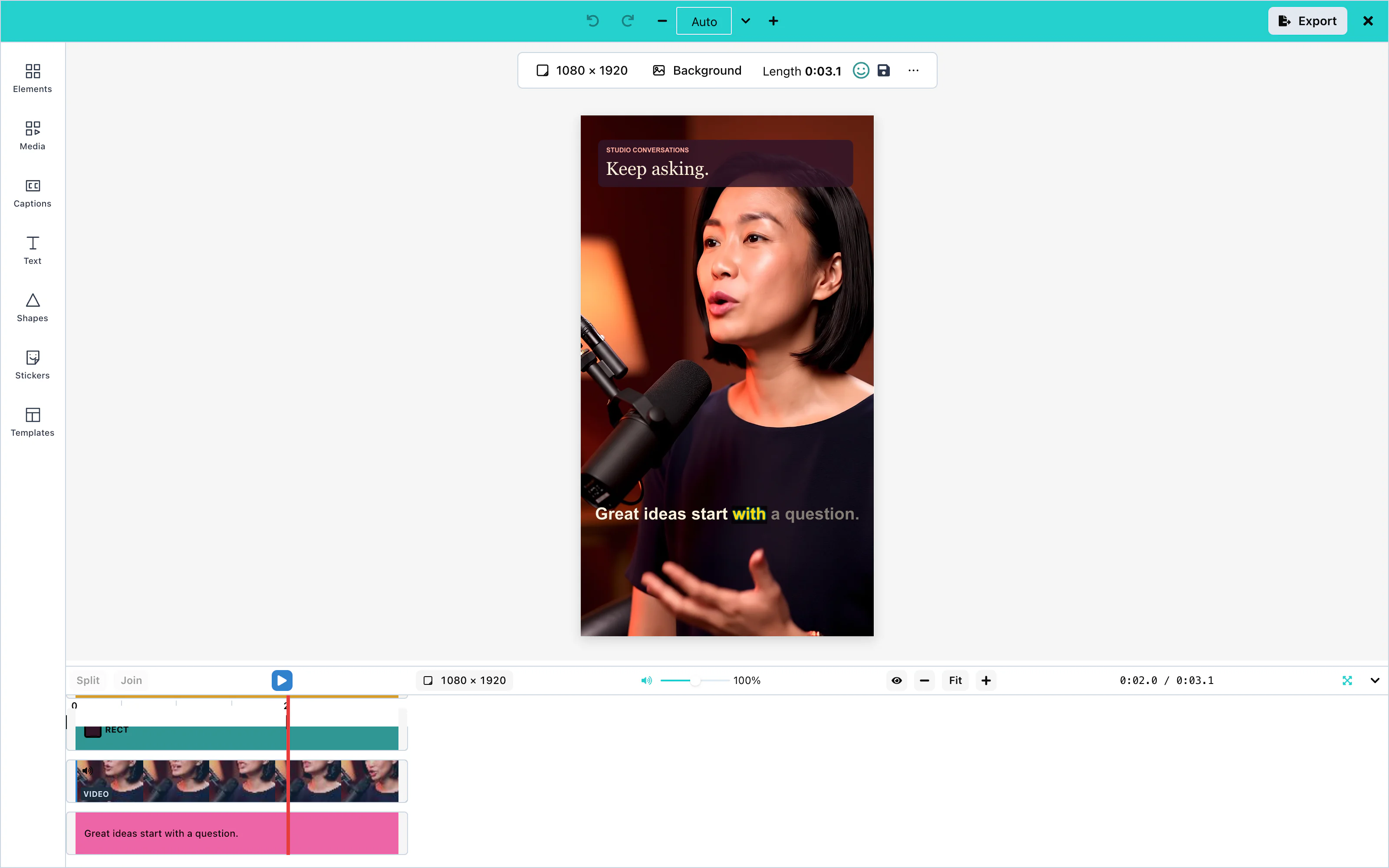 View full size
The video is as long as its last item. With one 6-second clip, the time display shows 0:00.0 / 0:06.0.
Placement
Every item has a start time and an end time. The editor places a new item at the start of the video.
- Move. Drag an item left or right to change when it starts. Its length stays the same.
- Trim. Every item has a handle on its left edge and on its right edge. The right edge changes when the item ends. The left edge changes when the item starts, and its end stays where it is. On a video or sound clip, the left edge also cuts footage from the start of the clip. A clip cannot start before the first second of its file, and no item can be shorter than 0.1 seconds.
- Split. Select a clip, move the playhead, and press Split. The clip becomes two clips at the playhead. Join joins them again. Two pieces at different speeds cannot be joined.
A clip at a speed other than 1× shows its speed on its block, for example 2×. See Clip speed.
See Right-click menu.
Layers
The order of the rows is the order of the layers. The item in the top row is drawn over everything else, and the item in the bottom row is furthest back.
To change the order, drag a row up or down, or use Bring forward, Send backward, Bring to front, and Send to back in the right-click menu. The background is always behind everything, and it has no row.
Show only clips at the playhead (the eye button) hides the rows of items that are not visible at the current time. If no item is visible there, the timeline shows all rows.
Playback
Press Play, or the Space bar, to play the video from the playhead. The time display shows the position of the playhead and the length of the video.
Click the ruler above the rows to move the playhead. The zoom buttons make the timeline wider or narrower, and Zoom to fit shows the whole video. Minimize timeline makes the timeline small, to give the canvas more space.
These keys work while the editor has the focus:
| Key | Action |
|---|---|
| Space | Play or pause |
| Left arrow, Right arrow | Move the playhead by one frame (1/30 second) |
| Shift + Left arrow, Shift + Right arrow | Move the playhead by one second |
| Up arrow, Down arrow | Move the playhead to the previous or next edge of a clip |
| Home, End | Move the playhead to the start or the end |
| Shift + Z | Zoom to fit |
| Cmd + Z (Ctrl + Z) | Undo |
| Cmd + Shift + Z or Cmd + Y (Ctrl on Windows) | Redo |
| Cmd + C, Cmd + V, Cmd + D (Ctrl on Windows) | Copy, paste, and duplicate the selected item |
| Cmd + ] and Cmd + [ | Bring forward, send backward. Add Shift for front and back. |
| Delete, Backspace | Delete the selected item |
| F | Open the full-screen player. F or Escape leaves it. |
| M | Mute or unmute the preview |
| Cmd + Option + C, Cmd + Option + V (Ctrl + Alt on Windows) | Copy the style of the selected item, and paste it on the selected items. See Copy style and paste style. |
| Cmd + Shift + E (Ctrl + Shift + E) | Open the Export panel |
Mute, the M key and the volume slider next to the play button change the sound of the preview only. They do not change the exported video. To change the sound of a clip, see Audio.
Right-click menu
A right-click on a clip opens the same menu as a right-click on that item on the canvas. The lines, the actions, the locks and the roles are the same, and so are your settings in ui.generative.contextMenu. If the clip is not selected, the right-click selects it first. A right-click on empty space, on the ruler or on the playhead opens the browser's own menu, and so does a long press on a phone.
The menu has one extra line, Split at playhead. The editor offers it only when it would cut the clip you clicked: exactly one clip is selected, it is the clip you right-clicked, and the playhead is inside that clip. This is the same rule as the Split button. A press with the right mouse button does not start a drag or a trim. On a Mac, Ctrl + click is a right-click, so it does not start a drag either.
Clip colors
Each type of clip has its own color on the timeline: video, sound, picture, shape, title, caption and sticker. Your theme still decides. When you set the theme color video, audio, image, shape or text, the clips of that type use your color. Captions follow text, and stickers follow image. Without them, the timeline uses its own built-in colors, which do not change the Play button or the audio panel. See Theming.
Panels and menus cover the timeline playhead line. The line stays inside the timeline while you edit in a panel.
Full-screen player
The Full screen button is next to the time in the timeline, and the F key does the same. It shows only the picture, with a small player bar: play and pause, a position slider, the time, the volume and mute (the same volume as the timeline's), and Exit full screen. The toolbar and editing keyboard shortcuts are off while it is open. A reply already in progress from the AI assistant can still change the design. Leave full screen with Escape before using Undo. The bar above the canvas, the floating pill and the selection frame are hidden, Delete, Undo and the other editing keys do nothing, and a click on the picture plays or pauses. Space plays and pauses. F or Escape leaves, and holding F does not switch the player on and off again. The zoom is set to fit and is put back when you leave, and the selection is kept.
To hide the button and turn off the F key, set ui.features['player.fullscreen'] to false. The editor shows the button only when the browser allows full screen for the page. Safari on an iPhone cannot show one element on the whole screen, so the iPhone shows no button. Safari before version 16.4 works through its older function names. In an iframe, add allow="fullscreen". If the browser refuses, nothing changes, and the console shows one warning that starts with [PlayerFullscreen].
Timeline on a phone
On a phone, the play button and the time come first in the row of controls. The row stays on one line, and a swipe moves it sideways so that every control can be reached. The button that minimizes the timeline stays outside the moving part.
Video
Use HTTPS for mediaApiUrl. HTTP is allowed only on your own computer at the loopback addresses.
Video clips come from the user's computer, from the camera, from Pexels, or from an AI model. On the timeline, the user splits and trims them. On the canvas, the user crops them and adds filters.
Upload, camera recording, split, trim, speed, volume, and filters work with no setup. The other options need a key, a server, or an AI provider, which you pass as options:
const options = {
    "stockMediaApis": { pexels: { apiKey: 'YOUR_PEXELS_KEY' } },
    "mediaApiUrl": "https://media.example.com",
    "ai": { endpointUrl: 'https://api.example.com/ai' }
};| Option | Prop | Configuration page |
|---|---|---|
| Stock video | stockMediaApis.pexels | Stock media |
| Stabilization | mediaApiUrl | AI providers |
| Text to video, image to video | ai | AI providers |
Upload
Open Media, choose Video, and press Upload Videos. The file appears under Local Upload. Press + on it to add it to the canvas and the timeline.
The panel lists MP4, WebM, and MOV. The browser must be able to decode the file. A file that it cannot decode is refused with a message such as "This video cannot be played here. old.avi is 2 seconds long, but your browser cannot decode this format. Please convert it to MP4 and try again."
Export reads clips from MP4, MOV, WebM, and MKV files. See Source clips for the video and sound formats that export reads.
A new clip fills the canvas and starts at the beginning of the video.
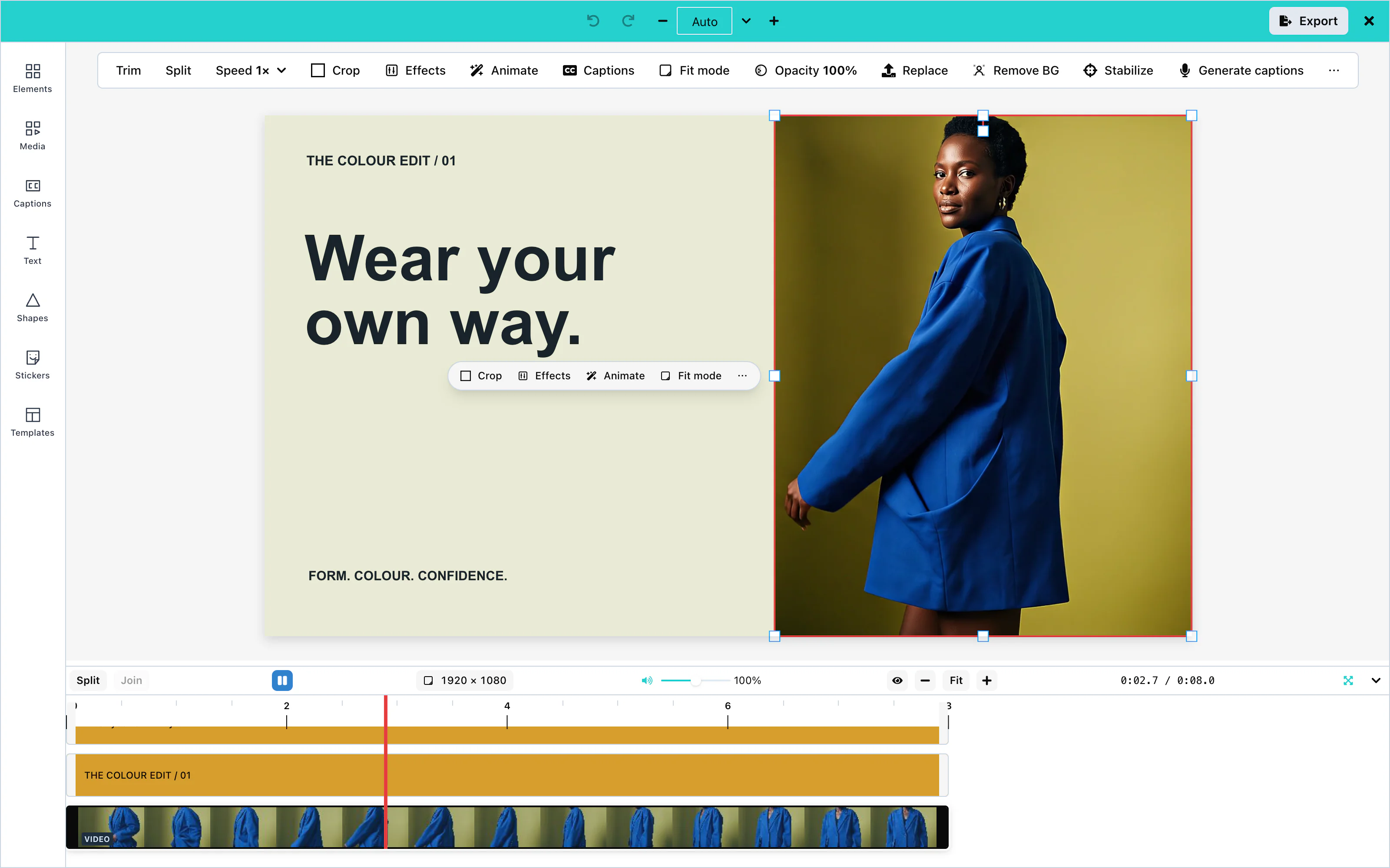 View full size
When a clip is selected, a bar under it offers Crop, Effects, Animate, and Fit mode. Crop shows part of the clip. Fit mode decides how the clip fills the canvas. The tool rail also shows Audio Effects and Animations.
Camera recording
The user records a clip with the computer's camera, inside the editor. Open Media, choose Video, and press Record with camera. The browser asks for permission to use the camera first. The recording goes into the uploads list, like a chosen file.
The camera needs a secure page: HTTPS, or localhost. On a page without camera access, the recorder says so. To remove Record with camera, set ui.features['recording.camera'] to false.
The editor records MP4 when the browser can, and WebM otherwise.
Stock video
With stockMediaApis.pexels, the Video tab of Media shows Stock Videos. The user searches, and clicks a video to add it.
Split
Select a clip, move the playhead to where you want to cut, and press Split above the timeline. The clip becomes two clips. Split at playhead in the right-click menu does the same.
Trim
Drag the left or right edge of a clip in the timeline. The left edge cuts footage from the start of the clip, and the clip's end stays where it is on the timeline. The right edge changes where the clip ends. A clip cannot start before the first second of its file, and cannot be longer than its file.
From your own code, the itemSetTimelinePlacement action trims the start with sourceStartSeconds: the second of its own file at which the clip begins. See Editor actions.
Volume and mute
The speaker icon on a clip in the timeline mutes and unmutes that clip. To change its level, select the clip, open Audio Effects, and use Volume on the Advanced tab. See Audio.
The mute button and the slider above the timeline change the preview only, not the exported video.
Stabilization
mediaApiUrl. ai: { hosted: true } uses Layermetry’s service. Hosted AI is coming soon. Available only with an enterprise licence from Layermetry. See AI providers.Stabilization removes camera shake from a clip. Select the clip, and choose Stabilize in the right-click menu. The editor replaces the clip with the steady version when the server has finished.
Your media server must be able to download the clip. A clip that is already at an http or https address is sent as it is. A clip that exists only in the browser is first stored through onUploadAsset, with source: 'staged', and the address you return is sent. The editor does not keep that address in the design. See Asset storage.
Filters
Select a clip and open Effects. Filters such as Grayscale and Sepia change the look of the clip, and adjustments such as brightness and contrast take a number. Filters appear in the exported video. See Effects and filters.
Text to video
ai. See AI providers.Open Media, choose Video, and press Generate video. The user describes the clip and presses Generate. A notice shows progress while the video is generated. The finished clip appears under Generated, and the user adds it from there.
A clip is 8 seconds long and 16:9 by default. ai.video.maxDurationSeconds and ai.video.aspectRatios limit what users can ask for. See Long-running jobs for your server.
Image to video
ai. See AI providers.Select a picture on the canvas and press Make video, or choose Make video… in its right-click menu. The AI model makes a new clip from the picture. The job runs like text to video.
The request has "operation": "imageToVideo" and carries the picture in input.source. The picture is sent as its web address when it has one. A picture uploaded from the computer, or a stock photo, is sent as the picture itself, in a data: URL.
Clip speed
Clip speed plays a video or sound clip faster or slower. Select the clip, open ⋯ in the bar under it, and choose Speed: 0.5×, 1×, 1.5×, or 2×. For a sound clip, the same choices are in the toolbar above the canvas.
The same footage keeps playing, so the length of the clip on the timeline changes. At 2×, the clip lasts half as long. The start of the clip stays where it is, and the clip after it does not move. The sound changes speed with the picture, so its pitch rises when the clip is faster and falls when it is slower, like a tape played faster or slower.
The preview and the exported video play the clip at the same speed. From your own code, the clipSetSpeed action accepts any speed from 0.25 to 4. The document stores it as playbackRate on the clip.
Transitions
Coming soonTransitions will blend one clip into the next, for example with a crossfade.
Configuration
| Prop | Type | Default | Description |
|---|---|---|---|
stockMediaApis | object | none | Pexels settings. Without pexels, there is no Stock Videos tab. |
mediaApiUrl | string | none | The media server that stabilizes clips. ai: { hosted: true } uses the Layermetry address. Hosted AI is coming soon. Available only with an enterprise licence from Layermetry. |
ai | object | none | The AI provider for text to video and image to video. video: false and imageToVideo: false hide them. |
onUploadAsset | function | none | Stores uploaded and generated clips in your storage when a design is saved or a clip is kept, and stores a clip that a media server job must download (source: 'staged'). |
Events
Video clips have no events of their own. They reach you inside the exported video through onExport, and through onUploadAsset when a design is saved. See Events.
Troubleshooting
Audio
Sound comes from video clips, from audio files, from Freesound, from an AI voice, from AI music and sound effects, or from the user's microphone. The editor improves it with presets, audio effects, and an equalizer.
Upload, microphone recording, presets, audio effects, the equalizer, and volume work with no setup. Stock music and text to speech need a key or an AI provider:
const options = {
    "stockMediaApis": { music: { apiKey: 'YOUR_FREESOUND_KEY' } },
    "ai": { endpointUrl: 'https://api.example.com/ai' }
};| Option | Prop | Configuration page |
|---|---|---|
| Stock music | stockMediaApis.music | Stock media |
| Text to speech | ai | AI providers |
| Music and sound effects | ai with your own server | Custom AI endpoint |
Upload
Open Media, choose Audio, and press Upload Audio. Press + on the file under Local Upload to add it to the timeline. The panel lists MP3, WAV, and M4A.
A sound file has no picture, so it appears only in the timeline.
Stock music
With stockMediaApis.music, the Audio tab of Media shows Stock Music. The user searches, listens to a preview, and adds a track.
Audio presets
A preset applies a ready-made set of audio effects in one click. Select a clip with sound, open Audio Effects in the tool rail, and choose a preset on the Presets tab. The same presets appear in a row under the canvas.
| Group | Presets |
|---|---|
| Quick Enhance | Crystal Clear, Make Louder, Clean Up Noise, Voice Boost, Sound Pro |
| Platform Optimized | YouTube (−14 LUFS), TikTok, Podcast, Voiceover, Interview, Vlog, Music Video, Presentation |
| Style | Warm & Rich, Bass Boost, Bright & Airy, Radio Ready, Lo-Fi Vinyl, Wide Stereo, Punchy Drums, Cinematic |
| Fix Problems | Fix Muffled, Fix Quiet, Fix Echo, Fix Tinny, Fix Phone, Fix Video Call, Fix Wind, Fix Hum, Fix Pops |
The editor listens to the clip and marks the presets that suit it with a star.
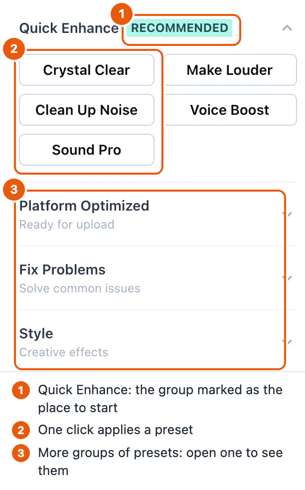
Presets and effects apply to the preview and to the exported video.
Audio processing
The Advanced tab of Audio Effects has one switch for each effect:
| Effect | What it does |
|---|---|
| Volume | Changes the level of the clip. |
| High-Pass Filter | Removes low rumble and noise. |
| Low-Pass Filter | Removes harsh high frequencies. |
| Compressor | Makes quiet and loud parts more even. |
| 3-Band EQ | Changes bass, mid, and treble. |
| Saturation | Adds warmth. |
| Stereo Pan | Moves the sound to the left or the right. |
| Normalization | Sets the loudness: Off, Peak (0 dBFS), LUFS −14 (Spotify and YouTube), LUFS −16 (podcasts), or LUFS −11 (broadcast). |
Peak (0 dBFS) raises or lowers the clip so its highest sample reaches 0 dBFS. This setting leaves no headroom below the maximum level. The editor’s help text recommends keeping peaks at least 1 dB below it.
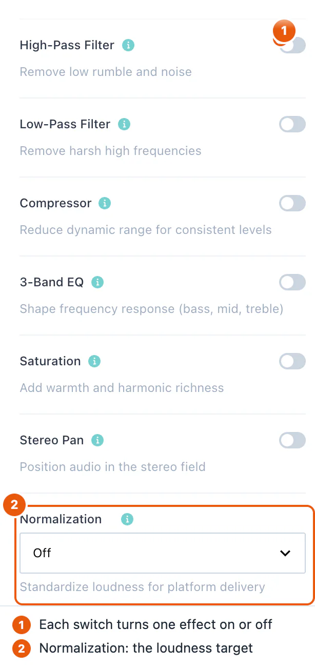
Equalizer
The Graphic EQ tab has ten bands, at 31, 62, 125, 250, and 500 Hz, and at 1, 2, 4, 8, and 16 kHz. Each band goes from −12 dB to +12 dB. Flat sets all bands to 0.
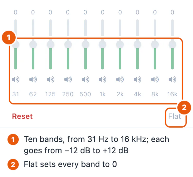
Volume and mute
To change the level of one clip, turn on Volume on the Advanced tab. To silence one clip, press the speaker icon on the clip in the timeline.
The mute button and the volume slider above the timeline, from 0 to 200%, change the preview only. The exported video keeps the levels of the clips.
Text to speech
ai. See AI providers.Open Media, choose Audio, and press Generate voiceover. The user types the words and presses Generate. Add to timeline adds the chosen recording to the timeline.
The request has "operation": "voice", and your server answers with { items: [{ url, durationSeconds }] }. The duration is optional. ai.voice.voices limits the voices users can choose. See Custom AI endpoint.
AI music generation
ai: { endpointUrl } or ai: { requestFn }. There is no hosted service for music and sound effects. See Custom AI endpoint.The editor makes music and sound effects from a description. Open Media, choose Audio, and press Generate music or Generate sound effect. Both buttons are under Generate voiceover. Cmd+K on a Mac, or Ctrl+K, with nothing selected, lists both too. The user describes the sound, for example "calm piano for a product story" or "a wooden door closing softly", and presses Generate.
The two buttons appear only when your server's model list names a model for them. A server that makes no music shows neither button. See Model list for music.
Length
| Choices | Starts on | |
|---|---|---|
| Music | 15 s, 30 s, 60 s, Match the video, or a number of seconds | Match the video when the timeline has something on it, otherwise 30 s |
| Sound effect | Auto, 1 s, 3 s, 5 s, or a number of seconds | Auto: the model decides |
Match the video asks for the length of the timeline, to a tenth of a second. The length is kept inside the model's range. The range is shown under the row, for example "This model makes music from 3 seconds to 3 minutes long." A length outside the range is refused with the same sentence, and nothing is sent.
When the range comes from your ai setting and not from a model list, the sentence starts with "This editor" instead, for example "This editor makes music up to 5 minutes long."
Instrumental and Loops cleanly
Music has an Instrumental switch. It is on at first, so music under a voiceover has no singing. A sound effect has a Loops cleanly switch. It is off at first. Turn it on for a sound whose end joins its start, such as rain.
Placing the sound
Each result plays in the box, with its length. Add to timeline adds the selected sound as a clip with its real length. Music made with Match the video starts at 0 seconds, so it covers the video. Every other sound starts at the playhead. Then the user moves, trims, and sets the volume of the sound like any sound clip.
The real length is the length your server states. When your server does not state it, the editor reads it from the file. A sound whose length cannot be read is not added, and the user sees "The length of this sound could not be read, so it was not placed."
Music gives one result, and Try again asks for another. A sound effect can give up to four results, and the user chooses one.
The box says Uses AI credits. When you set a limit with maxPerSession, it also says how many requests are left, for example Uses AI credits · 2 left. It shows no price.
Generated sound passes through onUploadAsset with source: 'generated'; the design keeps the reference your host returns. See Asset storage.
Microphone recording
The user records a voiceover with the microphone, inside the editor, while the video plays. Open Media, choose Audio, and press Record voiceover. On a desktop, the recorder takes the place of the Media panel. On a phone, it opens below the canvas.
The browser asks for permission to use the microphone. Recording needs a secure page: HTTPS, or localhost. The recorder never plays the microphone through the speakers.
The recorder has these settings. The browser remembers each choice.
| Setting | Default | What it does |
|---|---|---|
| Microphone | the system microphone | Chooses the input. Shown only when the device has more than one. |
| Play the video while recording | on | The video plays from the playhead while the user speaks. |
| Hear the video's sound | off | Plays the video's sound during the recording. The recorder says: "Use headphones, or the microphone will record it too." While it is off, the recorder shows Video sound off. |
A level meter shows the microphone's level before and during the recording. When the sound is close to the maximum, the top bars turn red, and the recorder shows Too loud.
Press Record, or Enter. After the countdown, the recorder records and shows the time. Press Stop, Enter, or the Space bar to stop. When the video played along, the playhead goes back to where the recording started. Escape cancels a countdown or a recording.
The recording, a take, appears in the recorder. The user plays it, then presses Use this to add it to the timeline, Record again to record another take, or the discard button to delete it. Use this adds the take at the moment on the timeline where its recording started, and selects it. One undo removes it.
A take shorter than half a second is not kept. The recorder then says: "The recording was too short to keep. Try again."
The file is WebM with Opus sound in Chrome, Edge, and Firefox, and MP4 (.m4a) in Safari. It is named voiceover-1, voiceover-2, and so on, with the extension of its format, for example voiceover-1.webm. The editor does not convert it.
With onUploadAsset, Use this first passes the file to your function with source: 'recorded', and the timeline keeps your reference. See Recorded voiceovers. Without it, the take stays in the browser, like a sound file from the user's computer. See Temporary assets.
When the recorder cannot start, it says why, and Record is turned off:
| Situation | What the recorder says |
|---|---|
| The user or the browser refused the microphone | The browser did not allow this page to use the microphone. Allow it in the address bar, then try again. |
| No microphone | No microphone was found on this device. |
The page is not HTTPS or localhost | Recording needs a secure page (https or localhost). |
| Anything else | The microphone could not be started. Close other apps that use it, then try again. |
Countdown
Before the recording starts, the recorder counts down. The user chooses the length under Countdown: Off, 3 s, or 5 s. The default is 3 seconds.
To set your own default, pass recording.countdownSeconds: 0, 3, or 5. The user's own choice in that browser still wins. To remove the choice, set ui.features['recording.countdownChoice'] to false. The recorder then always uses your default, or 3 seconds.
const options = {
    "recording": { countdownSeconds: 5 },
    "ui": { features: { 'recording.countdownChoice': false } }
};Input level
By default, the browser keeps the user's voice at an even level. To set the level by hand, the user turns off Automatic level. A Level slider then appears under the level meter, from 10% to 200%. The meter shows the level after the slider, and the recording has the same level.
To remove both settings, set ui.features['recording.inputLevel'] to false. The browser's automatic level is then always used.
Clean up noise
Each take has a Clean up noise box. When it is ticked, Use this adds the take with the Clean Up Noise preset already on it. It is the same preset as in Audio presets, so the preview and the exported video both have it. It runs in the browser, and it uses no AI and no credits. One undo removes the take and the preset together.
To tick the box by default, pass recording.cleanUpNoise: true. The user's own choice in that browser still wins. To remove the box, set ui.features['recording.cleanUp'] to false. The take then gets the preset only when recording.cleanUpNoise is true.
Several takes
Record again keeps the take and records another one. The newest take is shown at the top. The earlier takes are listed under Earlier takes, newest first, as Take 2, Take 1, and so on. Each has a play button, Use, and a delete button. Use adds that take at the moment on the timeline where its own recording started.
The takes exist only while the recorder is open. When the user closes the recorder with takes that were not used, the recorder asks first, for example: "Close the recorder? 2 recordings you have not used will be lost."
The recorder keeps at most 10 takes. At 10, Record again is turned off, and the recorder says: "You have kept 10 takes, the most the recorder holds. Delete one to record again."
To keep one take at a time, set ui.features['recording.takes'] to false. Record again then replaces the take. For a take longer than 30 seconds, the recorder first asks, for example: "Discard this 1:20 recording?"
To receive every take in your storage, not only the one the user adds, see Recorded voiceovers.
Script and prompter
The recorder has a Script section for the words the user reads. While the user records, a prompter strip shows the words and moves on by itself.
The script comes from one of three places:
- Type or paste: the user types or pastes the words. The prompter moves at the Speed that the user sets, from 80 to 220 words a minute. The default is 140. The browser remembers the speed.
- From captions: the user picks a caption track of the design. The prompter follows the times of the captions at the playhead, so each line appears when the captions show it.
- Your code: pass the words as
recording.script, or run thevoiceoverSetScriptaction. The words appear in the Type or paste box, where the user can still change them.
const options = {
    "recording": { script: 'Welcome to our spring sale. Everything is 20% off.' }
};A new value of recording.script replaces the current script. Leaving the prop out changes nothing. A script has at most 20,000 characters. A longer value is ignored, with a warning in the console.
When the design is saved, the script is saved with it as voiceoverScript. See Saving and loading. To remove the Script section and the prompter, set ui.features['recording.script'] to false.
ai. See AI providers.The Type or paste box has Write with AI. The user answers "What is the video about?", then presses the button. The words come back into the box, and the user can change them. Under the button, the recorder says Uses AI credits, and how many requests are left when you set a limit. Nothing is sent until the user presses the button.
The request is the same text request as the Text panel's: { "operation": "text", "prompt": "…" }. Your server answers with text. See Custom AI endpoint.
Captions from a recording
Each take has Generate captions. It writes down what was said, then adds the take and a caption track under it, timed to the voice. The caption track starts where the take starts. Under the button, the recorder says "Adds this take with a caption track of its words. Uses AI credits.", with the requests left when you set a limit. Nothing is sent until the user presses the button.
When the transcription fails, the take is not added, and the recorder says: "The captions could not be written:", then the reason, then "The take was not added; try again, or press Use this." When no speech is heard, the recorder says: "No speech was heard in this take, so there are no captions to add."
The recorder sends the first language of ai.captions.languages. Without a list, it sends no language, and the transcription service detects it. To remove the button, set ui.features['recording.captions'] to false. ui.generative hides it wherever it hides captions.
Re-record part of a clip
To fix a part of a voiceover without recording all of it again, select the sound clip on the timeline and open the recorder. Turn on Replace part of the selected clip, then set From and To. Type a time to a tenth of a second, or press Playhead to use the position of the playhead.
Press Record. There is no countdown. The video plays for 2 seconds before From, so the user hears what comes before. It never starts before 0:00. The recording starts at From and stops by itself at To. The take shows the range, for example "Replaces 0:05.0 to 0:07.5 of the clip".
Use this cuts the clip at From and at To, removes the part between them, and places the new take there. The new take fills the range exactly, with no gap and no overlap. One undo brings back the whole clip.
A range must be inside the selected clip and at least half a second long. Otherwise the recorder says why, for example "The range must be inside the selected clip, from 0:02.0 to 0:12.0." or "The range must be at least half a second long.", and Record is turned off.
On a phone, a selected clip replaces the bottom bar with its own buttons. There, select the sound clip and press Re-record part. The recorder opens with Replace part of the selected clip already on.
To change the time that plays before the range, pass recording.preRollSeconds, from 0 to 10. To remove the option, set ui.features['recording.punchIn'] to false.
Audio fades
Audio fades raise the sound of a clip from silence at its start, and lower it to silence at its end, in straight lines. They work on sound clips and on video clips with sound. The picture is not faded.
Select the clip and open ⋯ in the bar under it, then choose Fades. For a sound clip, the Fades (s) group is in the toolbar above the canvas. Each has two fields in seconds: In for the fade-in and Out for the fade-out. A value is kept between 0 and the length of the clip, and never more than 60 seconds. 0 removes the fade. Each change is one step to undo.
The preview and the exported video fade the sound at the same moments. When a clip is split, the fade-in stays with the first piece and the fade-out with the second. From your own code, use the audioSetFades action with fadeInSeconds and fadeOutSeconds. The document stores them as fadeIn and fadeOut on the clip.
Sound effects library
Coming soonThe sound effects library will offer short sounds, such as clicks and whooshes, to add to the timeline.
Configuration
| Prop | Type | Default | Description |
|---|---|---|---|
stockMediaApis | object | none | music connects Freesound. Without it, there is no Stock Music tab. |
ai | object | none | The AI provider for text to speech, music, and sound effects. voice: false hides Generate voiceover. music: false and soundEffect: false hide the other two. music and soundEffect take minDurationSeconds and maxDurationSeconds. |
ui.features['aiSound.length'] | boolean | true | false hides the Length row. Music then asks for the length of the video, or 30 seconds on an empty timeline. A sound effect lets the model decide. |
ui.features['aiSound.instrumental'] | boolean | true | false hides the Instrumental switch. Music is then always made without singing. |
onUploadAsset | function | none | Stores sound files, including generated sounds; a recorded voiceover is sent when the user presses Use this. |
recording | RecordingConfig | none | Settings for the voiceover recorder. See the table below. |
ui.features | object | every recorder control on | 'recording.microphone': false removes Record voiceover. The other recording. switches remove one control each. See UI customization. |
The fields of recording are all optional:
| Field | Type | Default | Description |
|---|---|---|---|
countdownSeconds | 0, 3, or 5 | 3 | The countdown before recording starts. 0 is no countdown. |
cleanUpNoise | boolean | false | Ticks Clean up noise by default. |
uploadAllTakes | boolean | false | Sends every take to onUploadAsset, not only the take the user adds. |
script | string | none | The words for the prompter, at most 20,000 characters. |
preRollSeconds | number | 2 | How long the video plays before the range when the user re-records part of a clip. From 0 to 10. |
The user's own choices in the recorder win over these defaults, except where a ui.features switch hides the choice. A value that is not allowed is ignored, and the console shows one warning, for example "[MediaEditor] recording.countdownSeconds was ignored: expected 0, 3, 5 or nothing, got 4.". The type is RecordingConfig.
Events
Audio has no events of its own. The sound reaches you inside the exported video through onExport. See Events.
Troubleshooting
Text
Text with no stored font uses Arial, with a sans-serif fallback, in the preview and export.
Text items show words over the video for a set time. The user chooses the font, the size, the color, an outline, and a shadow, and can style single words.
Text boxes, fonts, styles, effects, and templates work with no setup. Brand text styles come from templateMetadata, and the AI features need an AI provider:
const options = {
    "templateMetadata": {
        metadata: {},
        textStyles: {
            headline: {
                textStyleName: 'Brand headline',
                fontFamily: 'Georgia',
                fontSize: 96,
                fontWeight: 700,
                lineHeight: 1.1,
                fontStyle: 'normal',
                textDecoration: 'none',
            },
        },
    },
    "ai": { endpointUrl: 'https://api.example.com/ai' }
};| Option | Prop | Configuration page |
|---|---|---|
| Brand text styles | templateMetadata.textStyles | Brand text styles |
| The full Google Fonts list | googleFonts | Fonts |
| AI text generation, AI rewrite | ai | AI providers |
Text panel
The Text panel is ordered as follows: a selected-text strip when one item is selected; the AI control (Generate with AI, or Rewrite with AI and + New with text selected); Brand styles when a brand is active; Add text (Heading, Subheading and Body text); Styles (four previews and See all); and Generated. Sections fold. The Text styles toolbar control opens this panel at Brand styles.
Text boxes
Press Add Text in the toolbar above the canvas, or open Text in the tool rail and press Add Text. The Text panel offers Heading (48 px), Subheading (28 px) and Body text (18 px). The new item starts as “Add your heading”, “Add your subheading” or “Add your text”. When a brand is active, the tiles use its Title, Subtitle and Body styles. A text item starts at the playhead and lasts 5 seconds.
The letters of a new text item are 5% of the height of the canvas: 54 pixels on a canvas 1,080 pixels tall. The box is as wide as its words. When the style, the size, the typeface, the weight, or the words change, the box is measured again, so the words keep their lines. After the user drags the width of the box, the width stays where it was put. The saved design marks such a growing box with autoWidth: true.
Double-click the text, or press Edit under it, to change the words. Drag the item to move it, and drag its handles to resize or rotate it.
When a text item is selected, the toolbar above the canvas shows its controls: font, alignment, Rewrite with AI, text effects, bold, italic, underline, color, size, text styles, and animation.
Fonts
Press the font button in the toolbar to choose a font. The picker lists popular Google Fonts, such as Roboto, Open Sans, Lato, Montserrat, Poppins, Inter, Oswald, and Playfair Display. The editor loads the chosen font by itself.
The picker can also list the whole Google Fonts catalog, about 1,500 families, which the user can search. You choose where that list comes from with googleFonts. It takes exactly one of three ways, and none of them puts a Google key in the page:
| Setting | Where the list comes from |
|---|---|
googleFonts: { hosted: true } | The Layermetry server, which uses its own Google key. The request carries your licenseKey, and goes to mediaApiUrl when you set one. |
googleFonts: { endpointUrl: '/api/fonts' } | Your own server, which holds your Google key. The editor sends GET with no headers. The address can be relative. |
googleFonts: { requestFn } | Your own function. The editor makes no request. |
Without googleFonts, the picker uses its built-in families. If you provide both licenseKey and mediaApiUrl, it requests the font list from your media server and falls back to built-in families if that request fails. A setting that names two ways, or none, prints one console line and uses the built-in families.
Your server or your function answers with the same JSON as the Google Fonts Developer API: an items list in which each entry has family, variants, and category. Other fields are ignored. Your function receives an AbortSignal, which fires when the picker closes before the answer arrives:
const options = {
    "googleFonts": { requestFn: loadFonts }
};The editor keeps a good answer for as long as the page is open, so opening the picker again makes no second request. The browser downloads each chosen font from Google Fonts, which needs no key.
googleFontsApiKey is deprecated. It still works, but it sends your Google key in a request from the browser, where anyone who opens the page can copy it. When you pass both, googleFonts wins and the key is not sent. On a page that is not on localhost, the editor prints one console warning about the key. If you keep the key, restrict it by HTTP referrer in Google Cloud Console.
A font from a brand style must be loaded by your page, for example with a <link> to Google Fonts or an @font-face rule.
Text style controls
The Text Styles control in the canvas toolbar opens the Text panel at Brand styles. There is no separate Text Styles panel. When text is selected, the Styles section also offers size presets (H1 32 px, H2 28 px, H3 24 px, H4 20 px, H5 18 px, Normal 16 px) and case controls (ABC, abc, Abc). See Text for the current panel flow.
Brand text styles
Pass your brand's text styles in templateMetadata.textStyles, keyed by any name. They appear under Brand styles in the Text panel when a brand is active, and one click applies a style to selected text or adds text in that style:
const options = {
    "templateMetadata": {
        metadata: {},
        textStyles: {
            headline: {
                textStyleName: 'Brand headline',
                fontFamily: 'Georgia',
                fontSize: 96,
                fontWeight: 700,
                lineHeight: 1.1,
                fontStyle: 'normal',
                textDecoration: 'none',
            },
        },
    }
};| Field | Type | Description |
|---|---|---|
textStyleName | string | The name shown in the panel. |
fontFamily | string | A font that your page has loaded, or a system font. |
fontSize | number | The size in pixels, such as 24. Not a CSS string. |
fontWeight | number | The weight, such as 400 or 700. |
lineHeight | number | A multiple of the font size, such as 1.2. |
fontStyle | string | normal or italic. |
textDecoration | string | none or underline. |
Letter case
When text is selected, Styles offers ABC (uppercase), abc (lowercase), and Abc (capitalize). The words themselves are changed. The words themselves stay as the user typed them.
Rich text
One text item can mix styles. Double-click the text, select some words, and change their color, size, font, bold, italic, or underline. Only the selected words change.
Outline and shadow
Select a text item and press the text effects button (Ae). The Effects panel opens with the text options:
| Option | Range |
|---|---|
| Presets | Neon, Outline, Drop Shadow. Clear effects removes all. |
| Outline | On or off, with a color and a width from 0 to 10 |
| Shadow / Glow | A color, with blur 0 to 40, offset X and Y −40 to 40, and opacity 0 to 1 |
| Letter spacing | −5 to 40 |
| Line height | 0.5 to 3 |
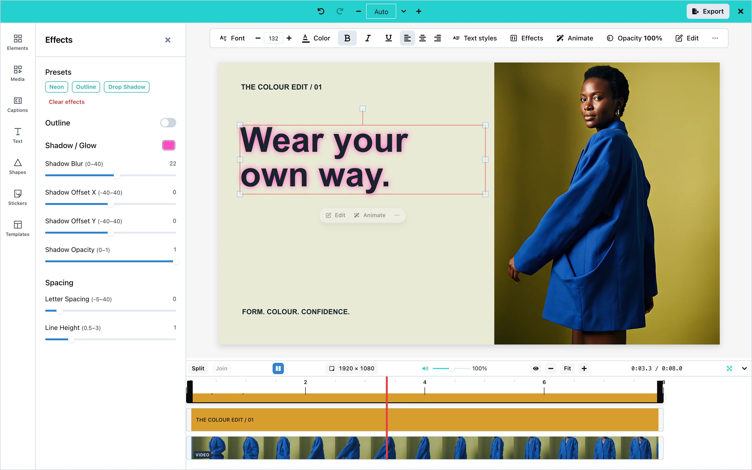 View full size
Text templates
The Text panel’s Styles section shows four templates and a See all view. The full view has search, purpose categories (Title, Button, Call to action, Sale, Price, Lower third, Quote, Testimonial, Social handle, Announcement, Countdown and Caption), then style categories (Bold, Elegant, Script, Neon, Outline and More for Gradient, Shadow and Minimal). Brand styles appear first when a brand is active. AI-made templates appear first with an AI badge. There is no Label category.
A template is a group of text and simple shapes. With one text selected, choosing a template replaces it, puts its words in the template’s main line and keeps its size. With several texts selected, each becomes its own group. A style-locked text cannot be put into a template. With no text selected, choosing a template adds the group. See Text templates for the host setting and AI format.
Text animation
Select a text item and press Animate to make it enter, exit, or move. See Animations.
AI text generation
The Text panel has one AI form. Generate with AI opens it for new wording. With text selected, the button is Rewrite with AI and + New starts a new item. In the form, choose Words or Text template; with a selection the choices read Change the words and Put it in a template. The single prompt is kept when you switch. Results preview on the canvas when selected. Generate more appends results; Try again replaces them. Add to canvas keeps the form open. See AI providers and Text templates.
AI rewrite
The toolbar action Rewrite with AI opens the Text panel’s AI form in rewrite mode. The right-click action opens the same form. Selecting a result previews it on the existing text; closing with ✕, pressing Escape, or changing selection keeps the chosen result as one undoable edit. + New switches to a new text item. The prompt is shared with text-template generation and stays when the operation changes.
Configuration
| Prop | Type | Default | Description |
|---|---|---|---|
textTemplates | AITextTemplatesSettings | none | Adds host categories and templates to Styles. Invalid entries are dropped with a console warning. See Text templates. |
templateMetadata | object | none | textStyles adds brand text styles under Brand styles in the Text panel. |
googleFonts | { hosted: true }, { endpointUrl }, or { requestFn } | Built-in families | Where the font picker gets the whole Google Fonts catalog. |
googleFontsApiKey | string | none | Deprecated. Sends your Google key from the browser. Use googleFonts. |
ai | object | none | The AI provider. Configure text, text rewriting and text-template generation independently. Hosted text-template generation is off unless ai.textTemplate is set. |
typography | object | none | The fonts of the editor's own panels. It does not change text items. See Theming. |
Events
Text has no events of its own. Text reaches you inside the exported video through onExport, and inside saved designs through onSaveTemplate. See Events.
Troubleshooting
Captions
Captions are words drawn into the picture of the video. They come from the speech in a clip, or from an .srt or .vtt file. For the difference between captions and subtitles, see Subtitles.
Importing a subtitle file and styling captions work with no setup. Automatic captions need a transcription service. The simplest one is your media server, which you pass as mediaApiUrl:
const options = {
    "mediaApiUrl": "https://media.example.com"
};Automatic captions
mediaApiUrl or ai.captions.transport. Hosted AI is coming soon. Available only with an enterprise licence from Layermetry. See Custom transcription and AI providers.Automatic captions write down what is said in a video clip. Select a clip, open the Captions panel, and press Generate captions.
A Generate captions button also appears in the bar under a selected clip, while the video has no captions yet.
A voiceover recorded in the editor can be captioned from the recorder itself. See Captions from a recording. The AI assistant and your own code can caption any clip with sound through the captionsFromClip action. See Editor actions.
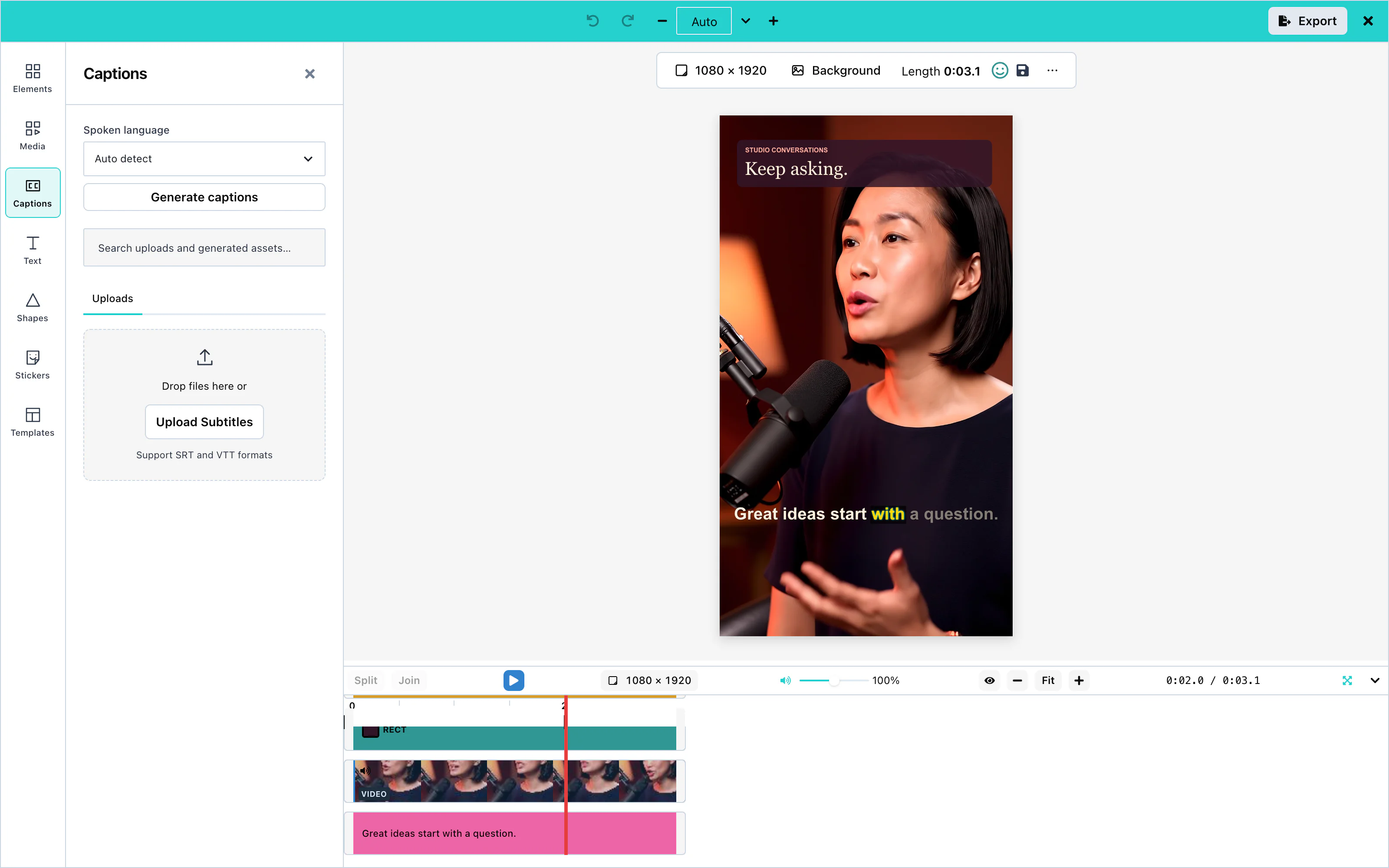 View full size
The editor sends the sound of the clip to the service, and adds one caption track that covers the clip. Then it adjusts the timing, so that no caption overlaps the next one and none stays on screen too long to read.
For a trimmed clip, the editor sends only the part of the file that the clip plays. For a clip at another speed, it places each caption by the clip's speed. The captions then match the voice on the canvas and in the exported video.
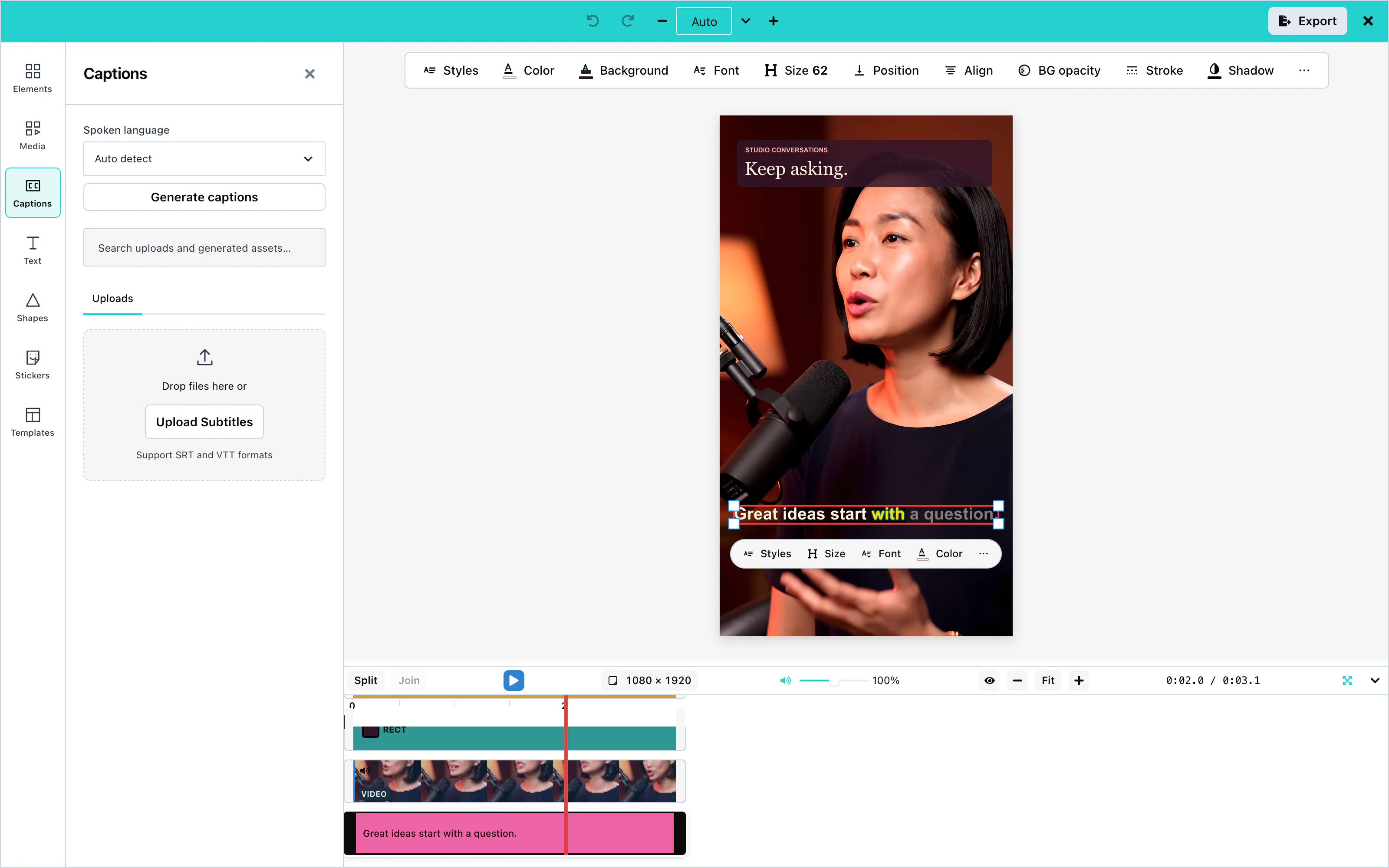 View full size
The panel shows Spoken language above Generate captions. By default it offers Auto detect, which is chosen at first, and a list of common languages. With Auto detect, no language is sent, and the transcription service detects the language itself.
To offer a fixed list of languages, set captions: { languages: ['fr', 'en'] } in ai. The list then shows exactly those languages, and the first one is chosen until the user picks another. The Generate captions button under a clip and the right-click menu use the same choice.
Disable captions
To remove automatic captions from the editor, pass captions: false in ai:
const options = {
    "ai": { endpointUrl: 'https://api.example.com/ai', captions: false }
};The editor then offers no control that sends sound to be written down. These controls are hidden:
- the Generate captions chip on a selected clip, in the selection pill, in the phone's selection bar, and in the phone's small pill when you add it through
itemActions; - Generate SRT in the toolbar above the canvas;
- the Generate captions button in the Captions panel, and its Spoken language control;
- the Generate captions line in the right-click menu;
- Generate captions in the voiceover recorder.
The AI assistant is not offered the captionsFromClip action. toolContracts on the Editor API and on the headless runtime leave it out, and list() still names it. A caller that runs captionsFromClip anyway is refused with "Captions are switched off in this editor, so the sound was not sent anywhere." No sound is sent to any service.
Each of these controls also follows ui.generative for captions. The bar above the canvas and the chips are the selection place, the Captions panel is panel, and the right-click menu is contextMenu. See UI customization.
Without an ai prop, captions controls stay visible and use your explicit mediaApiUrl. If you set neither mediaApiUrl nor ai.captions.transport, pressing Generate captions explains that the app needs a transcription service. No audio is sent. The developer console names the missing settings once.
SRT and VTT import
Open the Captions panel, press Upload Subtitles, and choose an .srt or .vtt file. The file appears under Uploaded Files. Press + on it to add the captions to the video.
The captions start at the beginning of the video and end with the last caption in the file. Imported captions start at the Bottom position, like every new caption.
1
00:00:00,500 --> 00:00:02,500
Welcome to the product tour.

2
00:00:02,800 --> 00:00:05,000
Here is how captions work.WEBVTT
00:00:00.500 --> 00:00:02.500
Welcome to the product tour.
00:00:02.800 --> 00:00:05.000
Here is how captions work.A caption can have more than one line. Formatting tags in a VTT file, such as <b>, are removed.
A caption can name its speaker. In an .srt file, the name comes first in square brackets: [Anna] Welcome back. In a .vtt file, the name is a voice tag at the start of the caption: <v Anna>Welcome back. Both become the caption's speaker, and the words are Welcome back.. In a .vtt file, &, <, and > become &, <, and >. An .srt file is read as it is written.
A VTT time can have hours, as in 00:00:01.000, or only minutes and seconds, as in 00:01.000. A file whose first line is WEBVTT is read as VTT, whatever its name. A speaker name is read only from square brackets at the start of a caption, such as [Anna] Hello.. Every other caption is kept exactly as written, including text with a colon.
Caption styles
Select a caption on the canvas or on the timeline. A bar appears under it with these controls:
| Control | What it changes |
|---|---|
| Styles | Applies one of 16 ready-made styles, such as Classic, Modern Minimal, and Karaoke Mode. |
| Size | The size of the letters, from 12 to 72. |
| Font | The typeface: Arial, Arial Black, Helvetica, Impact, Times, Courier, Georgia, Verdana, Roboto, or Open Sans. |
| Color | The color of the text. |
| Background | The color of the band behind the text. |
| BG opacity | How solid the band is, from 0 (invisible) to 1. |
| Position | Top, Center, or Bottom. See Positioning. |
| Align | Left, center, or right. |
| Stroke | An outline around the letters. |
| Shadow | A shadow behind the letters. |
The first four controls show in the bar. The others are under ⋯. Ready-made styles also set letter weight, letter spacing, line spacing, and letter case. The canvas and the exported video draw all four. Letter case changes only the drawn letters: the stored words, the SRT file, and the subtitle track keep the words as written.
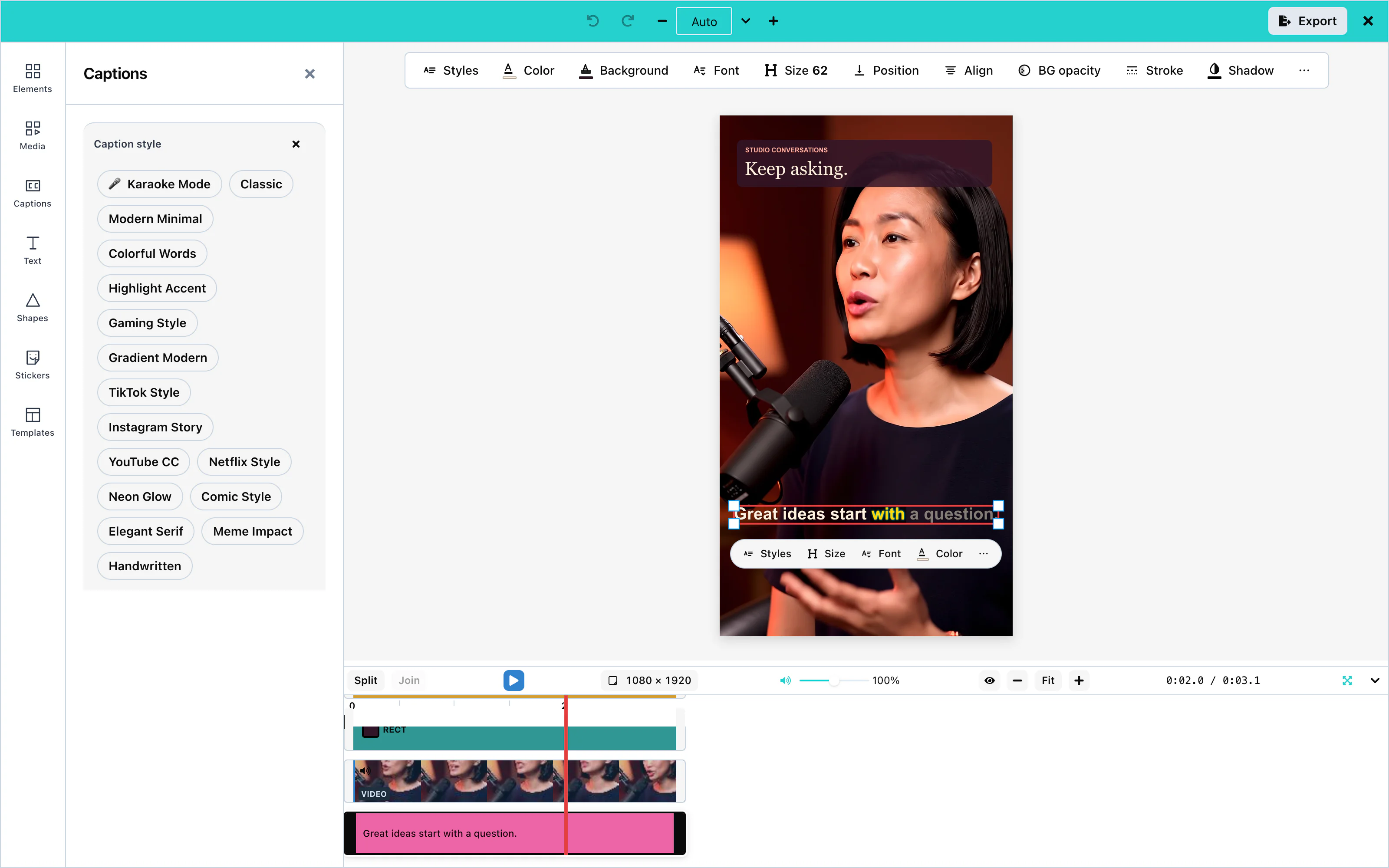 View full size
A new caption uses Arial, white letters on a black band at 80% opacity, centered at the bottom. The letter size follows the height of the video: 54 for a video 1,080 pixels tall.
Every style appears in the exported video exactly as in the editor, including the outline and the shadow together.
Caption animation
Each caption line can arrive with an animation. The animation takes 0.3 seconds from the moment the line starts, on the canvas and in the exported video:
| Value | What the line does |
|---|---|
none | Appears at once. |
fade | Fades in. |
slide | Fades in while it rises half a letter-height into place. |
bounce | Rises, goes a little too far, and settles. |
Set it with the animation argument of the subtitleSetStyle action, from the AI assistant or from your own code. See Editor actions.
Positioning
Position places the middle of the caption at a fixed share of the video's height:
| Position | Height from the top |
|---|---|
| Top | 10% |
| Center | 50% |
| Bottom | 85% (the default) |
The band behind the text spans the width of the video.
When you resize the canvas with Fit, Fill, or Reflow, captions scale with the picture. The letter size, the outline width, the shadow blur, the padding, and the letter spacing all change by the same ratio as every other item. The position stays the same share of the height. Keep changes nothing. An export at another size, from Sizes in the Export panel, scales its copy of the captions in the same way. See Resizing.
Word highlighting
The Karaoke Mode style highlights each word while it is spoken. The words already spoken stay bright, and the words still to come are dimmed.
Automatic captions carry the time of every word, so the highlight follows the voice. A subtitle file has no word times, so the highlight moves evenly across each line.
The highlight appears in the exported video.
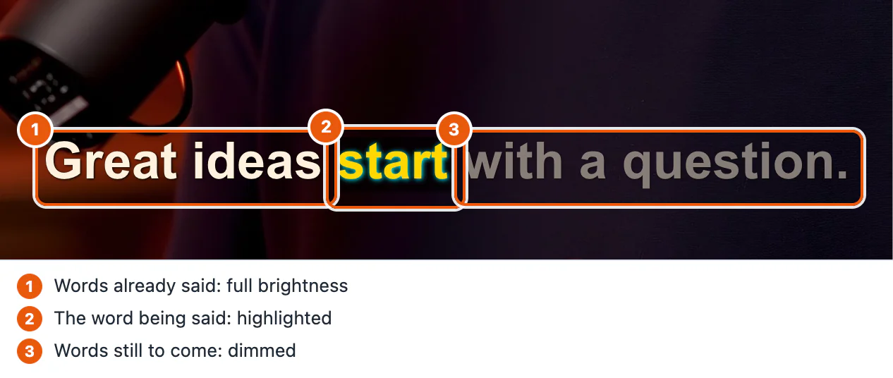
Custom transcription
ai. See AI providers.You can send the sound to your own service instead of mediaApiUrl. Give captions their own transport inside ai. Other AI features keep the transport at the top level.
This example sends the sound to /api/transcribe on your server:
const options = {
    "ai": {
        endpointUrl: 'https://api.example.com/ai',
        captions: { transport: { requestFn: transcribe } },
    }
};Your function returns the answer of your service. The editor reads any of these shapes:
| Answer | Word highlighting |
|---|---|
{ "items": [{ "segments": [{ "text": "Hello", "start": 0, "end": 1, "words": [{ "text": "Hello", "startTime": 0, "endTime": 1 }] }] }] } | Follows each word |
{ "items": [{ "srt": "1\n00:00:00,500 --> 00:00:01,500\nHello" }] } | Moves evenly across each line |
{ "items": [{ "text": "Hello" }] } | Moves evenly. The editor estimates the times of each line. |
{ "items": [{ "srtPath": "https://cdn.example.com/captions.srt" }] } | Moves evenly across each line; the file must allow the editor to read it. |
With endpointUrl as the captions transport, your proxy receives the sound as a multipart form with the fields audio, operation, and type, and answers with one of the same shapes. When the user chose a spoken language, the form also has language, and your function receives it as input.language. The editor does not send your license key to your proxy or your function.
Configuration
| Prop | Type | Default | Description |
|---|---|---|---|
mediaApiUrl | string | none | Your media server. Automatic captions send the sound to {mediaApiUrl}/speech-to-text. |
ai | object | none | Configure ai.captions.transport with your transcription endpoint or callback. The general AI transport is not inherited by captions. Hosted AI is coming soon. Available only with an enterprise licence from Layermetry. |
ai.captions | false or object | on | false hides every captions control and refuses captionsFromClip. See Disable captions. An object can set transport, maxPerSession, and languages. |
maxPerSession counts generations in the browser, per editor, while the page is open. It is a guard for honest use, not a security control, so enforce your real limit on your server.
Events
Captions have no events of their own. They are part of the design, and they reach you inside the exported video through onExport. See Events.
Troubleshooting
Subtitles
Subtitles are the words of a video, delivered next to the picture instead of inside it. The editor makes them from the same captions you create on the Captions page.
Captions and subtitles
Captions are drawn into the picture. Every viewer sees them in every player, and they look exactly as you styled them. The viewer cannot switch them off.
Subtitles travel beside the picture. The viewer's player shows them, and the viewer can switch them on and off. The player also decides how they look.
| Captions | Subtitle track | Caption file | |
|---|---|---|---|
| Where the words are | Drawn into the picture | A track inside the MP4 file | A separate .srt, .vtt, or .txt file |
| The viewer can switch them off | No | Yes | Yes, where the platform allows it |
| Your caption styles are kept | Yes | No, the player draws the words | No, the platform draws the words |
| Word highlighting | Yes | No | No |
Captions work in every player and on every social platform. YouTube and Vimeo ask for an SRT file.
Captions are the default. A video exported with captions has them drawn into the picture.
SRT and VTT import
An imported .srt or .vtt file becomes captions on the video. From there, the words can leave the editor as captions, as a subtitle track, or as a separate file (.srt, .vtt, or .txt). See SRT and VTT import.
Subtitle tracks
A subtitle track puts the words and their times inside the MP4 file, next to the video and the sound. Players such as QuickTime and VLC let the viewer switch the track on and off.
Only an MP4 file carries a subtitle track. In a WebM file or a GIF, the captions are always drawn into the picture. For web players, give them the .vtt file.
The Advanced step of the Export panel has a Captions field while the video has captions. It has three choices:
| Choice | What the file contains |
|---|---|
| In the picture | The default. The captions are drawn into every frame, exactly as styled. Viewers cannot switch them off. |
| Subtitle track | A track that viewers switch on and off. Nothing is drawn into the picture, so the words never appear twice. |
| Both | The captions in the picture, and a subtitle track. A viewer who switches the track on sees the words twice. |
The choice applies to every file of the export, Save & Exit included. From your own code, the exportStart action takes the same choice as subtitles: 'burn' | 'track' | 'both'. Leaving it out means 'burn', which draws the captions into the picture. See Editor actions.
The track carries only the words and their times. Each player uses its own font, color, and position, so your caption styles and word highlighting do not apply.
SRT export
While the video has captions, the Export panel shows a Captions file row with three buttons: Download .srt, Download .vtt, and Download .txt. Download .srt saves the captions as exported-video.srt, with the times of the finished video. The file is made in the browser from the design, so nothing is exported or uploaded. Upload this file to YouTube, Vimeo, or any other platform that accepts subtitle files.
The file uses the standard SRT format: a number, a time line, and the text of each caption.
1
00:00:00,500 --> 00:00:02,500
Welcome to the product tour.

2
00:00:02,800 --> 00:00:05,000
Here is how captions work.
Each time is rounded to the nearest millisecond, so 2.8 seconds is written 00:00:02,800.
Speaker names
Include speaker names appears in the Captions file row when at least one caption line names a speaker. It is off by default. When it is on, all three files carry the name at the start of the line:
| File | A line with the speaker Anna |
|---|---|
.srt | [Anna] Welcome to the product tour. |
.vtt | <v Anna>Welcome to the product tour. |
.txt | Anna: Welcome to the product tour. |
The editor reads a speaker name back from the .srt form and from the .vtt form when it imports a file. See SRT and VTT import.
Files in onExport
Every export of a video with captions also hands the caption files to your code. onExport receives them in its second argument as extras.srt, extras.vtt, and extras.txt. Each has two fields: text, the text of the file, and file, the same text as a File. The types are application/x-subrip, text/vtt, and text/plain. Each file is named after the video, so exported-video.mp4 comes with exported-video.srt, exported-video.vtt, and exported-video.txt. The three fields are present only when the video has captions:
const options = {
    "onExport": (file, extras) => {
        console.log(`Exported ${file.name}`);
        if (extras?.vtt) {
            console.log(`Captions: ${extras.vtt.file.name}, ${extras.vtt.text.length} characters`);
        }
    }
};The caption files come with every file that onExport receives: from Export, Save & Exit, Share…, and Export current canvas. They carry speaker names when Include speaker names was on. Export current canvas never adds speaker names.
From your own code, the readCaptionsFile action returns the same text as the three buttons, with format set to srt, vtt, or txt. See Editor actions. When the video has no captions, it answers ok: false with "There are no captions to write."
VTT export
Download .vtt saves the captions as exported-video.vtt, in the WebVTT format. Web players read this format with the HTML <track> element, and YouTube and Vimeo accept it too. The file starts with a WEBVTT line, and a time uses a full stop before the milliseconds:
WEBVTT

1
00:00:00.500 --> 00:00:02.500
Welcome to the product tour.

2
00:00:02.800 --> 00:00:05.000
Here is how captions work.
The characters &, <, and > in the words are written as &, <, and >, as the format requires.
Transcript export
Download .txt saves the words as exported-video.txt, a plain transcript with no times. Each caption line is one paragraph, with an empty line between paragraphs:
Welcome to the product tour.

Here is how captions work.
Images
Pictures come from the user's computer, from stock photo services, or from an AI model. On the canvas, the user crops a picture, fits it to the canvas, adds filters, and removes its background. A picture stays on screen for a set time, like a clip.
Upload, crop, fit modes, and filters work with no setup. The other options need a key, a server, or an AI provider, which you pass as options:
const options = {
    "mediaApiUrl": "https://media.example.com",
    "stockMediaApis": {
        pexels: { apiKey: 'YOUR_PEXELS_KEY' },
        unsplash: { apiKey: 'YOUR_UNSPLASH_ACCESS_KEY', showAttribution: true },
    },
    "ai": { endpointUrl: 'https://api.example.com/ai' }
};| Option | Prop | Configuration page |
|---|---|---|
| Stock photos | stockMediaApis | Stock media |
| Background removal | mediaApiUrl | AI providers |
| Image generation, AI image editing | ai | AI providers |
Upload
Open Media, choose Photo, and press Upload Images. Press + on the file under Local Upload to add it to the canvas. The panel lists JPG, PNG, and GIF.
A selected picture shows Edit with AI, Make video, Crop, Effects, and ⋯ under it. ⋯ holds Animate, Fit mode, Fit to canvas, Remove BG, Opacity, and the layer order.
Stock photos
With stockMediaApis, the Photo tab of Media shows Stock Images, with one tab for each service. A click on a photo adds it to the canvas.
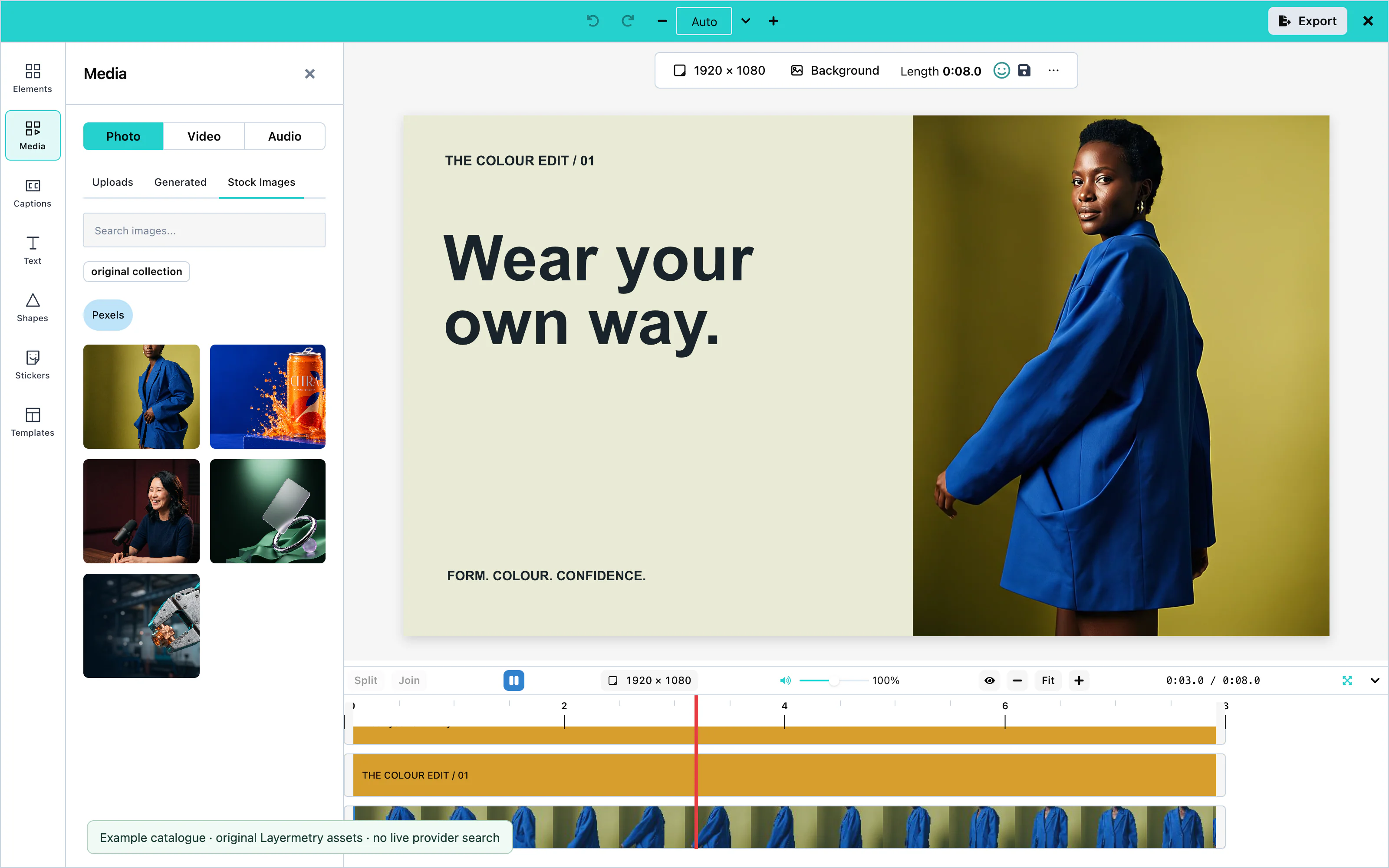 View full size
Unsplash requires showAttribution: true, so the photographer's name is shown with each photo.
Crop
Select a picture and press Crop. Drag the edges of the frame to choose the part that shows. Click outside the picture to apply the crop, or press Esc to cancel. Clear crop shows the whole picture again.
Fit modes
Fit mode, under ⋯, decides how a picture fills the canvas:
| Mode | What it does |
|---|---|
| Fit | Shows the whole picture, as large as the canvas allows. Space can remain at two sides. |
| Fill | Covers the whole canvas, and cuts off what does not fit. |
| Stretch | Covers the whole canvas, and changes the proportions of the picture if needed. |
Fit to canvas applies the Fit mode in one click.
Filters and adjustments
Select a picture and press Effects. Four filters switch on and off: Grayscale, Sepia, Invert, and Emboss. Adjustments take a number:
| Adjustment | Range |
|---|---|
| Blur | 0 to 10 |
| Brightness | 0 to 200 |
| Noise | 0 to 100 |
| Pixel Size | 1 to 10 |
| Contrast | 0 to 2 |
| Corner Radius | 0 to 100 |
| Shadow | 0 to 50 |
| Offset X, Offset Y | −50 to 50 |
| Shadow Offset X, Shadow Offset Y | −50 to 50 |
| Opacity | 0 to 100 |
Filters and adjustments appear in the exported video. See Effects and filters.
Background removal
mediaApiUrl. ai: { hosted: true } uses Layermetry’s service. Hosted AI is coming soon. Available only with an enterprise licence from Layermetry. See AI providers.Select a picture and choose Remove background in the right-click menu, or Remove BG under ⋯. The editor replaces the picture with the one your server returns, and says "Background removed from image successfully".
Image generation
ai. See AI providers.Open Media, choose Photo, and press Generate image. The user describes the picture and presses Generate. Add to canvas adds the selected result to the canvas. Every picture made in the session stays under Generated.
The right-click menu of the empty canvas also has Generate image here…, which places the picture where the user clicked.
The request has "operation": "image", and your server answers with { items: [{ url }] }. See Custom AI endpoint.
AI image editing
ai. See AI providers.Select a picture and press Edit with AI, or choose Edit with AI… in its right-click menu. The user describes the change, or starts from Change the background, Add something, Remove something, Change the time of day, or Change the style…, and presses Generate. The first suggestion previews on the selected picture. Click a card to compare results; choose Original to restore the source. Closing the box keeps the selected result as one editing action, with one Undo step.
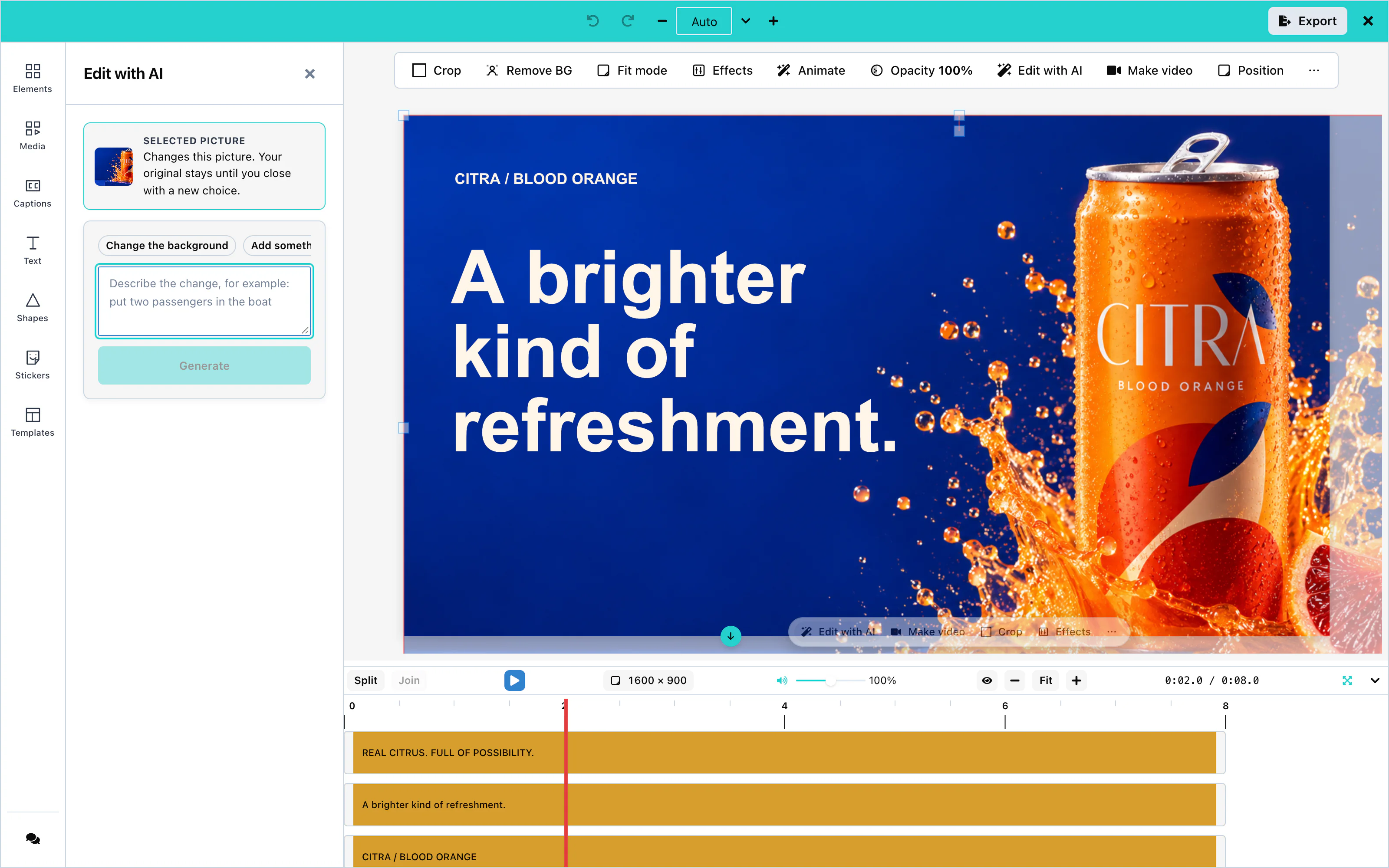 View full size
The request has "operation": "imageEdit" and carries the picture in input.source. With onUploadAsset, the editor stores the new picture in your storage before it replaces the old one. See Asset storage.
Upscaling
Coming soonUpscaling will increase the resolution of a picture.
Masks
Select a picture and press Mask beside Crop to hide part of it. Choose Rectangle, Rounded, Circle, Star, Polygon, Linear, or Shape…, then move, resize, or rotate the mask. Invert hides the inside instead, and Feather softens the edge. Press Enter or click outside to apply it, or press Esc to cancel. In compact layout, use Done or Cancel. Clear mask removes the mask without changing the crop.
Video masks work on pictures, GIFs, stickers and video clips. A new mask is rectangular, inset 10% on each side, with no feather or inversion. Rounded corners and feather range from 0–50%; stars and polygons accept 3–12 points or sides. Mask controls are enabled by default; set ui: { features: { masks: false } } to hide them.
When the user edits a masked picture with AI, the request includes input.mask alongside input.source. White pixels identify the editable area, black pixels protect the rest, and gray pixels describe the feathered edge. Your provider must support mask input to honor that region.
Configuration
| Prop | Type | Default | Description |
|---|---|---|---|
stockMediaApis | object | none | Pexels and Unsplash settings. Without it, there is no Stock Images tab. |
mediaApiUrl | string | none | The media server that removes backgrounds. ai: { hosted: true } uses the Layermetry address. Hosted AI is coming soon. Available only with an enterprise licence from Layermetry. |
ai | object | none | The AI provider. image: false hides Generate image, and imageEdit: false hides Edit with AI. |
onUploadAsset | function | none | Stores uploaded and AI-made pictures in your own storage. |
Events
Pictures have no events of their own. The editor calls onUploadAsset when the user keeps a picture made by AI, and the finished video reaches you through onExport. See Events.
Troubleshooting
Shapes
Shapes are vector graphics: rectangles, circles, stars, arrows, lines, and more. They stay sharp at every size. The user sets their fill, their outline, and how long they stay on screen.
The shape library, fill, and stroke work with no setup. AI shape generation needs an AI provider:
const options = {
    "ai": { endpointUrl: 'https://api.example.com/ai' }
};| Option | Prop | Configuration page |
|---|---|---|
| AI shape generation | ai | AI providers |
Shape library
Open Shapes in the tool rail and click a shape to add it. The filters above the library group the shapes as Basic, Geometric, Arrows, Lines, Organic, and Symbols.
The library has 42 shapes, among them Rectangle, Rounded Rectangle, Circle, Ellipse, Triangle, Pentagon, Hexagon, Polygon, Star, Heart, Diamond, Ring, Squircle, Soft Blob, Badge, Speech Bubble, Callout, and Pill.
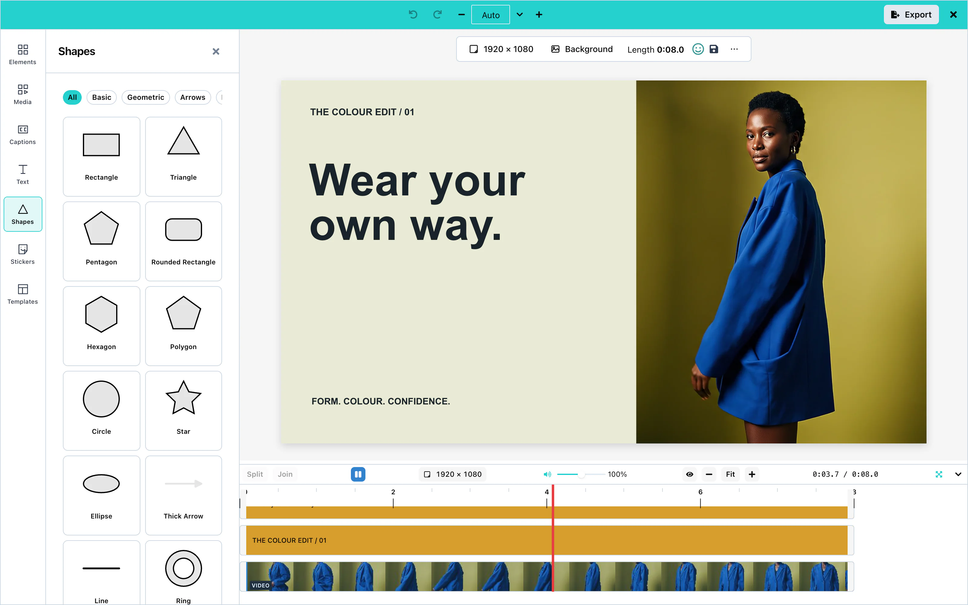 View full size
Add shape in the toolbar above the canvas also adds a shape. A new shape stays on screen for 5 seconds from the playhead.
Fill and stroke
Select a shape. The toolbar above the canvas shows Fill, Stroke, and Stroke width:
- Fill sets the color inside the shape.
- Stroke sets the color of the outline.
- Stroke width sets the thickness of the outline. 0 removes it.
Opacity, under ⋯, makes the whole shape see-through. See Effects and filters for more options.
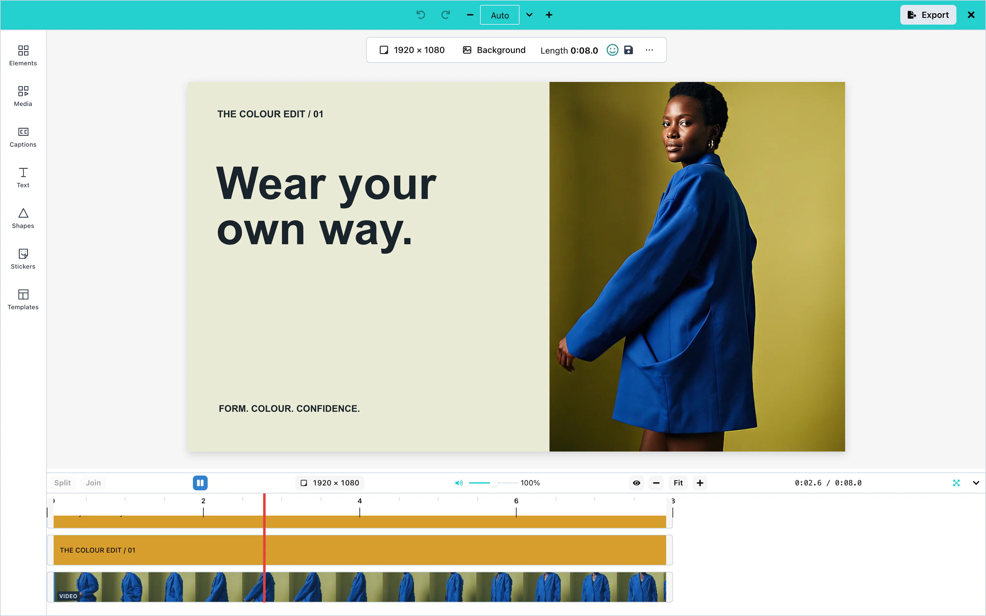 View full size
Lines and arrows
The library has six lines: Line, Divider, Dashed Line, Dotted Line, Arrow Line, and Double Arrow Line. It also has seven arrows: Thick Arrow, Arrow Up, Arrow Down, Arrow Left, Arrow Right, Double Arrow, and Curved Arrow. The Lines and Arrows filters show them.
A line has no inside, so Stroke and Stroke width set its color and thickness.
AI shape generation
ai. See AI providers.Open Shapes and press Generate shape. The user describes the shape and presses Generate. The editor shows each outline that the model drew, as a small tile. Add to canvas adds the chosen outline as a shape.
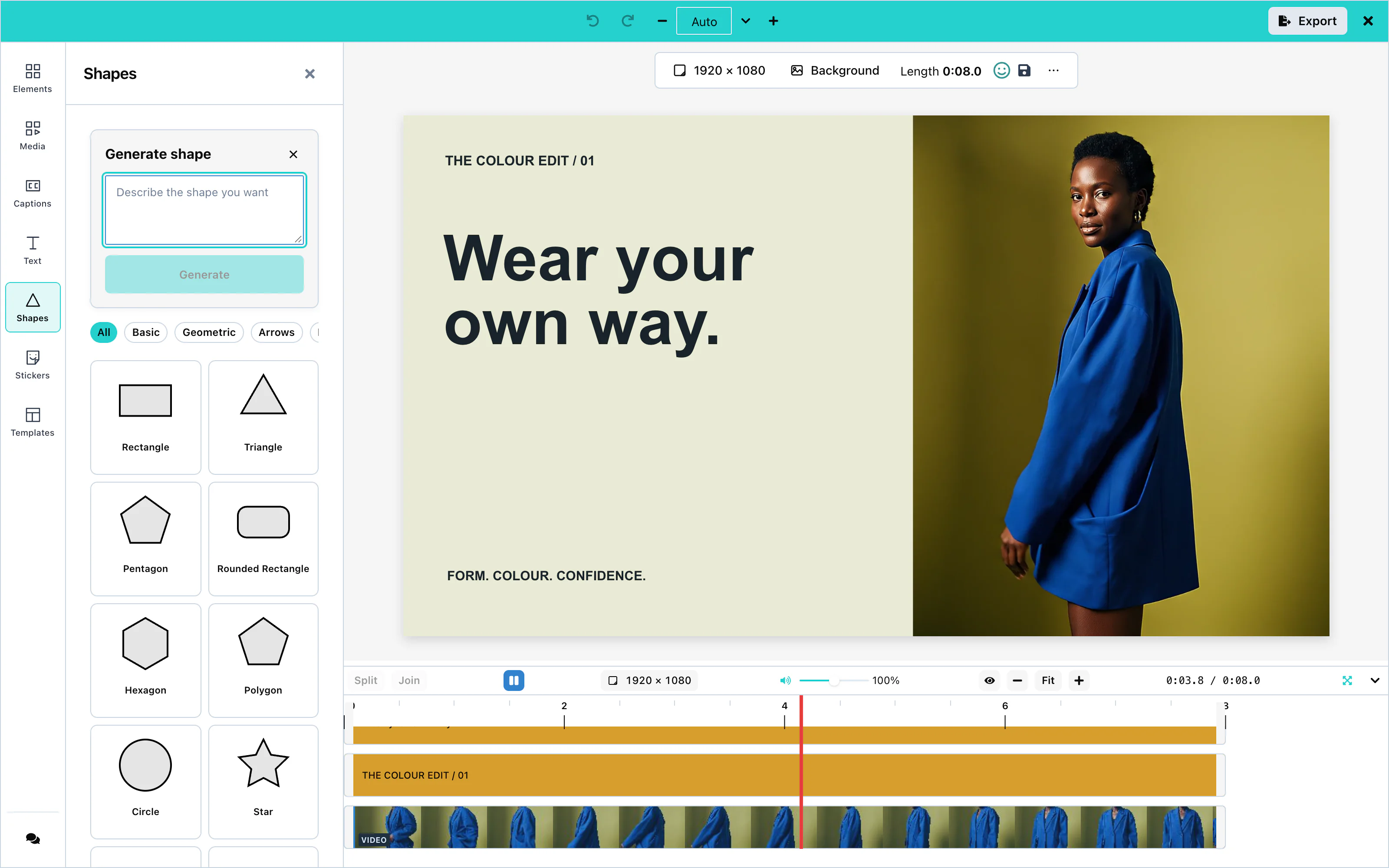 View full size
Your server answers with { items: [{ pathData }] }: SVG path data that starts with M. The editor drops an outline that draws nothing. See Custom AI endpoint.
Configuration
| Prop | Type | Default | Description |
|---|---|---|---|
ai | object | none | The AI provider. svgPath: false hides Generate shape. |
ui | object | none | ui.toolRail.hidden: ['shapes'] removes the Shapes panel. See UI customization. |
Events
Shapes have no events of their own. They reach you inside the exported video through onExport, and inside saved designs through onSaveTemplate. See Events.
Troubleshooting
Stickers
Stickers are small ready-made pictures, still or animated. They come from the built-in set, from packs you provide, and from GIPHY. The Stickers panel shows every source you configure, in your order.
Without the stickers prop, the panel shows the built-in stickers. With it, you choose the sources:
const options = {
    "stickers": {
        sources: [brandPack, builtInStickers(), giphyStickers({ endpointUrl: '/api/giphy' })],
    }
};| Source | Function | Needs |
|---|---|---|
| Built-in stickers | builtInStickers() | Nothing |
| Your own pack | staticStickers({ id, label, items }) | The addresses of your pictures |
| GIPHY | giphyStickers({ apiKey }), ({ endpointUrl }), or ({ requestFn }) | A GIPHY key. See Stock media. |
stickers: { sources: [] } removes the sticker tools.
Built-in stickers
The built-in set, Essentials, has four stickers: Heart, Star, Sparkle, and Check mark. They are drawn as vector graphics and carried inside the package, so they need no network.
Click a sticker to add it to the canvas. A sticker stays on screen for a set time, like a picture.
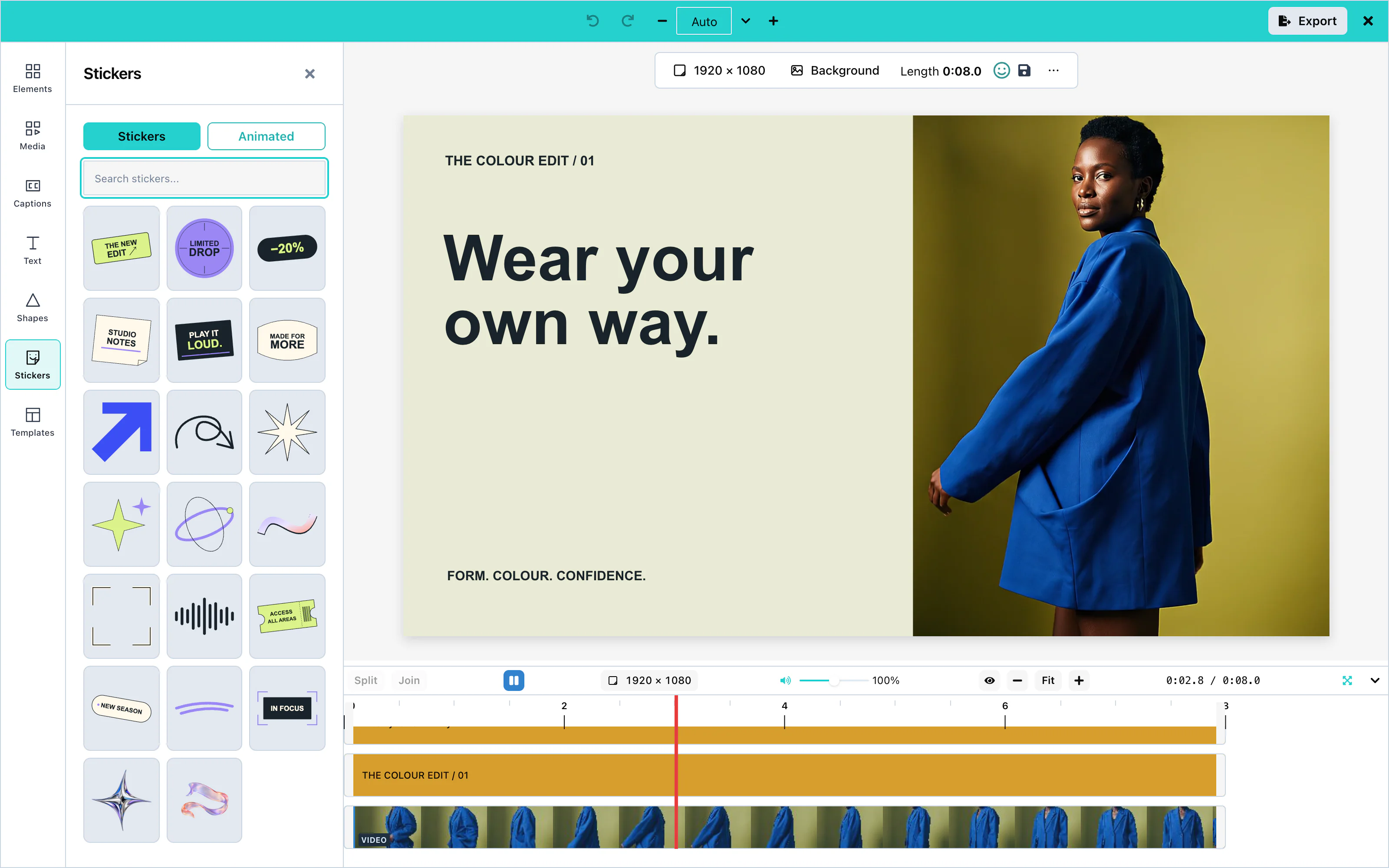 View full size
Insert Emoji in the toolbar above the canvas adds one sticker when you choose an emoji. The picker shows Loading emoji… while its picture loads. If the picture cannot be loaded within the time limit, it shows Emoji not added.
The picker and inserted stickers use Twemoji 17.0.3. The picker credits "Emoji graphics: Twemoji by Twitter, Jason Sofonia, Justine De Caires and other contributors, CC-BY 4.0". The package’s THIRD-PARTY-NOTICES.md includes this content under Content loaded at run time.
GIPHY
giphyStickers adds GIPHY's stickers, with search. The panel shows the trending stickers first. It shows the "Powered by GIPHY" mark that GIPHY's terms require.
const options = {
    "stickers": { sources: [giphyStickers({ endpointUrl: 'https://api.example.com/giphy' })] }
};GIPHY asks for stickers rated pg. A proxy adds your key and returns GIPHY's answer unchanged.
Animated GIFs
The Animated tab shows only stickers that move. A GIPHY sticker appears there when it has a moving version that the editor can play and export.
A sticker of your own moves when its address ends in .gif or .webp, or when you give it an animatedUrl. The still url is then used for the Stickers tab.
A GIF from the user's computer, added under Media > Photo, also plays in the video. It appears as a GIF row in the timeline.
Custom sticker packs
staticStickers turns a list of pictures into a source. The panel search matches the words in title and id:
| Field | Type | Description |
|---|---|---|
id | string | A unique name for the sticker. |
title | string | Optional. The name that search matches. |
url | string | The address of the picture. |
animatedUrl | string | Optional. The address of a moving version. |
thumbnailUrl | string | Optional. A small version for the panel. Defaults to url. |
width, height | number | Optional. The size of the picture in pixels. |
For a pack that lives on your server, write your own source: an object with id, label, and a search(query, page, signal) function that returns { items, hasMore }. trending(page, signal) is optional, and fills the panel before the user searches.
Configuration
| Prop | Type | Default | Description |
|---|---|---|---|
stickers | { sources: StickerSource[] } | the built-in set | The sticker sources, in the order the panel shows them. An empty list removes the sticker tools. |
Events
Stickers have no events of their own. They reach you inside the exported video through onExport. See Events.
Troubleshooting
Backgrounds
The background is the layer behind everything on the canvas. It lasts for the whole video, and it has no row in the timeline.
Colors, gradients, a blurred copy of a clip, and an uploaded picture work with no setup. Searching Unsplash for a picture needs your Unsplash key, and Generate background needs an ai setting that serves pictures:
const options = {
    "stockMediaApis": {
        unsplash: { apiKey: 'YOUR_UNSPLASH_ACCESS_KEY', showAttribution: true },
    }
};Open Background in the tool rail. At the top is Generate background, when your ai setting serves pictures. Below it are three tabs: Solid Color, Gradient, and Image.
Default: a white background.
Solid color
On the Solid Color tab, click one of the Preset Colors, or choose a Custom Color and press Apply Color.
The color stays with the background when the user changes it to a gradient, a picture, or a blurred copy. It is the fallback color: the preview and the exported video show it whenever the background cannot be drawn. That happens while the clip of a blurred copy is not on screen, when the colors of a gradient cannot be read, and when a picture cannot be loaded. In the preview, a picture that has not loaded yet also shows the color. When no color was ever chosen, the fallback is white. To change the fallback color, choose a color again. The background then becomes that color.
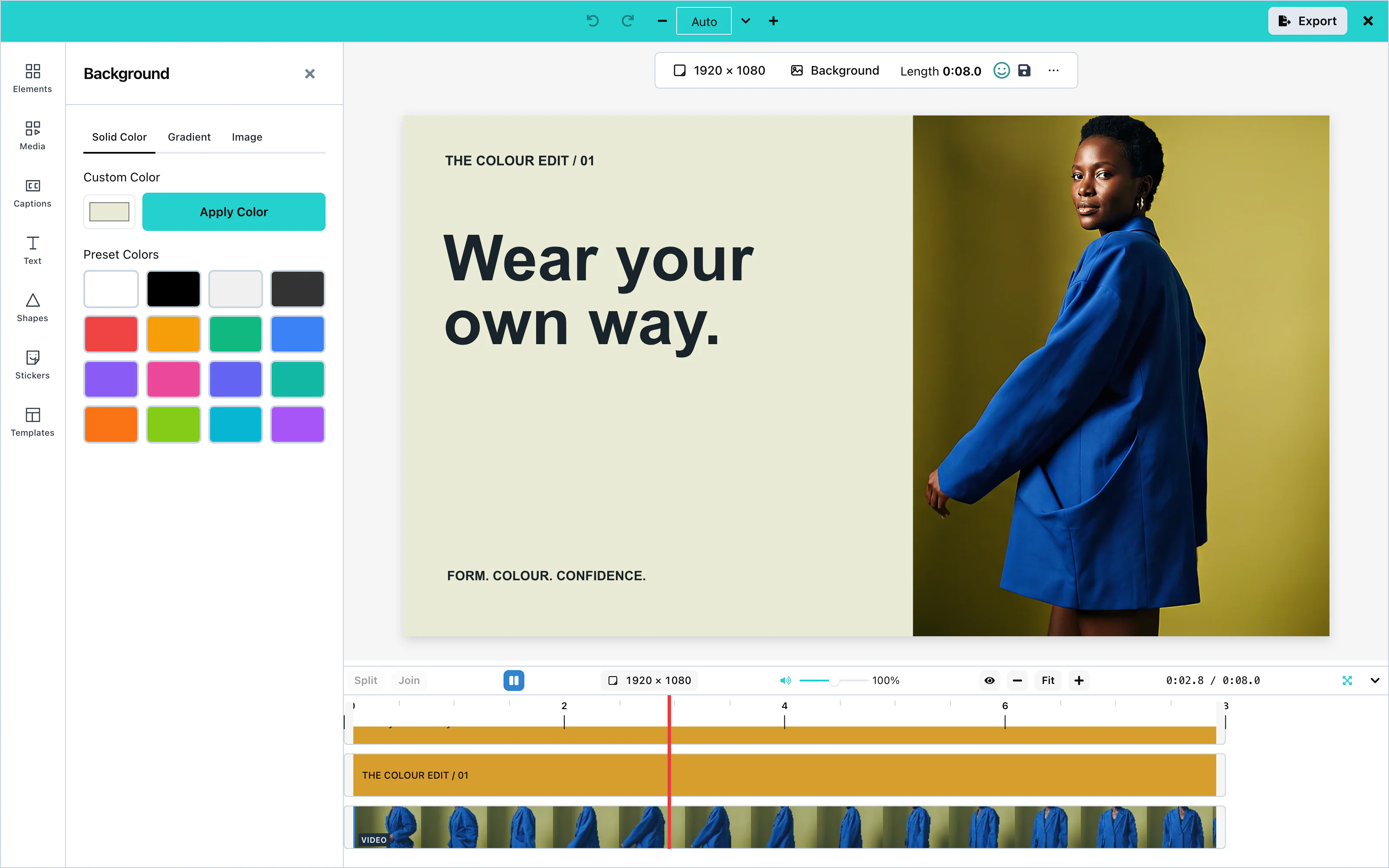 View full size
Gradient
On the Gradient tab, click one of the Gradient Presets, or choose the Start, Middle, and End colors and press Apply Custom Gradient.
Under the colors, Direction says which way the gradient runs: → (left to right, the default), ↓ (top to bottom), ↘ and ↗ (the two diagonals). For any other direction, type a number of degrees from 0 to 359 and press Enter. 90 is left to right and 180 is top to bottom.
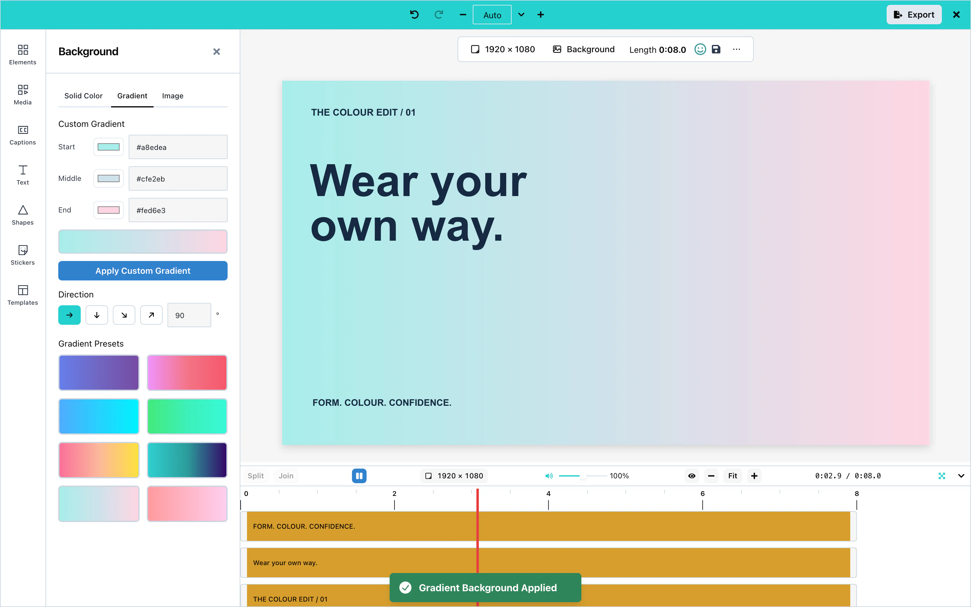 View full size
Image
The Image tab puts a picture behind everything. It has, from top to bottom:
- From this design: one tile for each picture or clip on the canvas. Press a tile to make the background a blurred, darkened copy of that picture or clip. See Blurred background.
- Upload a picture: choose a picture file from the computer.
- The Unsplash search, when Unsplash is connected. The user searches photos and clicks one. The photographer's name is shown with each photo, as Unsplash requires.
- Blur and Darken, whenever the background is a picture or a blurred copy.
A picture is scaled to cover the whole canvas and centered. The parts that do not fit are cut off equally from both sides, on screen and in the exported video.
Pictures from web addresses
A background picture can come from a web address, for example from Unsplash, from a template, or from the canvasSetBackgroundImage action. The editor asks for it as a cross-origin request, in the preview and in the export. So the server that holds the picture must allow your page to read it. It does this with a CORS header in its answer, for example:
Access-Control-Allow-Origin: https://app.example.comUse the address of your page, or * for a public picture. Pictures that you store through onUploadAsset need the same header. See Asset storage.
When the server does not send this header, the picture cannot be drawn. The preview then shows the fallback color, and so does the exported video. See Solid color.
A signed address, from S3 or CloudFront for example, is loaded exactly as it is. See Signed addresses.
Blur softens the picture, from 0 (sharp) to 40 pixels. Darken puts black over it, from 0 to 100 %. Both help text on top stay readable. The design changes once, when the slider is let go.
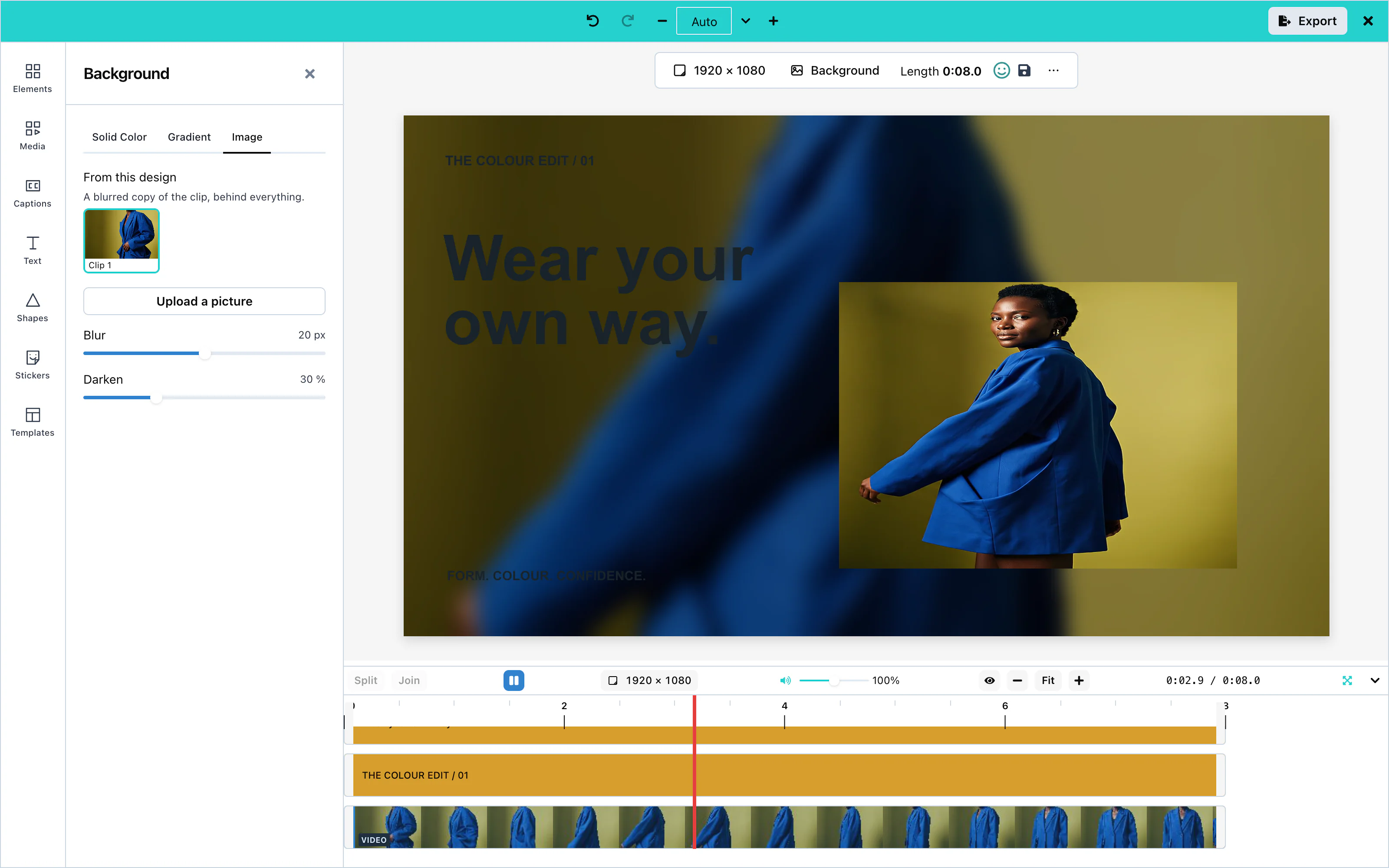 View full size
Blurred background
A landscape clip on a portrait canvas leaves empty bars above and below it. A blurred background fills them with a soft, darkened copy of the clip itself, the way phone video apps do.
There are three ways to make one:
- On the Image tab, press the clip's tile under From this design.
- Right-click the clip on the canvas and choose Use as blurred background. The same line is on the menu of a picture.
- In the Resize panel, choose Blurred fill before Apply. Everything is fitted to the new size, and a blurred copy of the clip on screen fills the rest.
A new blurred copy starts at Blur 20 pixels on a canvas 1080 pixels on its short side (the number follows the short side, from 0 to at most 40) and Darken 30 %. If the background was already a picture or a blurred copy, its own Blur and Darken are kept.
The copy follows the clip as it plays, and it is fitted again whenever the canvas is resized. It shows the whole frame of the clip, even when the clip itself is cropped.
While the clip is not on screen, the background shows its fallback color instead (see Solid color). The panel then says: "The blurred background shows only while this clip is on screen. Elsewhere the canvas shows the colour below." with a small swatch of that color.
Generate background
ai setting that serves pictures. See AI providers.Press Generate background at the top of the panel, describe the picture, and press Generate. Choose a result and press Set as background. It becomes the background. Your onUploadAsset stores it first, so the design keeps your own address for it.
A host that shows AI pictures in panels shows this control too. To remove it, leave 'panel' out of ui.generative.actions.image.surfaces. That also removes Generate image from the Media panel.
Configuration
| Prop | Type | Default | Description |
|---|---|---|---|
stockMediaApis | object | none | unsplash adds the photo search to the Image tab. Without it, the tab still offers From this design and Upload a picture. |
ai | object | none | A picture capability adds Generate background. See AI providers. |
ui | object | none | ui.toolRail.hidden: ['background'] removes the Background panel. See UI customization. |
Events
The background has no events of its own. It reaches you inside the exported video through onExport. See Events.
Troubleshooting
Styling and export
Effects
Effects change the look of video clips, pictures, and shapes: filters such as grayscale, and adjustments such as brightness. Text has its own effects: outline, shadow, and spacing.
Effects need no setup. Select a clip, a picture, or a shape, and open Effects in the tool rail, or press Effects under the selected item.
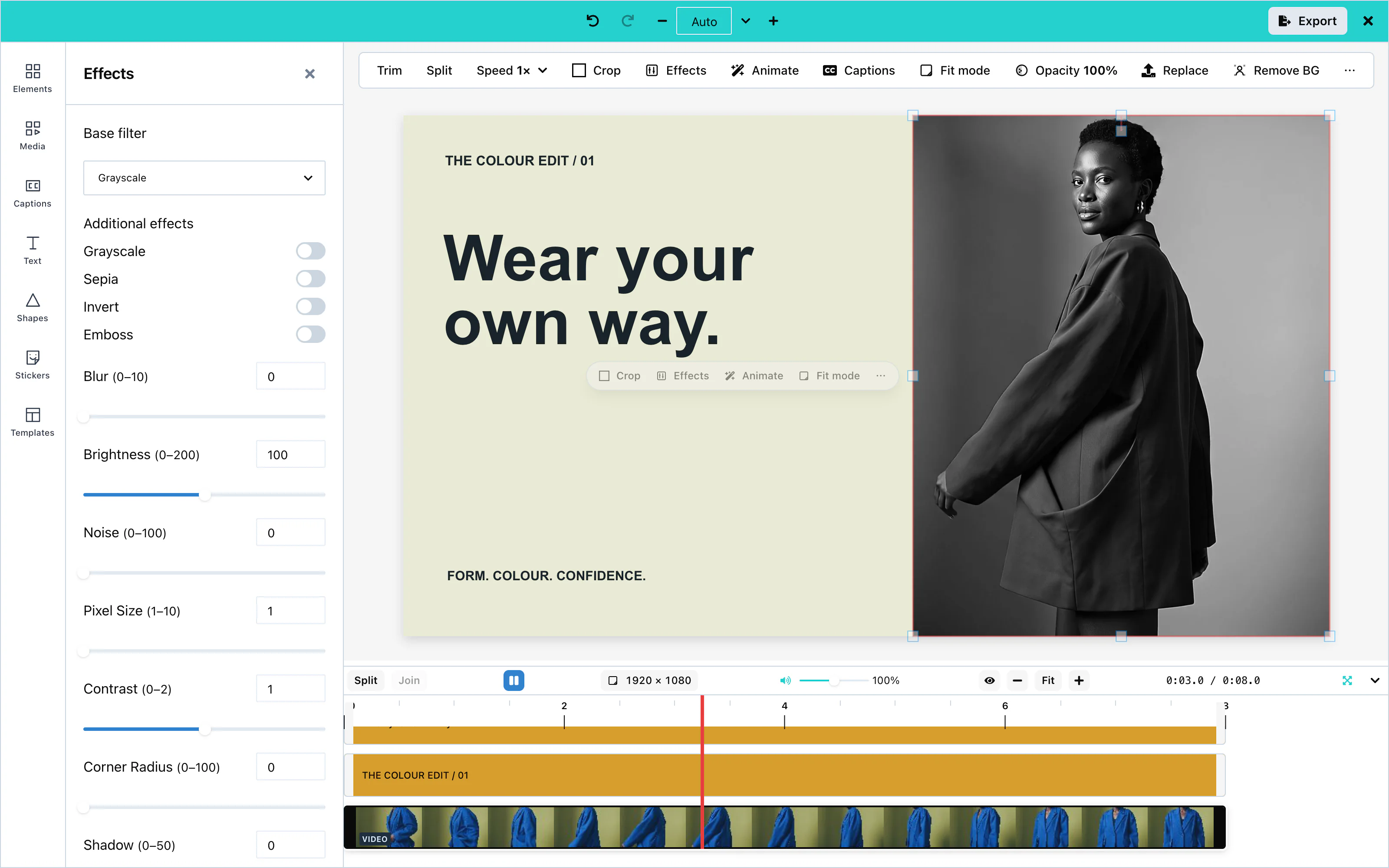 View full size
Filter presets
On a phone, expand the Effects sheet for more room. While expanded, press Collapse beside Done, or tap the grip, to return to its default height.
Base filter chooses one preset: None, Grayscale, Sepia or Invert. Additional effects switches effects on or off independently: Grayscale, Sepia and Invert, plus Emboss for pictures and shapes. These group labels are the same on desktop and phone.
Base Filter applies one filter to the whole item: None, Grayscale, Sepia, or Invert.
Filters also switch on and off one by one:
| Filter | Video clips | Pictures and shapes |
|---|---|---|
| Grayscale | Yes | Yes |
| Sepia | Yes | Yes |
| Invert | Yes | Yes |
| Emboss | Yes | Yes |
Adjustments
Adjustments take a number. Video clips, pictures, and shapes offer these adjustments. Opacity is available for pictures and shapes:
| Adjustment | Range | Video clips |
|---|---|---|
| Blur | 0 to 10 | Yes |
| Brightness | 0 to 200. 100 is no change. | Yes |
| Contrast | 0 to 2. 1 is no change. | Yes |
| Noise | 0 to 100 | Yes |
| Pixel Size | 1 to 10 | Yes |
| Corner Radius | 0 to 100 | Yes |
| Shadow | 0 to 50 | Yes |
| Offset X, Offset Y | −50 to 50 | Yes |
| Shadow Offset X, Shadow Offset Y | −50 to 50 | Yes |
| Opacity | 0 to 100 | No |
Export support
Every filter and adjustment that the panel offers for an item appears in the exported video, exactly as in the editor.
Text effects
Select a text item and press the text effects button (Ae). The panel then offers text presets (Neon, Outline, Drop Shadow), an outline, a shadow or glow, and letter and line spacing. See Text.
Configuration
Effects have no options. To remove the panel, hide it in the tool rail:
const options = {
    "ui": { toolRail: { hidden: ['effects'] } }
};Events
Effects have no events of their own. They reach you inside the exported video through onExport. See Events.
Troubleshooting
Animations
Animations make an item appear, move, and leave. Every item that is visible on the canvas can have them: clips, pictures, text, shapes, and stickers. Each item has four places for an animation: In, Loop, Motion, and Out.
Animations need no setup. Select an item, and press Animate under it, or open Animations in the tool rail. The tool appears in the rail while an item is selected.
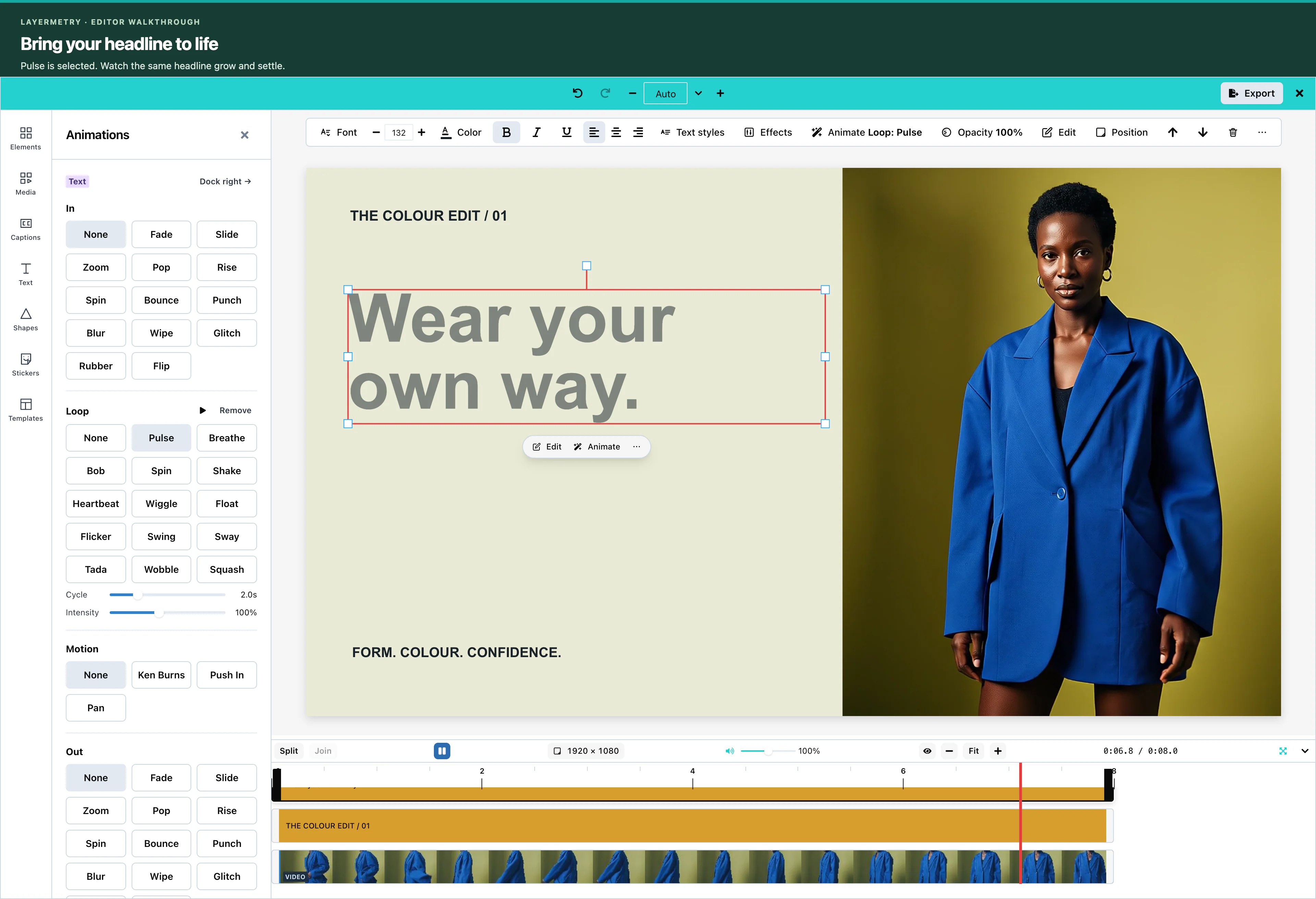 View full size
Press a preset to apply it. The editor plays the animation once on the canvas, so the user sees it at once. Remove clears one place.
Entrance and exit
In plays once when the item appears. Out plays once when it leaves. Both offer the same 13 presets:
Fade, Slide, Zoom, Pop, Rise, Spin, Bounce, Punch, Blur, Wipe, Glitch, Rubber, and Flip.
Slide also takes a direction: from the left, the right, the top, or the bottom. Spin turns clockwise or counter-clockwise.
Loop animations
Loop repeats for the whole time the item is visible. It offers 14 presets:
Pulse, Breathe, Bob, Spin, Shake, Heartbeat, Wiggle, Float, Flicker, Swing, Sway, Tada, Wobble, and Squash.
For a loop, Cycle sets the length of one repetition.
Motion effects
Motion is a slow move across the whole time of the item, often used on photos:
| Preset | What it does |
|---|---|
| Ken Burns | A slow zoom and pan. |
| Push In | A slow zoom in. |
| Pan | A slow pan across the item. |
Easing and timing
Each In, Loop, and Out animation has a Duration (or Cycle) and an Easing:
- Duration is from 0.1 to 10 seconds, and is 1 second when you apply a preset. In and Out together cannot be longer than the item is visible.
- Easing is Linear, Ease in, Ease out, Ease in-out, or Overshoot. Auto uses the easing that suits the preset.
- Intensity changes how strong some presets are, from 0.25 to 2. The default is 1.
Animations appear in the exported video exactly as in the preview.
Configuration
Animations have no options. To remove the tool, hide it in the tool rail:
const options = {
    "ui": { toolRail: { hidden: ['animations'] } }
};Events
Animations have no events of their own. They reach you inside the exported video through onExport, and inside saved designs through onSaveTemplate. See Events.
Troubleshooting
Templates
Templates are saved designs that users open again as the start of a new video. Your application stores them. The Templates panel lists them, and it also holds Workflows: actions that change many clips in one press.
The template library needs your storage: onGetTemplates to list templates, and onSaveTemplate to save them. See Saving and loading for a complete example.
Workflows and text templates need no setup.
Template library
Open Templates in the tool rail. The Designs tab calls onGetTemplates and shows the video templates it returns. A click on a template opens it on the canvas. Refresh asks again.
Without onGetTemplates, or when it returns no video templates, the tab says "No templates available".
The tab shows only records with sceneMode set to "video", so one list can hold video and image templates. All and Drafts filter the list.
When a template was made on a canvas of another size, templateCanvasPolicy decides what happens. See Loading designs.
Saving templates
With onSaveTemplate, the user saves the current design with Save current design in the panel, or with the save button in the toolbar above the canvas. See Saving designs.
Drafts
Save draft in the Export panel, or Cmd+S (Ctrl+S), saves unfinished work through the same onSaveTemplate, marked draft: true. The Drafts filter lists them. See Drafts.
Text templates
The Text panel includes built-in and host-provided text templates. See Text templates.
Workflows
A workflow applies the same change to many items in one press. The Workflows tab lists the built-in workflows, then yours:
| Workflow | What it does |
|---|---|
| Mute everything | Mutes every clip with sound. |
| Studio sound everywhere | Applies the Crystal Clear audio preset to every clip with sound. |
Select a workflow and press Run. A message reports how many items changed.
Add your own workflows with the workflows prop. A workflow is plain JSON, so you can store it like a template:
const options = {
    "workflows": [podcastSound]
}; View full size
| Field | Description |
|---|---|
id | A unique name. |
title, description | The text shown in the list. |
scope | Which items change: all-audio (every clip with sound), selection (the selected items), or canvas. |
source | Where the workflow comes from. Use host. |
steps | The actions, in order. Each step has an op, optional params, and a label. |
There are two operations:
op | params | What it does |
|---|---|---|
setMuted | { muted: true } or { muted: false } | Mutes or unmutes each item. |
applyAudioPreset | { presetId } | Applies an audio preset, such as crystal-clear, podcast-ready, youtube-video, or fix-hum. |
The editor checks each workflow when it starts. A workflow with a mistake is skipped, with a warning in the console that says why.
AI workflows
Coming soonAI workflows will build a workflow from a description in words.
Configuration
| Prop | Type | Default | Description |
|---|---|---|---|
onGetTemplates | function | none | Returns the templates for the Designs tab. |
onSaveTemplate | function | none | Stores a template or a draft. Without it, there is no save button. |
templateCanvasPolicy | string | 'adopt' | What happens when a template's canvas size differs: 'adopt', 'fit', or 'place'. |
workflows | array | none | Your workflows, shown after the built-in ones. |
ui.drafts.autosave | boolean | false | Saves drafts while the user works. |
Events
After each save, the custom element sends templatesave with detail: { template, saved }. See Events.
Troubleshooting
Resizing
Resizing changes the size and shape of the video, for example from a 16:9 landscape video to a 9:16 story. The editor moves and scales the items to suit the new shape.
Resizing needs no setup. Press the canvas size above the timeline, for example 2048 × 1080, or Resize canvas in the toolbar above the canvas. In the compact layout, press Resize in the dock.
Default: a new video is 2048 × 1080 pixels until the user adds a clip or chooses a size.
Size presets
The panel lists sizes for common platforms:
| Platform | Sizes |
|---|---|
| Post 1080 × 1080, Story 1080 × 1920, Ad 1080 × 1080 | |
| Post landscape 1200 × 630, Post square 1080 × 1080, Cover 851 × 315 | |
| YouTube | Thumbnail 1280 × 720, Channel 2560 × 1440, Short 1080 × 1920 |
| Post 1200 × 627, Banner 1584 × 396, Square 1080 × 1080 | |
| Post 1600 × 900, Header 1500 × 500, Square 1080 × 1080 | |
| Video | Full HD 1920 × 1080, 4K UHD 3840 × 2160, Vertical HD 1080 × 1920, Square HD 1080 × 1080 |
| Invitation, A4, A3, Letter, Business Card, and Poster, in centimeters or inches |
 View full size
Choose a size. The panel shows the change, for example 2048 × 1080 → 1080 × 1920, and a preview. Press Apply to resize.
 View full size
Custom sizes
Choose Custom at the top of the list, and type the width and the height in pixels.
Video encoders need even numbers. When the width or the height is odd, Export offers to round the size to even numbers first. See Export.
Resize modes
The mode decides what happens to the items on the canvas:
| Mode | What it does |
|---|---|
| Fit | Everything stays visible, scaled down and centered. |
| Fill | Everything covers the new canvas. The edges can be cut off. |
| Reflow | Each item keeps its relative place, for example in the top-left corner. |
| Keep | Items keep their positions and sizes; use edge markers to recover outside items. |
| Blurred fill | Like Fit, and a blurred, darkened copy of the clip on screen fills the empty space behind it. Shown when a picture or clip is on screen. See Blurred background. |
The preview shows the result of the mode before you press Apply, background included. Undo reverses a resize; for Blurred fill, one Undo takes back the resize and the background together.
With Fit, Fill, Reflow, and Blurred fill, a blurred or softened background keeps the same look at the new size: its blur grows or shrinks with the short side of the canvas. Going from 1920 × 1080 to 1080 × 1920 keeps it the same. Keep does not change the blur.
Caption scaling
Captions keep their position and their size in proportion to the picture. A caption at the bottom of a landscape video is at the bottom of the vertical video too, and its letters scale with the new size.
Configuration
Resizing has no options. To remove the Resize button from the compact dock, hide it:
const options = {
    "ui": { dock: { hidden: ['resize'] } }
};Events
Resizing has no events of its own. The new size reaches you in the exported video, and in canvasWidth and canvasHeight of a saved template.
Troubleshooting
Export
Export renders the design as an MP4 or WebM video file, or as an animated GIF. The user downloads it, or your code receives it through onExport.
Pass onExport to receive the file. With it, the Export panel shows Save & Exit:
const options = {
    "onExport": (file) => console.log(`Exported ${file.name}: ${file.size} bytes`)
};The Export button in the app bar opens the Export panel. Cmd + Shift + E on a Mac, or Ctrl + Shift + E on Windows and Linux, opens it too, while the keyboard is in the canvas or the timeline. The keys do nothing while the user types in a text field.
In Firefox, while the developer tools are open, the same keys are also the shortcut for their Network panel.
The panel has four sections, and these buttons:
| Button | What it does |
|---|---|
| Save draft | Saves the unfinished design through onSaveTemplate. See Drafts. |
| Export | Renders the video, downloads it in the browser, and calls onExport with it. Extra sizes are only downloaded. |
| Save & Exit | Renders the video, calls onClose, and then calls onExport with the file. |
| Share… | Asks for an email address and a name, and calls onExport with them in extras.email. |
| Download .srt, Download .vtt, Download .txt | In the Captions file row. Save the captions as an SRT file, a VTT file, or a plain transcript. Shown only while the video has captions. See Subtitles. |
 View full size
Browser requirements
Export runs in the user's browser. The browser encodes the picture and the sound, and nothing is downloaded to do it. The editor needs three things from the browser:
- A secure page. The page must be served over HTTPS, or from
localhost. On a plainhttp://page, the browser gives the page no video encoder. - Video encoding. Current versions of Chrome, Edge, Firefox, and Safari on the desktop can encode video for a web page.
- Sound encoding, for a video with sound. The browser must be able to save the sound in the chosen file. The table below shows which browsers can.
| Browser | Sound in an MP4 | Sound in a WebM |
|---|---|---|
| Chrome and Edge on Windows and Mac | Yes | Yes |
| Chrome and Edge on Android | Yes | Not tested |
| Chrome and Edge on Linux and on Chromebooks | No | Yes |
| Firefox on a computer | No | Yes |
| Safari 26 or newer | Yes | Yes |
| Safari before 26 | No | No |
A video without sound exports in all of these browsers, as MP4 or WebM. A GIF needs no video encoder from the browser. See GIF export. When the design has sound and the browser can keep it only in a WebM, the Export panel chooses WebM by itself. See WebM.
The editor checks the browser before every export and shows a sentence when the browser cannot do the work. See Export failures.
Source clips
Export reads video clips from MP4, MOV, WebM, and MKV files. The video can be H.264, HEVC, VP8, VP9, or AV1, and the sound can be AAC or Opus. AV1 exports only in a browser that can decode AV1. A sound-only Opus or AAC file exports as a sound clip.
The editor does not convert a file when it is added. The file you store through onUploadAsset stays exactly as the user gave it. A long file is read a piece at a time.
Export refuses a clip in these cases, and says why:
| Clip | Why |
|---|---|
| Video in Theora, MPEG-4 Part 2, MPEG-2, or ProRes | No browser can decode these formats for a web page. Convert the clip to H.264 (MP4) or VP9 (WebM). |
| A fragmented MP4, or an MKV file whose frames are compressed a second time inside the file | Export cannot read the file. Save the clip again as an ordinary MP4, MOV, WebM, or MKV file. |
MP4
The file is an MP4 video with H.264 or HEVC video and AAC sound. H.264 has the widest compatibility; HEVC needs a player that supports it. Its name is exported-video.mp4. An export that waited in the queue behind another export is numbered, for example exported-video-2.mp4.
The sections of the panel:
| Section | Options |
|---|---|
| Format | MP4, GIF, or WebM. The panel opens on MP4, or on WebM when the design has sound and this browser can keep the sound only in a WebM. |
| Quality | Better quality (sharpest picture, recommended) or Smaller file (a noticeably smaller file, which older devices may not play). |
| Sizes | The current canvas, and more sizes with Add size or Social pack. Each size is a separate video. |
| Advanced | Codec, frame rate, bitrate, and more. See the table below. |
The Advanced section applies to every file of the export:
| Option | Values |
|---|---|
| Codec | For MP4: H.264 (most compatible), or HEVC (H.265) for smaller files that not every player reads. For WebM: VP9. A GIF has none. |
| Frame rate | Match source, 30 fps, or 60 fps. It is a ceiling: the editor never invents frames. |
| Bitrate ceiling | 3, 5.4, 6, 9, or 15 Mbps |
| Bitrate mode | Variable or Constant. The choice is passed to the browser's video encoder, and the encoder decides how closely to follow it. Many browsers, Chrome among them, write the same file for both choices. |
| Sessions | Hardware only (uniform quality), or hardware and CPU together (faster) |
| Captions | Shown only while the video has captions: In the picture (the default), Subtitle track, or Both. See Subtitles. |
When the width or the height of the canvas is an odd number, the editor offers to change the canvas to the nearest even size before it exports. H.264 needs even sizes.
With captions, Advanced also chooses how they reach the file: in the picture, as a subtitle track, or both. The Captions file row saves them as a separate .srt, .vtt, or .txt file. See Subtitles.
Photo credits
When the design holds a stock photo with a credit, the Export panel shows two switches: Show photo credits on the canvas and Include photo credits in the export. The second one writes the credits, such as "Photo by Ana on Unsplash", in a small dark box in the bottom-left corner of the video. The user's choice is saved with the design. See Stock media.
GIF export
A GIF is an animated picture without sound, suited to chat apps and short loops. The Format step describes it as "A moving picture with no sound. For chat apps and short loops. Files grow quickly beyond a few seconds."
The editor writes the GIF itself. It needs no video encoder from the browser, so it is made the same way in Chrome, Firefox, and Safari. The GIF row is grayed only when the browser cannot draw frames in the background, with the sentence "This browser cannot render frames off-screen, which this option needs."
The panel never chooses GIF by itself. The user chooses it. The summary line at the top of the panel then reads, for example, "Exporting 480×270 · GIF · no sound".
The two Quality cards decide the frame rate and the colors:
| Card | What it says | Frame rate | Colors | Dithering |
|---|---|---|---|---|
| Better quality | Smoother motion and more colours. Larger file. | 15 fps | 256 | On |
| Smaller file | Fewer frames and colours. Best for short loops. | 10 fps | 128 | Off |
Dithering hides the steps between colors with fine dots. Without it, areas of color are flat, and the file is smaller.
For a GIF, Advanced has one field, Frame rate: 10, 12, 15, 20, or 24 fps. It has no Match source. Its caption says: "More frames per second means a larger file. GIF services recommend under 200 frames in total." A GIF has no codec, bitrate, or sessions field. Colors, dithering, and looping are not fields: the cards decide colors and dithering, and a GIF made in the panel always loops.
A GIF plays at up to 24 frames per second. A design at a higher frame rate is exported at 24 frames per second, at its normal speed.
The Sizes step shows a sentence when the first size is wider than 720 pixels, or the design is longer than 15 seconds: "GIF services accept up to 15 seconds and recommend under 6; 480 pixels wide is the usual size. Most chat apps accept a few megabytes." The export still runs. The user decides.
A GIF has no subtitle track. Its captions are always drawn into the picture. In place of the Captions field, Advanced says: "Captions: drawn into the picture. A GIF cannot carry a subtitle track." Export without sound never appears for a GIF, because a GIF has no sound.
The file's type is image/gif. Its name is exported-video.gif, or a numbered name such as exported-video-2.gif when it waited in the queue behind another export. The export runs in the background like a video export, and onExportProgress reports its progress.
A GIF is slower to make and larger than a video. In one test in Chrome, a 60-second 1280×720 design took 51 seconds and made an 82 MB GIF at 15 fps. The same design took 4.5 seconds as a 68 MB MP4, and 6.5 seconds as a 44 MB WebM. Real footage gives other numbers.
With onThumbnails, a GIF export also makes thumbnails. They are made from the design, not cut from the GIF. See Thumbnails.
GIF from your own code
The exportStart action takes format: 'gif', and three arguments that apply to a GIF only:
| Argument | Values | When left out |
|---|---|---|
gifColors | 64, 128, or 256: how many colors each picture may use. Fewer colors make a smaller file, with visible bands of color. | 256 |
gifDither | true hides the steps between colors with fine dots. false gives flat areas and a smaller file. | true |
gifLoop | true plays for ever. false plays once. | true |
fps for a GIF is at most 24. A GIF request is refused at once, with one of these sentences:
- A codec, a bitrate, or a bitrate mode: "A GIF has no codec or bitrate; leave those out."
subtitles: 'track'or'both': "A GIF cannot carry a subtitle track. Use burn, or leave subtitles out."fpsabove 24: "A GIF plays at up to 24 frames per second."gifColors,gifDither, orgifLoopwithoutformat: 'gif': "gifColors, gifDither and gifLoop apply to a GIF only. Add format "gif", or leave them out."
WebM
A WebM file carries VP9 video and Opus sound. It plays in web browsers. YouTube, TikTok, and LinkedIn accept it. Instagram does not.
WebM keeps the sound in Firefox, and in Chrome and Edge on Linux and on Chromebooks. These browsers cannot save sound in an MP4 video. When the design has sound and the browser can keep it only in a WebM, the Export panel opens with WebM chosen. It says: "This browser cannot save sound in an MP4 video. WebM keeps the sound." In every other case, the panel opens on MP4.
The user can still choose MP4 in such a browser. The MP4 row then shows the same sentence. A notice above the Export button says: "This browser cannot save sound in an MP4 video, so this video cannot be exported here. To export it with its sound, use Chrome or Edge on Windows, Mac or Android, or Safari 26 or newer."
The two Quality cards write VP9 for a WebM:
| Card | What it says | Bitrate ceiling |
|---|---|---|
| Better quality | Sharpest picture. Plays in every modern browser. Recommended. | 9 Mbps |
| Smaller file | Noticeably smaller, softer in fast motion. | 5.4 Mbps |
When the user changes the format, the Quality step goes back to Better quality for the new format.
In Advanced, the Codec list shows VP9 only. Under Sessions, the panel says: "VP9 is made by the processor, so the two choices behave the same here."
A WebM file made by the editor has no subtitle track. Its captions are always drawn into the picture. In place of the Captions field, Advanced says: "Captions: drawn into the picture. A WebM file made here carries no subtitle track; download the .vtt file below for web players." See VTT export.
The file's type is video/webm. Its name is exported-video.webm, or a numbered name such as exported-video-2.webm when it waited in the queue behind another export. The file has an index at its start, so a player can jump to any moment at once.
Export without sound
Export without sound is a box in Advanced. It appears only while the design has sound and this browser cannot save the sound in the chosen file. For example, it appears when the user chooses MP4 in Firefox. Its caption says: "This browser cannot save the sound in this kind of file. Ticking this makes a file with the picture only."
When the box is ticked, the summary line at the top of the panel ends with "no sound", and the notice above Export goes away. The editor never makes a video without its sound unless the user ticks this box.
WebM from your own code
The exportStart action takes format: 'webm'. codec accepts 'vp9' for a WebM, and 'h264' or 'hevc' for an MP4. withoutSound: true makes a file with the picture only. It is never the default. Without format, a codec of 'vp9' makes a WebM, and any other request makes an MP4.
A request that the file cannot hold is refused at once, with one of these sentences:
- "WebM holds VP9 video. Choose vp9, or choose MP4 for H.264 and HEVC."
- "MP4 holds H.264 or HEVC video. Choose one of those, or choose WebM for VP9."
- "A WebM file made here carries no subtitle track. Use burn, or choose MP4 for a subtitle track."
The readExportCapabilities action says which files this browser can make, and which of them keep the sound. Call it before exportStart when the video has sound. In Firefox, its message is:
MP4: picture yes, sound no (this browser cannot save sound in an MP4 video). WebM: picture yes, sound yes. GIF: yes, never with sound. For a video with sound, use format "webm".Its data.formatKeepingSound names the file to ask for, or is null when no file made in this browser can keep the sound. While the editor is still checking the browser, the action answers ok: false with "This browser is still being checked for which files it can export. Ask again in a moment." Only an editor on a page can answer. On the headless runtime, the action answers ok: false with "This runtime cannot check which files this browser can export: it has no export engine. Only an editor mounted in a browser can answer."
Progress and cancellation
Exports run in the background, one at a time. A chip in the app bar lists them, and each row has Cancel export, or Retry export after a failure. The user keeps editing while an export runs. A later change does not reach an export that has started.
onExportProgress reports the background export after Save & Exit closes the editor on its first frame, usually in less than two seconds:
const options = {
    "onExportProgress": (event) => {
        if (event.jobType === 'thumbnails')
            return;
        console.log(event.done ? 'Export finished' : `Exporting: ${Math.round(event.percent)}%`);
    }
};Events has a complete example and every field of the event.
Export failures
When the browser cannot export the design, no file is made. The export list shows a failed row with a sentence that says why, and two buttons: Retry, and Export current canvas, which exports the design as it is now. After Save & Exit, the editor stays open, and onExportProgress receives one last event with done: true and the same sentence as error.
| Code | The sentence the user sees |
|---|---|
api-missing | This browser does not have the video features that export needs, so the video could not be exported. |
audio-encoder-unsupported | This browser cannot save sound in an MP4 video, so the video could not be exported. To export it with its sound, use Chrome or Edge on Windows, Mac or Android, or Safari 26 or newer. |
webm-sound-unsupported | This browser cannot save sound in a WebM video, so the video could not be exported. To export it with its sound, use Chrome, Edge or Firefox on a computer, or Safari 26 or newer. |
decoder-unsupported | One of your clips uses a video format this browser cannot decode, so the video could not be exported. Convert that clip to H.264 (MP4) or VP9 (WebM) and add it again. |
unsupported-container | One of your clips is in a file type that export cannot read. MP4, MOV, WebM and MKV files can be read; save the clip as one of those and add it again. |
encoder-unsupported | This browser on this device cannot encode the chosen format at this size. Try a smaller size or H.264. |
odd-dimensions | H.264 cannot save a video with an odd width or height. Make the canvas one pixel smaller, or choose HEVC. |
offscreen-canvas-unavailable | This browser cannot draw video frames in the background, which export needs. |
storage-unavailable | This export is too large to hold in memory, and this browser cannot write it to disk. Try a shorter timeline or a lower bitrate. |
empty-timeline | There is nothing on the timeline to export yet. |
codec-not-implemented | This format is not available for export yet. Choose H.264 or HEVC. |
probe-error | This browser could not check whether it can export this video, so the export did not start. |
When several reasons apply, the user sees the first one only. No other export method runs in place of a refused export.
Handling the export
onExport receives a File of type video/mp4, video/webm, or image/gif. Upload it to your storage:
const options = {
    "onExport": handleExport
};The editor does not wait for your upload. With Save & Exit, it calls onClose before the file is ready. Keep the upload running in your page after the editor is removed.
When the video has captions, the second argument of onExport also carries them as three files: extras.srt, extras.vtt, and extras.txt. See Files in onExport.
Thumbnails
With onThumbnails, each export also makes a preview: a still JPEG picture and a short silent MP4 clip, cut from the finished video. onThumbnails receives them after onExport:
const options = {
    "onThumbnails": handleThumbnails,
    "videoThumbnails": "always"
};videoThumbnails decides when thumbnails are made:
| Value | When |
|---|---|
'ask' | The default. Advanced shows a box, already ticked, that the user can untick for one export. |
'always' | On every export, without asking. |
'never' | Never on its own. |
Without onThumbnails, the editor makes no thumbnails and shows no box. In TypeScript, videoThumbnails other than 'never' needs onThumbnails.
delivery.notes has one sentence for each thumbnail that could not be made. Show it or log it: nothing makes the thumbnail again later.
Configuration
| Prop | Type | Default | Description |
|---|---|---|---|
onExport | function | none | Receives the MP4, WebM, or GIF File, and extras as the second argument. Without it, there is no Save & Exit. |
onExportProgress | function | none | Progress of a Save & Exit export that finishes after the editor has closed, and the reason when an export is refused. |
onThumbnails | function | none | Receives the still picture and the short clip of each export. |
videoThumbnails | 'ask', 'always', 'never' | 'ask' | When thumbnails are made. |
showAttributionOverlay | boolean | false | The starting value of Show photo credits on the canvas. |
includeAttributionInExport | boolean | false | The starting value of Include photo credits in the export. |
export | { experimental: boolean } | none | Deprecated. Accepted, and changes nothing: every export uses the same engine. |
Events
The export reaches you through onExport, and through the export DOM event of the custom element. See Events.
Troubleshooting
Additional resources
AI assistant
The AI assistant edits the video from a conversation. The user types a request, such as "Add a title that says Summer sale", and the assistant makes the change on the canvas and answers in words.
Capabilities
The assistant can apply or clear a media mask. For example, ask “Make the photo a circle.” Clearing a mask leaves its crop unchanged.
The assistant uses the same editing actions as the editor's own controls, so every change can be undone, and appears in saved designs and in the export. The supported actions cover these tasks:
| Group | Examples |
|---|---|
| Text | Add text, change words, font, size, color, weight, and effects |
| Captions | Add captions, make captions from a clip's sound, change their lines and their style |
| Items | Move, resize, rotate, layer, group, animate, and place in time |
| Media | Add pictures and clips from web addresses, crop, mask, and filter |
| Canvas | Resize the canvas, and set a color, gradient, picture, or blurred copy of an item as background |
| Shapes | Add shapes and lines, and set their colors |
| Audio | Add sound from a web address, set volume and fades, apply presets, replace part of a clip, and prepare a voiceover script |
| Clips | Split, join, mute, and change the speed of clips |
| Reading | Read the canvas, find items, check the layout, and write the captions as a file |
| Export | Start, list, and cancel exports, and check which files keep the sound in this browser |
| Playback | Play, pause, and move the playhead |
| Labels | 3 |
Editor actions lists every action.
The assistant also reads the design before it acts, so it can find "the title" or "the red circle" by what they are.
Enabling the assistant
The assistant appears only when you pass a valid ai prop. It talks to a chat service at your media server: POST {mediaApiUrl}/video-editor-chat. Configure your own mediaApiUrl for chat. ai: { hosted: true } uses Layermetry’s service when no media address is set. Hosted AI is coming soon. Available only with an enterprise licence from Layermetry.
const options = {
    "mediaApiUrl": "https://media.example.com",
    "ai": { endpointUrl: 'https://api.example.com/ai' },
    "onChatEvent": handleChatEvent
};Open AI Assistant at the bottom of the tool rail, or AI Chat in the compact dock. The user types a request and presses Send. New chat starts a new conversation.
The editor sends the conversation and the list of actions. The chat service answers with a stream. When the service asks for an action, the editor runs it on the canvas and sends the result back. One request can take up to 8 such rounds.
The AI Assistant button and the AI Chat tile show only when ai is given and valid. To remove the assistant while you keep ai, set ui: { features: { 'ai.chat': false } }.
Limitations
- The assistant needs the chat service. It sends every request there, with your license key.
- One request runs at most 8 rounds of actions. For a longer job, the user sends another request.
- The assistant changes the design in the editor. It does not render the video until the user exports, or asks it to export.
- The assistant does not upload files from the user's computer. It adds media from web addresses.
- Without
chatSessionId, the conversation is kept in the browser only. See Conversation history.
Conversation history
A conversation with the assistant has a name, its messages, and the design it worked on. You can keep it in your own database and open it again later, with the design as the conversation left it.
Storage
Pass a name for the conversation as chatSessionId, and two functions: onSaveChatSession stores the record, and onGetChatSession returns it:
const options = {
    "mediaApiUrl": "https://media.example.com",
    "ai": { endpointUrl: 'https://api.example.com/ai' },
    "chatSessionId": "campaign-42",
    "onSaveChatSession": saveChatSession,
    "onGetChatSession": getChatSession
};The editor calls onSaveChatSession:
- when the user opens a conversation that your database does not have yet, so it has a record before the first message;
- at the end of every request;
- for both conversations when the user presses New chat;
- once more, without waiting, when the editor closes.
The record has these fields:
| Field | Type | Description |
|---|---|---|
id | string | The name of the conversation, the same as chatSessionId. |
schemaVersion | number | The version of the record format. It is 1. |
messages | array | The messages, in the format that the chat service reads. |
draft | object | The design, as a template record. See Saving and loading. |
lastTurnId | string or null | The last request that the editor's panel ran. |
createdAt, updatedAt | string | Dates in ISO 8601 format. |
The editor waits for the Promise of onSaveChatSession. If it rejects, or takes longer than 30 seconds, the panel shows "Not saved — retry" with a button.
When you pass chatSessionId or onSaveChatSession, the editor stops keeping the conversation in the browser. Your database then holds the only copy.
Pass onUploadAsset too. The design in each record is built like a saved template, so without it every picture from the user's computer is stored inside the record, on every save.
Default: without these options, the editor names each conversation itself and keeps it in the browser only. The console says so once.
Resuming a conversation
Pass the same chatSessionId again. When the assistant panel opens, the editor calls onGetChatSession. The record you return brings back the messages and the design:
What your function returns decides what happens:
| Return value | What happens |
|---|---|
A record with draft | The messages and the design open. The design wins over defaultTemplate. |
A record without draft | The messages open. The canvas keeps defaultTemplate, or stays empty. |
A record with an empty messages list | The conversation exists and is new. |
null | Your database does not know the name. The editor starts an empty conversation with that name, and saves it. |
Without onGetChatSession, pass the stored messages as initialMessages instead. That restores the messages only, not the design.
A design whose pictures are no longer in your storage still opens. The console names each missing item, and the rest is drawn.
To follow the conversation as it happens, use onChatEvent. See Custom chat UI.
Custom chat UI
You can run the assistant from your own chat window instead of the editor's panel. Your window sends the messages, and the changes still appear on the editor's canvas.
Sending messages
Hide the built-in panel, and pass onChatEvent. The first event is ready, and it carries api, the handle of the live canvas. Pass the handle to runChatTurn for each message:
const options = {
    "mediaApiUrl": MEDIA_API_URL,
    "ai": { endpointUrl: 'https://api.example.com/ai' },
    "chatSessionId": SESSION_ID,
    "templateMetadata": BRAND,
    "ui": { features: { 'ai.chat': false } },
    "onChatEvent": handleChatEvent
};runChatTurn(history, userMessage, options) sends the conversation to the chat service, runs the actions that the service asks for on the canvas, and returns the whole conversation after the turn:
| Option | Description |
|---|---|
endpoint | The chat service: {mediaApiUrl}/video-editor-chat. |
toolContracts | The actions that the service may ask for: api.toolContracts. |
executeTool | Runs one action: api.executeTool, wrapped with withChatEvents to report events. |
sessionId | The name of the conversation. Pass it on every turn. |
templateMetadata | Your brand details, the same object as the prop. Pass it on every turn. |
onHistoryChange | Called with all messages each time the conversation changes. |
onAssistantUpdate | Called with the assistant message while it grows. |
signal | An AbortSignal that stops the turn. |
Pass sessionId and templateMetadata on every turn. The chat service keeps what it learns about your brand under the conversation's name. Without them, each turn starts with no brand and no memory.
A message is { id, role, parts }. A user message has one part: { type: 'text', text }.
Streaming responses
The chat service streams its answer. runChatTurn builds the assistant message as the parts arrive, and calls onAssistantUpdate and onHistoryChange, so your window can show the words while they come.
onChatEvent receives five kinds of event:
type | When | Fields |
|---|---|---|
ready | The canvas can be edited. | sessionId, api |
message | The conversation changed. | turnId, message, messages |
toolCall | An action is about to run. | turnId, toolName, args |
receipt | An action has run. | turnId, toolName, result |
done | The turn ended. | turnId, messages, and error if it failed. A refused turn also has errorCode, and topUpUrl when the server sent one. |
Turns typed in the editor's own panel arrive at onChatEvent by themselves, as message, toolCall, receipt, and done events. Turns that you run arrive there only through withChatEvents, as in the example, and only as toolCall and receipt events: a toolCall before each action, and a receipt when the action returns a result. The editor never sends message or done for a turn that you run. To follow such a turn, use onHistoryChange and onAssistantUpdate, and store the list that onHistoryChange gives you. A turn that fails or is stopped does not return, but the actions it already ran are in that list.
Store messages, not the events. A receipt carries everything that one action changed, and can be large.
Tool results
Each action returns a result, which receipt events carry. ok says whether the action ran. On failure, error is a sentence that says why, and the chat service passes it to the model, so the model can try again.
{ "ok": true, "receipt": { "summary": "Added 1 text item." } }On success, receipt describes the change: a one-line summary, and the items and fields that changed, with their values before and after. A turn stops after 8 rounds of actions.
To run actions yourself, without the chat service, call api.execute(name, args). See Editor API.
Additional resources
Headless runtime — Coming soon
Run a conversation with no editor on the screen.
Editor API
Run actions on the mounted editor from your code.
Editor actions
Every action, with its arguments.
Turbo navigation
The topic examples mount inside their view and unmount when Stimulus disconnects. To keep the editor's live state across Turbo visits instead, put a custom element inside a permanent layout region and initialize it once from a head-loaded browser module. The incoming page must contain the same permanent region ID.
Use the initializer and SDK asset copy from Usage. This alternative uses its own browser module; do not attach the topic's data-controller="media-editor" to this region.
Turbo matches permanent elements by id between the live page and incoming HTML. Render the same region in every page that should keep it. A Stream or Frame response that replaces this region must include the matching permanent element too; keep the editor outside replace targets when you cannot guarantee that contract.
Load the permanent module from the layout head, so Turbo does not reattach its listeners on every body replacement. The SDK retains its styles and remeasures an editor that survives a move. turbo-cache-control with no-preview suppresses the cached preview while a visit loads; it does not save a design. Use Saving and loading for persistence beyond the live editor.
Programmatic editing
Editor API
Use onChatEvent to capture the live editor handle from ready, then run named actions from your own controls. ready does not require an ai prop. This API operates on a mounted browser editor. The independent prelaunch Headless Runtime is coming soon; this handle is not a server editing API.
if (event.type === 'ready') api = event.api;
const result = api.execute('canvasSetBackgroundFill', {
  fillColor: '#FFCC00', scopeReason: 'explicit',
});| Member | Use |
|---|---|
execute(name, args, meta?) | Run one action synchronously; inspect ok, receipt, and refusal error. Optional metadata can record generated-content provenance. |
executeAsync(name, args, meta?) | Runs an action that waits before it can change anything, such as itemUnlock, which waits for your onUnlock. Returns a Promise of the result. From version 1.0.0. |
list(filter?) | Inspect action names and argument schemas; filter by category, itemType, or readonly. |
getItems() | Read current items. The returned array is fresh, but item objects are shared; treat them as read-only. |
toolContracts | Read the contracts offered to the chat pipeline. |
executeTool | Execute a chat tool call; pass it to runChatTurn for a custom chat integration. |
itemSetOpacity accepts video clips as well as text, shapes and pictures. Its opacity argument is a fraction from 0 (transparent) to 1 (solid).
Actions use the editor's validation, locks and undo history. Supply scopeReason: 'explicit' for an explicit user-directed edit and show refusals rather than assuming success. Do not mutate items from getItems() to bypass those checks. list() describes available actions and their schemas; Editor actions supplies the argument reference. Some actions, including playback and export capability checks, depend on the mounted browser editor.
Keep the button disabled until ready. Clear the handle before close or disposal, ignore callbacks from an old mount, and wait for a fresh ready after reopening. A changed chatSessionId can emit another ready event, so replace the stored handle when it does.
Media utilities
Import probeMediaFile and generateThumbnail from @layermetry/media-editor to inspect local media and create previews without mounting an editor. Both run in browser JavaScript; backend language and framework choice do not determine decoder support.
Probe media files
For Windows Media (ASF) files, ignore bitrateBps: the reader currently reads it from the wrong field. Duration and format recognition are separate from that bitrate value.
Call probeMediaFile(file) before an upload to read metadata without decoding frames.
const info = await probeMediaFile(file);
const warning = info.undecodableReason;
MediaInput accepts a File, Blob, Uint8Array, or ArrayBufferLike. The result includes container, sizeBytes, and durationSource. durationSec, track data in video and audio, and bitrate fields depend on what the file states. Check durationSource before using a duration for precise work; a duration estimate is not an exact length. Unrecognized contents return container: 'unknown' rather than throwing because of the file. undecodableReason is a sentence to show the user when the SDK knows the container cannot play; its absence does not guarantee playback. For still images, the probe reports the image format; thumbnail decoding supplies dimensions. Probing has no cancellation option, so ignore a result after replacement or teardown.
Generate thumbnails
A timeoutMs value of 1 produces a timeout refusal whose sentence says "0 seconds". Use reasonCode to handle a timeout and supply your own deadline message when you choose such a short budget.
Call generateThumbnail(file, options) with a browser File or Blob to create a poster and optional sampled video frames.
const result = await generateThumbnail(file, { at: 1, maxEdge: 400 });
// Show result.reason when result.poster is null.| Option | Default | Behavior |
|---|---|---|
at | 1 | Video time in seconds; negative values become 0, values past the end select the last picture. Ignored for still images. |
maxEdge | 400 | Integer of at least 16; preserves aspect ratio and does not enlarge a source without box. |
box, fit | no box, 'contain' | Exact positive integer { width, height }; overrides maxEdge, permits enlargement. 'cover' crops to fill; 'contain' retains the whole picture. |
format | 'image/jpeg' | JPEG, PNG, or WebP. Read the result's actual mimeType. |
quality | 0.82 | Number from 0 to 1; ignored for PNG. |
frames | none | Positive integer count or { count, maxEdge }; samples at durationSec * (i + 0.5) / count when a positive duration is known. Ignored for still images. |
timeoutMs | 5000 | Positive finite milliseconds; one deadline covers video poster and sampled frames. |
signal | none | Abort signal for video decoding and sampling. Keep a stale-result guard for work that finishes after cancellation. |
poster is a Blob or null. A refusal returns reason for the user and reasonCode for program logic; log detail rather than displaying it. Unsupported files, sound-only media and decoder failures return a refusal. Invalid options reject the promise with RangeError before reading the file. The still-image branch currently does not apply signal or timeoutMs to its decoder; cancellation does not replace the host's stale-result guard.
Successful results report width, height, actual mimeType, info, and source dimensions with video rotation or image EXIF orientation applied. sourceTimeSec describes the decoded video frame, which can precede the requested time. frames and aligned frameTimesSec are optional; fewer frames than requested can return when the shared deadline or cancellation cuts sampling short. A completed poster can still be returned with partial frames. No frames are produced for still images.
MP4, MOV, WebM and Matroska need a supported browser video decoder; JPEG, PNG, GIF, WebP and AVIF depend on the browser's image decoder. Recognizing TIFF, SVG or HEIC does not guarantee a poster. Check poster and show reason instead of treating recognition as decoding support.